Your new post is loading...
Technology News
Blazing fast 5G speeds are here but they aren't all that useful on the new 5G smartphones. WSJ's Joanna Stern packed up a motor home to see if the connection could power all her connected gadgets, including laptops, printers, Xboxes and camera-equipped doorbells.
Credit Wall St
Via TechinBiz
What is the carbon footprint of one single Google search? How about a single email? These and many other questions are presented in the following infographic...
Via Lauren Moss
Recently, I was overwhelmed with the constant presence of electronic devices in my life. I realized that I could hardly get through an hour, much less a day, without checking my email or Facebook.
Via Barb Jemmott
The 10 most egregious UX offenses against users. Web design disasters and HTML horrors are legion, though many usability atrocities are less common than they used to be.
Marty Note
If you took a day and fixed any of these Top 10 Web Design Mistakes That Apply you would make 50% more this holiday season. These are "cost of poker" fixes that can easily remain for years and years. Every year one of these mistakes exists your website is 10% less effective.
When you make 2 or more of these mistakes you pay with an order of magnitude more pain for each added mistake so 2 mistakes doesn't cost you 20%. No 2 mistakes cost you 200% of what your website could be doing for you.
Fix all 10 of these basic problems and your site is on its way to its "mission critical" place in your company.
Via Martin (Marty) Smith
Don't Make These 10 Web Design Mistakes
1. Don't Use Flash.
2. Careful with fonts easy to do bad.
3. Text over images - Not So Much.
4. Too Many Ads.
5. No Clear Call To Action. 6. Too much text (break up with graphics or multiple pages). 7. Bad link colors. 8. Popups suck (don't do it). 9. Tiny font size. 10. Long paragraphs especially problem longer the post.
Via Martin (Marty) Smith
The amount of information available online has gotten out of hand. Everything about our lives, from where where we went to high school and what we ate for breakfast this morning, can be found on the internet. If you think that's bad, think about children growing up today – their entire lives, from infancy through middle school, are being documented by their parents on Facebook! Privacy just doesn't exist online anymore; it can take drastic measures to delete ourselves from the internet, but here's a step-by-step guide for those who want to do so...
Via Lauren Moss
Deleting yourself from the Internet is hard work. First, you have to decide where exactly you want to disappear — from social media sites to retailer databases — and then you have to figure out how you're going to do all that.
So attention, web users.
Via Barb Jemmott
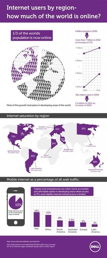
Today, around the world more people have mobile phone subscriptions than have access to electricity and safe drinkable water. Today, almost a third of the world's population uses the internet (a 528.1% growth since 2000!
So what are we doing with all the time we spend online, and how do we know all that time is being spent in useful ways? For many of us, the internet is among the first things we experience after we wake; in fact, 75% of users are online before 9 a.m. Over 75% of people in the US own a laptop, 53% a smart phone, and 31% a tablet. Email is the most common action performed by people on their laptops, while search is the top action for mobile phone and tablet users. 72% of people like to play games on their tablets while 70% use their mobile phones for social media. Where do we use these devices? 72% of people use their mobile phones while traveling, and 64% use them in restaurants and coffee shops. As for tablets, 88% of people use their devices in the living room, 79% in the bedroom. Find more statistics and data at the infographic or article link.
Via Lauren Moss
|
Computer engineers study the mathematics of how to optimize complex systems. In one example, they face a logistics challenge known as the "travelling salesman problem:" how can a hypothetical salesperson visit every city on their route in the shortest distance? The algorithms developed to answer these sorts of questions are useful in many situations, such as reducing the costs of and pollution from a fleet of delivery trucks. But when engineers tried to optimize traffic on the internet, they found their methods wanting. [...] Honeybees don't study mathematics, but the demands of evolution reward those colonies that succeed in optimizing their resources. Fortunately, in the strange tale of how honeybees make the internet work, the scientists were smart enough to see that the honeybees knew better than they did.
Via Miguel Prazeres
PicassoHead App
Sharing this cool "draw a "Picasso Head" app (my PicassoHead http://www.picassohead.com/?id=5290a28#.VBCfth1bqjo.twitter ) to illustrate a few of our favorite web design concepts such as:
* DO LESS and let them DO MORE (them = customers, visitors, advocates_.
* GALLERIES ROCK - especially when your gallery is chock a block full of User Generated Content (UGC).
* Engagement Rocks - do you have a tool that is fun to use AND promotes positive site heuristics such as time on site, pages viewed, lower bounce?
* Every product, idea or website starts about the creators and must become about those who visit and love it.
* People love what THEY create and contribute more than what you do.
* This means all web design is or will be about collaboration.
We love the simplicity of this little app, but the even COOLER riff came from our confirming email. This is the email that shares the link where my Picasso At The Beach drawing lives (linked from this post http://www.picassohead.com/?id=5290a28#.VBCSuy4Lksk.twitter ) and where this little pitch lived:
"This summer check out Picasso Looks at Degas at the Clark in Williamstown, MA. You won’t want to miss this groundbreaking, Clark-exclusive exhibition that is the first to look at Pablo Picasso’s deep fascination with Edgar Degas.
http://www.clarkart.edu/exhibitions/picasso-degas/ "
Wow, cool idea. Create a little art based app and sell related links in the confirmation email. That's brilliant marketing, subtle marketing and the art of web design. Kudos to Picassohead creators RFI Studios, http://www.rfistudios.com. #toogood
Via Martin (Marty) Smith
A poorly designed website has real impacts, whether page views or sales. We won't hesitate to bounce away to another with a better user experience.
1. Requiring users to signup before browsing your site
2. Forgetting about multiple screens
3. Having ridiculous forms to fill out
4. Using hard to read or cutesy fonts
5. Implementing a Search bar that sucks
6. Bombarding the reader with a wall of text
7. Displaying your products with low-res images MS - 8 Non stop animated gifs (you will discover what I'm talking about)
Marty Note
Agree with all 7 of these annoying disasters and would add an 8th - too many animated gifs all running at the same time with NO STOP.
Via Martin (Marty) Smith
The internet increasingly pervades our lives, delivering information to us no matter where we are. It takes a complex system of cables, servers, towers, and other infrastructure, developed over decades, to allow us to stay in touch with our friends and family so effortlessly. Here are 40 maps that will help you better understand the internet — where it came from, how it works, and how it's used by people around the world.
Via Lauren Moss
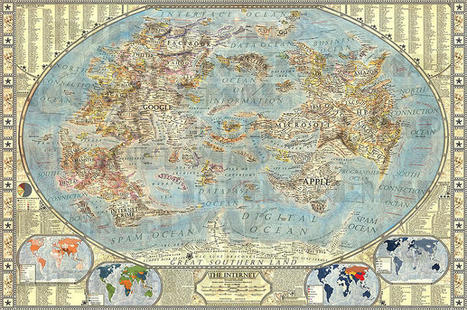
An artist has created a hand-drawn map of the Internet, where Google, Apple, and porn are continents. The world of the Internet mirrors the real-world in myriad ways: there are members (we call them populations), websites (destinations to visit), acquisitions of companies (redrawn political boundaries). So what if the Internet could be visualized like our global politics? That’s exactly what designer Martin Vargic did in this cartographic experiment which treats mega-companies such as Google, Microsoft, HP, and Apple like empires, on a classic world map. To explain the dominance and relationships of these entities, Vargic created a visual hierarchy that gives prominent treatment to companies with the most users (or sites with the most visitors), surrounding them with smaller states and townships named after adjacent businesses. More details at the link...
Via Lauren Moss
A map from the Oxford Internet Institute reveals the geographical distribution of billions of photos uploaded to the popular image-sharing site. Individually, each of those photos shows us something, some flash of a moment on this Earth. All together, they show us something else, a planet pulsing—unevenly—with photo documentation...
Via Lauren Moss
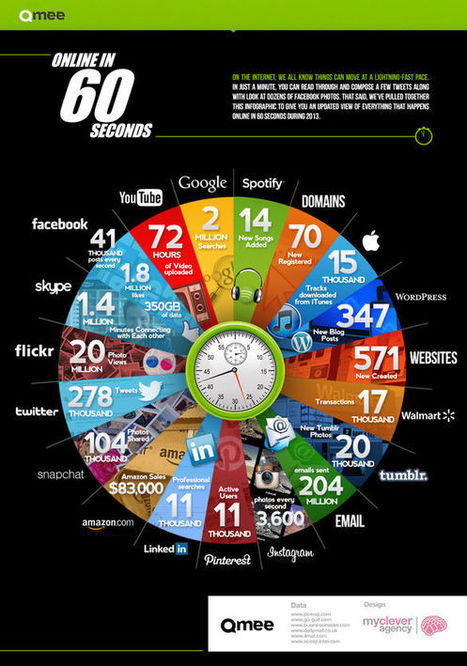
Early last year we learned that one hour of YouTube is uploaded every second. It was a bracing reminder of just how many people are spending their time online simultaneously. Created by rewards site Qmee, the infographic "Online In 60 Seconds" is a pie chart that shows off the sheer amount of online activity that takes place every single minute. The amount of YouTube videos uploaded has already increased from January 2012's 60 hours per minute to 72. Additionally, over 1.8 million things are liked on Facebook, and 278 thousand bon mots tweeted. Not depicted in the chart: the amount of work that is going undone while all of these items are being viewed.
Via Lauren Moss
A showcase of the best infographics from around the web (Internet Users By Region – How Much Of The World Is Online?
A look at the current statistics of worldwide internet usage.
Via Lauren Moss
|


![What's the carbon footprint of the Internet? [Infographic] | Design, Science and Technology | Scoop.it](https://img.scoop.it/aNn9VgqhUBgovEsoWYVBrDl72eJkfbmt4t8yenImKBVvK0kTmF0xjctABnaLJIm9)


![How to Disappear from the Internet [INFOGRAPHIC] | Design, Science and Technology | Scoop.it](https://img.scoop.it/7Y9rC3ugylCOUYu3n49W_Dl72eJkfbmt4t8yenImKBVvK0kTmF0xjctABnaLJIm9)


![How People Use the Internet [INFOGRAPHIC] | Design, Science and Technology | Scoop.it](https://img.scoop.it/HxayS8uDxOfZb1g4NfEF4jl72eJkfbmt4t8yenImKBVvK0kTmF0xjctABnaLJIm9)