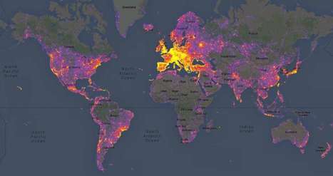
Sightsmap forms an aggregation of the most photographed buildings by integrating Google's Panoramio, which allows users to tag a location or attraction within their photo.
In a colorful gradient of purples, reds, and yellows, the website reveals the most photographed places around the globe. Broad patches of purple coincide with a lesser amount of photographs, while smaller clusters of yellow reveal the locations where people can't seem to put their cameras down. Unsurprisingly, the densest areas of yellow are the world's most popular tourist spots − including New York City and cities across Europe such as Istanbul.
Sightsmap is more than just a map of tourist destinations however; it also shows the close connection between architecture and what inspires people to take photos. Sightsmap forms an aggregation of the most photographed buildings by integrating Google's Panoramio, which allows users...
Via
Lauren Moss


 Your new post is loading...


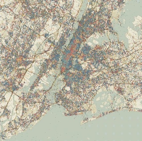


Example of data scientist faux pas: Meteors choose to fall so unevenly...!