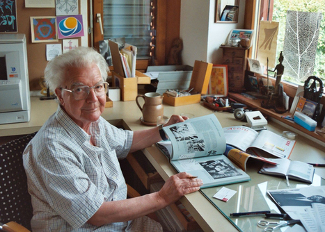

Swiss typographer Adrian Frutiger, designer of typefaces including Univers, Avenir and the eponymous Frutiger, has died.
Get Started for FREE
Sign up with Facebook Sign up with X
I don't have a Facebook or a X account


 Your new post is loading... Your new post is loading...
Swiss typographer Adrian Frutiger, designer of typefaces including Univers, Avenir and the eponymous Frutiger, has died. 
No comment yet.
Sign up to comment
It’s tricky to implement the intricate tricks of an optical illusion in a book cover design without the finished product appearing slightly heavy-handed, but designer Hansje van Halem does it with poise and perfectionism. She’s worked as a freelance graphic designer since graduating from Amsterdam’s Gerrit Rietvield Academie in 2003 (as her About section explains) and her enjoyment of what others might find to be repetitive shines through in the illusory patterns in her portfolio.

Robin Good's curator insight,
September 18, 2013 3:02 PM
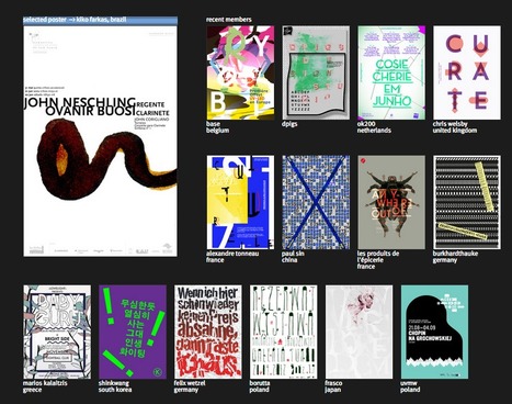
Conceived and created by andré felipe back in 2008, Typo/Graphic Posters is a curated collection of "inspiring" quality posters with a strong focus on typography and expressive graphical compositions. The works represented come from artists and graphic designers from all over the world and which "challenge type, colors and shapes to express a message". For each selected author you can see an horizontally laid out collection of his visual posters, which can be clicked and enlarged, and commented via a Facebook plugin appearing at the end of the set.
Comments. A great curated visual collection, where you can truly find inspiration at every step. Every single set included in it, has been rigorously vetted before being accepted. This is not something you can check, but if you look contained in this collection, you can tell right away that the quality you see is not fruit of an accident. This type of content is so good and valuable, it stays evergreen even if it's not updated. When curating content, even if it is not of a visual nature, a curator should strive to achieve the same level of quality and long-lasting value of such collections. Free to access. Curated gallery: http://www.typographicposters.com/ Favorite sets:
![Guide to Professional Typography Usage [Infographic] - Cardprinting.us via Infographic Journal | Design, Science and Technology | Scoop.it](https://img.scoop.it/pZskQDc7IYPtzGQMLi8D9zl72eJkfbmt4t8yenImKBVvK0kTmF0xjctABnaLJIm9)

Marteq's curator insight,
March 28, 2013 7:52 AM
|
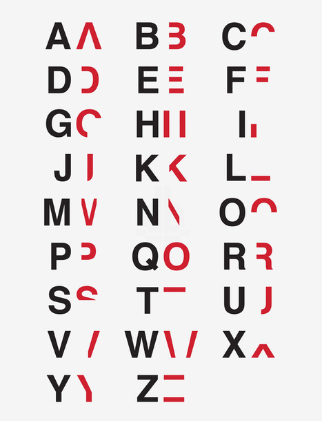
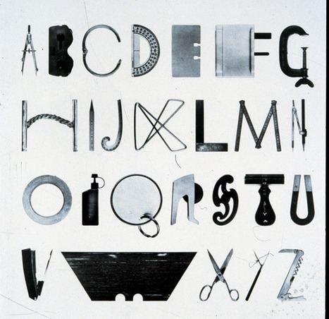
by breaking down and reassembling the alphabet into layers, daniel britton attempts to show how impairing the condition can be.
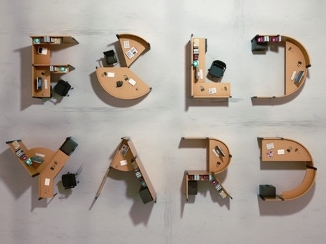
French designer Benoit Challand gives new life to the open office system by converting desks into typography inspired cubicles. Every desk in his office is shaped as a different letter of the alphabet, transforming the archetypal workspaces into large scale alphabetical sculptures. Via Lauren Moss

Basée à Vancouver au Canada, Head & Heart est spécialisée dans la création et la vente de pochettes de costumes. D’une grande beauté, ces élégants modèles colorés proposent des messages décalés, embellis par de jolies typographies. Via Alessandro Rea
From visual puns to the grid, or what Edward Tufte has to do with the invention of the fine print. Design history books abound, but they tend to be organized by chronology and focused on concrete -isms. From publisher Laurence King, who brought us the epic Saul Bass monograph, and the prolific design writer Steven Hellerwith design critic Veronique Vienne comes 100 Ideas that Changed Graphic Design — a thoughtfully curated inventory of abstract concepts that defined and shaped the art and craft of graphic design, each illustrated with exemplary images and historical context. Via Lauren Moss
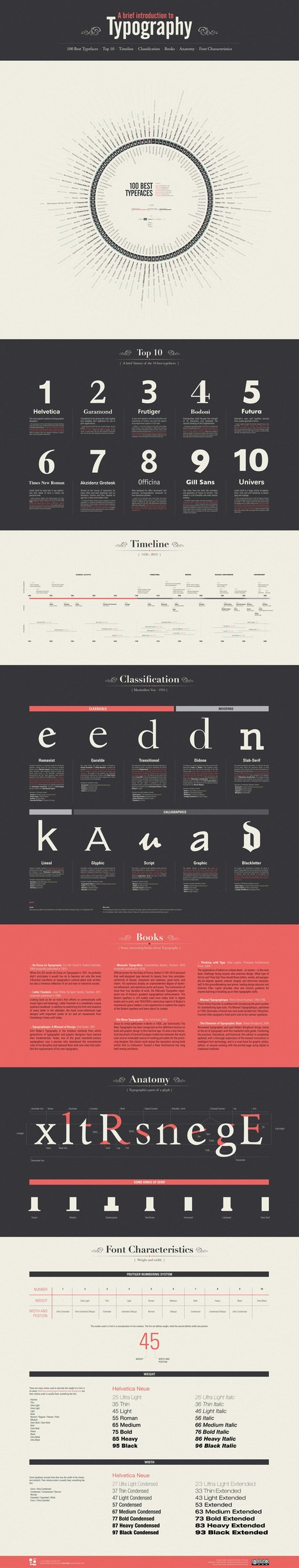
Typography is a key element of any graphic design. Any computer contains hundreds of pre-installed fonts to choose from and there are dozens of websites with thousands of free fonts, just some minimal knowledge and aesthetic taste.
This infographic intend to explain the basics of typography and disseminate the “best” ones that always work without too much complications. Take short walk through this fascinating world... Via Lauren Moss

Georgia Gibbs Design's curator insight,
April 19, 2013 8:05 PM
The lines in any face tell an interesting story and choosing the right type will help you to tell your own. 
Greg Andrade's curator insight,
October 11, 2013 10:09 PM
This is typography 101. These are some of the typography basics I teach my students. There are many other good articles pertaining to all types of design from architecture, furniture and of course graphic design. |