Do you want to kick your social media marketing up a notch, but you don’t know where to start? Visual content could be the answer.
Via janlgordon
Get Started for FREE
Sign up with Facebook Sign up with X
I don't have a Facebook or a X account


 Your new post is loading... Your new post is loading...
Do you want to kick your social media marketing up a notch, but you don’t know where to start? Visual content could be the answer. Via janlgordon 

janlgordon's comment,
November 3, 2016 10:47 AM
Thank you @Stan Smith @Ricard Lloria @Jenne & @Mehdi BH :-)
janlgordon's comment,
November 4, 2016 10:36 AM
Thank you @Antonios Bouris :-)
janlgordon's comment,
November 8, 2016 10:44 AM
Thank you @Negotei Elena :-)
Sign up to comment

Digital citizenship is not so different from traditional citizenship. We still need to guide students to be kind, respectful and responsible. What’s new is teaching them how to apply these values to the realities of the digital age. Via Beth Dichter

Beth Dichter's curator insight,
November 6, 2014 7:37 AM
This new infographic from ISTE compares a good citizen to a good digital citizen. Many students many find this poster of value as they learn the need to be a good citizen both online and offline. As the post states, being a good citizen and a good digital citizen "are not so different from the basic tenets of traditional citizenship: Be kind, respectful and responsible, and just do the right thing." 
Lon Woodbury's curator insight,
November 10, 2014 3:36 PM
We still have a long ways to go to figure out how to make this happen as effectively as we do face to face interactions. -Lon
From
circos

How To Succeed Visually * Learning Curve Protects The Niche WHEN You Get In. Via Martin (Marty) Smith
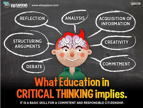
"Critical thought is a cognitive process that proposes the systematic analysis of information, opinion and statements that we accept in our daily life as valid or true. It is a basic skill for a competent, free and responsible citizen." Via Beth Dichter

María Dolores Díaz Noguera's curator insight,
March 18, 2014 8:35 AM
Critical Thinking: Educating Competent Citizens 
Susan Walker-Meere's curator insight,
November 9, 2014 12:49 PM
I would add: Trans-disciplinary thinking; systems thinking for sustainability. Most people can not see the forest through the trees so miss the larger connections of the impacts that action, goods & services have on both environmental systems and human systems. 
Willem Kuypers's curator insight,
November 16, 2014 3:48 PM
La pensée critique, une competence clé du 21ème siècle avec tant d'information qui nous arrive.
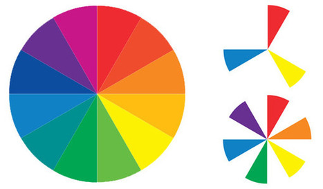
Sometimes the toughest step in building a new website or redesign can be the conceptual ones. Selecting a color palette is one of them that can be tough if you don’t have the right tools. So where do you start?
It all comes down to basic color theory and the color wheel. That same tool that teachers used in school really is the basis for how designers plan and use color in almost every project from the simplest web page to expansive brands with multiple sites and campaigns... Via Lauren Moss
|
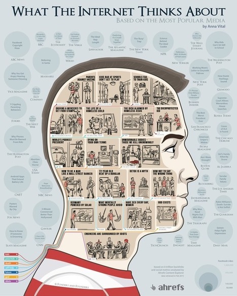
What does the Internet care about? What articles do we share the most? Using the data from the Ahrefs Content Explorer, the people at Funders and Founders Via Lauren Moss

Emilio Ruano's curator insight,
May 4, 2015 1:17 PM
At least, the concern about equality, energy and social welfare is there. I like the last one about engineers tho. Hahaha. 
Mackenzie Hamilton's curator insight,
October 13, 2015 8:36 AM
I think this article is awesome because they use data visualization to show what people share the most, visit the most, and search the most. Data is everywhere and people are using it everyday and sometimes don't even think about it.

Autism Daily Newscast's curator insight,
September 10, 2014 4:26 AM
Not an app but close enough - love it. 
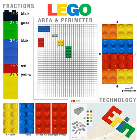
Elizabeth Bowden's curator insight,
September 12, 2014 7:52 PM
In addition to using Lego for maths, I've taken my sons (extensive) Lego collection into History and Society & Culture to have the students (high school) demonstrate their understanding of concepts such as globalisation, communism, nationalism, capitalism. Worked really well and classes sooo happy.
Having been broken up into groups and given a concept each, They created cities or environments demonstrating the concept then talked the rest of the class through. 
Ness Crouch's curator insight,
September 13, 2014 4:06 PM
Fantastic ideas for using lego in mathematics. Simple hands on tasks.

Pop Chart Lab's latest poster pays homage to the most important eras in graphic design. Start at the top, left-hand corner, of A Stylistic Survey of Graphic Design, and read from left to right. Each era (say, Arts & Crafts or Art Nouveau) is represented by a rectangular box that includes several squares that graphically represent the style described. The Modern movement, one of the largest movements depicted here, includes Bauhaus, Vorticism, De Stijl, New Typography and Istotope, Constructivism, Suprematicsm, and Futurism. Pop Chart creates, within each stamp-sized box, a visual representation of that particular style, with the design elements that prevailed at the time. So the Constructivism box echoes the intense Soviet Party posters from the 1920s, the Futurism box has a bold, attention-grabbing arrow on it, and so on. Via Lauren Moss
If you’re a visual learner, then you know maps, charts and infographics can really help bring data and information to life. Maps can make a point resonate with readers and this collection aims to do just that. A few of these maps are important to know, some interpret and display data in a beautiful or creative way, and a few may even make you chuckle or shake your head. If you enjoy this collection of maps, the Sifter highly recommends the r/MapPorn sub reddit. You should also check outChartsBin.com. There were also fantastic posts on Business Insider and Bored Panda earlier this year that are worth checking out. Enjoy! Via Lauren Moss
|