

Careful editing can make such a difference to your writing, as there is so much more to think about than just spelling, grammar and sentence construction.
Via janlgordon
Get Started for FREE
Sign up with Facebook Sign up with X
I don't have a Facebook or a X account


 Your new post is loading... Your new post is loading...
Careful editing can make such a difference to your writing, as there is so much more to think about than just spelling, grammar and sentence construction. Via janlgordon 
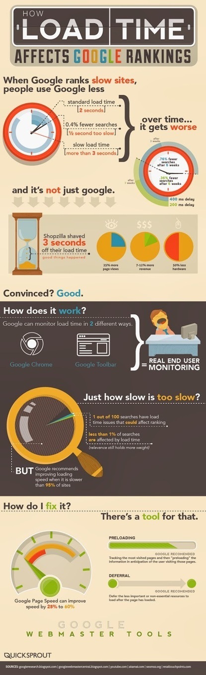
Have you ever been to a slow site and it felt like it took hours to load? You look down at your computer clock and really only 30 seconds have gone by. That's just the user experience on a slow site- the real question is “Does your website speed effect your ranking?” Will your slightly slower site be penalized by Google and other search engines when you clients are even looking for you?In this easy to understand graphic, we see that 1 second makes all the difference in the world. And after just 6 short weeks of poor load times, your site can lose 75% of it’s traffic to that page.If you have a low ranking you might want to follow some of the Google Guidelines to pre-load your most popular pages to increase your site’s overall performance.
Via Lauren Moss

Mr Tozzo's curator insight,
March 4, 2014 8:12 AM
Does Website Speed Affect Your Ranking? (infographic) 
Carlos Polaino Jiménez's curator insight,
March 8, 2014 6:12 AM
SEO SEO, al final todo es KPI's y posicionamiento. 
outofseo's curator insight,
April 4, 2014 5:27 AM
Website speed affects ranking and conversions. Pages load time is an important issue to be fixed if load time is over 3 sec.
|

|
Rescooped by Antonios Bouris from Must Design |
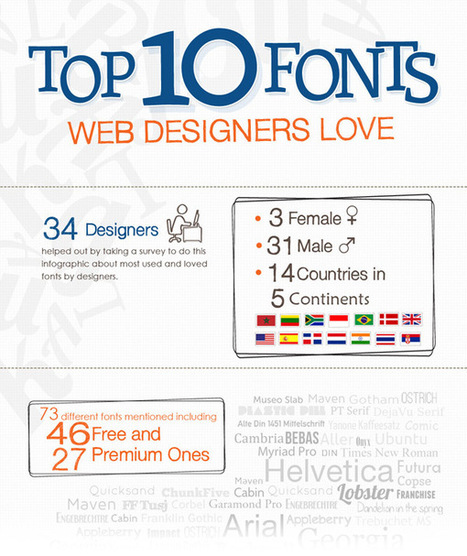
When I was starting out with Web and graphic design, I was always wondering about the fonts that real designers use.

Note where Hevetica comes in :).
|
|
Rescooped by Antonios Bouris from Must Design |
![Color Is MASTER of Us All [Infographic] | Design, Science and Technology | Scoop.it](https://img.scoop.it/Kz1Zt8f2ZttL8kN2rA-1yzl72eJkfbmt4t8yenImKBVvK0kTmF0xjctABnaLJIm9)
The Art of Color Coordination
Such a helpful infographic. Beyond helpful for web design.

Slightly off topic but thought it of potential general interest.

I thought this looked like a great helpful online reference on color. When you have someone that needs review this info it's nice to have a go to link handy.
|
|
Rescooped by Antonios Bouris from SOCIAL MEDIA, what we think about! |

Building on the Social Web
A few months ago, I embarked in a project which has become more and more engaging and exciting as the weeks progress. With my partner Erik Lumer, we have been working hard in the development and distribution of a product called CircleMe, which Saul quickly spotted on his radar just less than a month from our public release, on October 4th, 2011. Our vision with CircleMe is to create an online environment where users can take advantage of technology and the social web to enjoy more their passions and interests in life (i.e., their “likes”).
Social Graph Power
The way we want to achieve this is by asking users to “connect” to the things and topics they love, and then CircleMe will leverage clever algorithms along with the power of the social graph to surface relevant content and new items tailored to each user. To get there, we need to move gradually. The first step has been to create an engaging environment where users can easily express all their ‘likes’ and discover (in a serendipic way) new things of potential interest. Then, as activity increases, we will have enough data to reach the goal to surface relevant content in a timely fashion for any interested user...
|
|
Rescooped by Antonios Bouris from Curation, Social Business and Beyond |

There are so many things you could do on your website to get more visitors and traffic. Here are 4 tips to improve your website SEO

I selected this article from Curatti written by Ashley Faulkes
because it shows you how to boost your website traffic.
Unusual methods that will attract visitors to your landing page.
4 Ways to Increase Website Traffic
In order to get more visitors online you need to have the right strategies in place. I agree that by paying attention to what Google is telling you and discovering any issues with your website can be very helpful.
Faulkes provides unique strategies you can use to improve your traffic.
Here's what caught my attention:
Selected by Jan Gordon for Curatti covering Curation, Social Business and Beyond
Image: Courtesy of Pixabay.
Read full article here: http://ow.ly/kALa309gFUL
Stay informed on trends, insights, what's happening in the digital world become a Curatti Insider today
|
|
Rescooped by Antonios Bouris from Must Design |
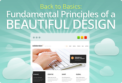
The purpose of this post is not just to present the state of today's web design - it’s more pragmatic. Seven basic principles of a good web design are presented here.
Marty Note
This is a great post about what web design IS and IS NOT. I'm going to include my notes here so they follow the post since the writing, though brilliant, is not as direct as I like. Here are my much more direct interpretations of the 7 Basics of Great Website Design:
1. Website Design Can’t Win, But You Can Sure LOSE Due to It.
We've past the period when shinny websites work. Every website has seconds before a visitor clicks off to find what they are looking for on some other website.
2. Create Website Surfaces For Scanners and Skimmers since Readers will work for what they want.
Key to know not all information is great for "scanning" and "skimming". Tease the click don't drown it is another way to think of this idea. Also, content such as news, Q&A and testimonials have more attention hooks than sharing complex or highly detailed material. If your website depends on sharing complex and highly detailed content tease it with snippets and with graphics firs.
Stay with simple, clean and useable as your guide.
3. Avoid NEW until it is UNDERSTOOD.
You don't have to wait until some new thing is old hat, but avoid using The New simply because it is new. New hurts conversion because it requires explanation and is hard to tease since visitors don't have "made to stick" context. If you must present "new" present with an "old" analogy.
Read Made To Stick by Heath brothers for more.
4. Confused customers do many things, BUYING and CONVERTING and never among them.
5. Hierarchy of information and navigation is LIFE online.
People know there is a YOU or a team behind your design. They want to know what YOU want them to DO and why they should do it with YOU. Sites that make the curator's hand visible via navigation, images and copy win. Those who challenge visitors to figure everything out for them selves lose.
This is NOT to say some mystery can't work in a web designer's favor, but make sure the mystery is immediately solved before posing another one. Daisy chain one mystery on another and visitors get frustrated and leave since benefit doesn't equal the work to realize it.
6. Colors can ruin a website.
Colors have so many overt and covert signals they should be used sparingly and consistently with the brand. If you use RED for a Zen website do so in accents and carefully since red is an ALERT color and so may be inconsistent with the brand.
7. Devil is in the web design details.
In my almost 15 years of experience NOTHING on this list is more true. Once you make a website simple and clean any small dissonance becomes LARGE because it sticks out like the proverbial "sore thumb". Make sure your site is a smooth surface with a clear message.
One of the best posts about website design I've read in a long time. So much of what WE think is "website design" either "was website design" or is more an expression of someone's ego than what is happening NOW. This post is one of the best "what is happening now" in website design articles I've read. M
|
|
Rescooped by Antonios Bouris from Must Design |
Getting started in the world of design can be both thrilling and intimidating. Sometimes, you feel like you just don’t have the tools or skills you need to
I found some of the resources listed here helpful and I created my first website in 1999. Great Scoop by Brian Yanish (a FOM and a MUST FOLLOW @MarketingHits)
|
|
Rescooped by Antonios Bouris from Must Design |
Gamification is fundamentally rewriting the rules of engagement and design. We can leverage its techniques to create unprecedented connections with our customer
Building Engagement In
There are ways to BUILD engagement into a website's design. Here are three secrets to promote engagement not included in this excellent Slideshare:
* Place Email Subscription High Up and Prominent.
* Include curated User Generated Content on every page.
* Create CTAs with CONTRAST.
Email Subscriptions
When your "Subscribe To Our Email List" Call to Action is high on the page in a Can't Miss It spot you communicate a clear "we want YOU" signal.
UGC Everywhere
When you curate User Generated Content to your site you communicate how well you listen and care for community members. The website isn't all about YOU and what you think the inclusion of UGC says.
CTAs
I see to very common mistakes in websites I'm asked to review as Director of Marketing for Atlantic BT in Raleigh (http://www.atlanticbt.com ): NO CTAs or poorly contrasted CTAs. I PREFER CTAs to be buttons and usually test red, orange or green (depending on the background color). I'm convinced there is no ONE magic CTA color but the contrast is what makes a Call To Action helpful or not, clicked on or not, converting or not.

Engaging and experience should always go hand-in-hand, regardless of the implementation.
|
|
Rescooped by Antonios Bouris from Must Design |
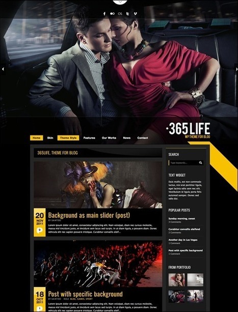
WordPress themes are very popular. While minimalist & clean themes are high in demand, there are also other types of themes which are less popular but still beautiful, creative and original. Here
I am NOT a big fan of black on a website, but the color black does make images pop off the screen.


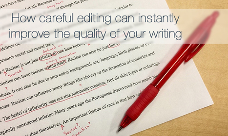
I selected this article from Curatti written by Alice Elliott because she explains the importance of carefully editing your blog posts.
Improve your writing with quality content.
How to Effectively Edit Your Articles
It's tempting to hit the publish button right away after writing a blog post. I agree that in order to make the best of it you need to carefully look your copy over first.
Elliott explains the process of how to edit your articles and improve your writing at the same time.
Here's what caught my attention:
Selected by Jan Gordon for Curatti covering Curation, Social Business and Beyond
Image: Courtesy of Alice Elliott.
.
Read full article here: http://ow.ly/qtpb30aY16P
Stay informed on trends, insights, what's happening in the digital world become a Curatti Insider today