


 Your new post is loading...

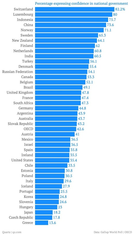

The Paris-based think tank known as the OECD is just out with its semi-annual survey of how different economies stack up in terms of social well-being. (Well-being is basically the polite way economists talk about happiness.) The organization even has a new data visualization to let you see where your country ranks in certain key measures.
Called "Society at a Glance," the report is well worth a read. But here are some of the most interesting bits of data we found, in no particular order.
Via Lauren Moss


Un análisis de datos a la VENA!