Design, Science and Technology
45.8K views | +1 today
Follow
Design, Science and Technology
#ideas #design #science #technology #inspiration #media #information
Your new post is loading...
Rescooped by Antonios Bouris from visual data
Scoop.it!

A Tool For Building Beautiful Data Visualizations

A Tool For Building Beautiful Data Visualizations | Design, Science and Technology | Scoop.it
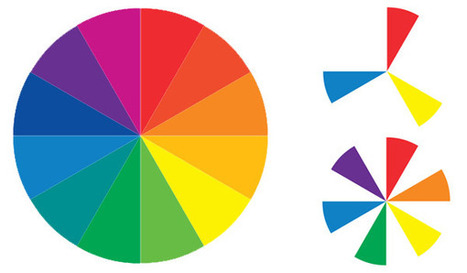
Visage makes infographics easy, and they customize palettes for free.

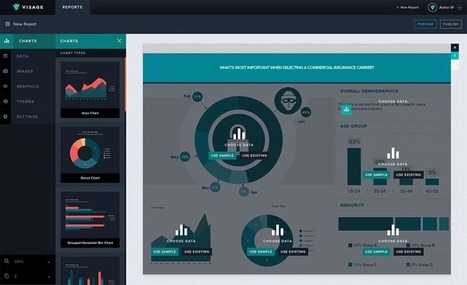
If you’re an art director at a media outlet, odds are you have to assign and commission each data visualization you publish. That gets time-consuming, even when the graphic in question is nothing but a small pie chart running alongside a feature story.

Visage, a newly launched platform, provides custom templates for graphics. There are myriad tools on the market that do this (for a gander at 30 of them, check out this list), but Visage is the latest, and it's gaining traction with designers at Mashable, MSNBC, and A&E...


Via Lauren Moss
Sang Lee's curator insight, June 17, 2014 9:58 PM

I will try this later. 

Rescooped by Antonios Bouris from visual data
Scoop.it!

Visual Design: Understanding Color Theory and the Color Wheel

Visual Design: Understanding Color Theory and the Color Wheel | Design, Science and Technology | Scoop.it

Sometimes the toughest step in building a new website or redesign can be the conceptual ones. Selecting a color palette is one of them that can be tough if you don’t have the right tools. So where do you start?


It all comes down to basic color theory and the color wheel. That same tool that teachers used in school really is the basis for how designers plan and use color in almost every project from the simplest web page to expansive brands with multiple sites and campaigns...


Via Lauren Moss
No comment yet.
Rescooped by Antonios Bouris from Must Design
Scoop.it!

20 Resources for Beginner Designers & Developers | Resources

20 Resources for Beginner Designers & Developers | Resources | Design, Science and Technology | Scoop.it
Getting started in the world of design can be both thrilling and intimidating. Sometimes, you feel like you just don’t have the tools or skills you need to

Via Brian Yanish - MarketingHits.com, Martin (Marty) Smith
Martin (Marty) Smith's curator insight, September 26, 2013 6:33 PM

I found some of the resources listed here helpful and I created my first website in 1999. Great Scoop by Brian Yanish (a FOM and a MUST FOLLOW @MarketingHits)

Alejandro Coronado's curator insight, January 4, 2014 6:01 PM

add your insight...

Rescooped by Antonios Bouris from visual data
Scoop.it!

The Future of Data Visualization Tools

The Future of Data Visualization Tools | Design, Science and Technology | Scoop.it

Data is everywhere and well-designed data graphics can be both beautiful and meaningful. As visualizations take center stage in a data-centric world, researchers and developers spend much time understanding and creating better visualizations. But they spend just as much time understanding how tools can help programmers and designers create visualizations faster, more effectively, and more enjoyably.


As any visualization practitioner will tell you, turning a dataset from raw stuff in a file to a final result in a picture is far from a single-track, linear path. Rather, there is a constant iteration of competing designs, tweaking and evaluating at once their pros and cons. The visualization research community has recognized the importance of keeping track of this process.


Read the complete article to learn more about the future of the practice and the tools that enable designers to create thoughtful infographics and visualizations...


Via Lauren Moss
No comment yet.