Design, Science and Technology
45.8K views | +13 today
Follow
Design, Science and Technology
#ideas #design #science #technology #inspiration #media #information
Your new post is loading...
Scooped by Antonios Bouris
Scoop.it!

4 Creative Email Experiments You Should Try

4 Creative Email Experiments You Should Try | Design, Science and Technology | Scoop.it

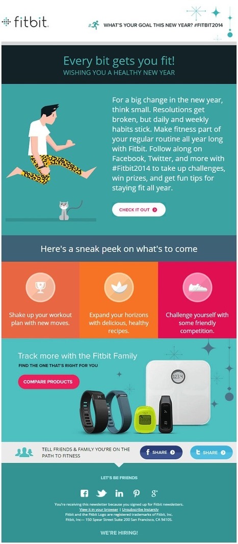
Email marketing has never had good press. That's because many newsletters look the same. 


Unfortunately, what works for one marketer may not for another person. You need to be creative.


As I always say, the most creative ideas are often the simplest. 


Rohan Ayyar has written a very good articles for HubSpot. Here are his suggestions, accompanied with case studies:


- Understand the user experience

- Reengage inactive subscribers

- Leverage coupons beyond sales

- Build reviews into your emails


Bookmark the post. You may find yourself coming back to it quite often. 


Read it at http://blog.hubspot.com/marketing/email-marketing-experiments


-------------------


Cendrine Marrouat

Rescooped by Antonios Bouris from Must Design
Scoop.it!

Why Email Marketing Key to Web 3.0 Website Design

Why Email Marketing Key to Web 3.0 Website Design | Design, Science and Technology | Scoop.it

Website design is about to change about as much as something can change and email marketing is already half way there. Email marketers such as @Bronto move massive amounts of information in real time.

Welcome to the future.

The future of web design will happen in real time, be logic based and require a mountain of creative controlled by predictive analytics in real time. If that sounds like email marketers are sitting pretty you win a cookie.

Bronto became Cure Cancer Starter's (http://www.curecancerstarter.org) email marketing and marketing automation partner today (http://sco.lt/55jx1F ;).  Bronto joins Atlantic BT and the Story of Cancer Foundation (501c3) in the Tech Cures Cancer Movement. 

This deck is about where web design is headed (at light speed) and why thinking like an email-marketer is a good idea. 

#TechCuresCancer @CureCancerStart


Via Martin (Marty) Smith
Dolly Bhasin 's curator insight, July 13, 2013 11:53 PM

works well with customer facing sites, not B2B.

Martin (Marty) Smith's comment, July 15, 2013 12:23 PM
Dolly, disagree. The biggest myth is the significant difference between B2B and B2C marketing online, a myth you may believe. I've been an Ecom Director and now run marketing for an agency. The process of read the cookie, fire the creative is going to be very important for B2B websites for much the same reason as the tactic will be critical for B2C. MAD or Mutually Assured Destruction says if a competitor is firing more relevant information faster than your website they win. The logic discussed here applies equally well to B2B or B2C websites. The main difference is the conversion funnel. B2B conversion funnels are LONGER in time, but the advantage of wrapping a website around a visitor and then following with persona based email marketing is the key to web 3.0 no matter what side of the Rubicon your website resides upon (B2B or B2C). Feel free to support your statement with links or further posts, but your assertion hasn't been true to my B2C and now B2B experience. I still see read the cookie or behavior and fire the creative / content as one of the most valuable HTML5 and CSS3 advances. The fact few B2B relationship based sellers are there yet doesn't mean the tactic isn't beyond valuable.
Robin Martin's comment, July 15, 2013 3:28 PM
Thanks for sharing Marty!
Rescooped by Antonios Bouris from The MarTech Digest
Scoop.it!

Is Your Email Subject Line Creative... or Deceptive? - Profs

Is Your Email Subject Line Creative... or Deceptive? - Profs | Design, Science and Technology | Scoop.it

Digest...


However, you do have a few ways of ensuring that your subject lines fall closer to the creative side of the spectrum:

1. If the subject line is aligned with the contents of the email, it's probably closer to creative than deceptive.

2. If the subject line has you thinking (or shouting!), "I can't wait to open this email," it's probably closer to creative than deceptive.

3. If the subject line has you thinking one thing, yet when you open the email you are disappointed... it's probably closer to deceptive than creative.


Via Marteq
Marteq's curator insight, April 22, 2013 6:51 AM

Bottom-line: don't be cheesy. If you've got to resort to cheesy, it's time to understand what works in the world of B2B subject lines. There are plenty of articles on excellent subject lines in The Marketing Automation Alert: just search the tag "email marketing."


  • See the article at www.marketingprofs.com
  • Receive a daily summary of The Marketing Automation Alert directly to your inbox. Subscribe here (your privacy is protected).
  • If you like this scoop, PLEASE share by using the links below.
  • iNeoMarketing merges marketing automation with content marketing for a powerful lead management solution, configured and managed by our knowledgeable, experienced staff.  Contact us.
Rescooped by Antonios Bouris from Must Design
Scoop.it!

Picasso At The Beach and The NEW Art of Web Design

Picasso At The Beach and The NEW Art of Web Design | Design, Science and Technology | Scoop.it

PicassoHead App
Sharing this cool "draw a "Picasso Head" app (my PicassoHead http://www.picassohead.com/?id=5290a28#.VBCfth1bqjo.twitter ) to illustrate a few of our favorite web design concepts such as:

* DO LESS and let them DO MORE (them = customers, visitors, advocates_.
* GALLERIES ROCK - especially when your gallery is chock a block full of User Generated Content (UGC).
* Engagement Rocks - do you have a tool that is fun to use AND promotes positive site heuristics such as time on site, pages viewed, lower bounce?
* Every product, idea or website starts about the creators and must become about those who visit and love it.
* People love what THEY create and contribute more than what you do.
* This means all web design is or will be about collaboration.

We love the simplicity of this little app, but the even COOLER riff came from our confirming email. This is the email that shares the link where my Picasso At The Beach drawing lives (linked from this post http://www.picassohead.com/?id=5290a28#.VBCSuy4Lksk.twitter ) and where this little pitch lived:

"This summer check out Picasso Looks at Degas at the Clark in Williamstown, MA. You won’t want to miss this groundbreaking, Clark-exclusive exhibition that is the first to look at Pablo Picasso’s deep fascination with Edgar Degas.

http://www.clarkart.edu/exhibitions/picasso-degas/ "

Wow, cool idea. Create a little art based app and sell related links in the confirmation email. That's brilliant marketing, subtle marketing and the art of web design. Kudos to Picassohead creators RFI Studios, http://www.rfistudios.com.

#toogood


Via Martin (Marty) Smith
Rescooped by Antonios Bouris from Must Design
Scoop.it!

Gamification - Designing for Engagement

Gamification is fundamentally rewriting the rules of engagement and design. We can leverage its techniques to create unprecedented connections with our customer

Via Martin (Marty) Smith
Martin (Marty) Smith's curator insight, June 1, 2013 8:12 AM

Building Engagement In

There are ways to BUILD engagement into a website's design. Here are three secrets to promote engagement not included in this excellent Slideshare:

* Place Email Subscription High Up and Prominent. 
* Include curated User Generated Content on every page.

* Create CTAs with CONTRAST.


Email Subscriptions
When your "Subscribe To Our Email List" Call to Action is high on the page in a Can't Miss It spot you communicate a clear "we want YOU" signal. 

UGC Everywhere
When you curate User Generated Content to your site you communicate how well you listen and care for community members. The website isn't all about YOU and what you think the inclusion of UGC says.


CTAs
I see to very common mistakes in websites I'm asked to review as Director of Marketing for Atlantic BT in Raleigh (http://www.atlanticbt.com ): NO CTAs or poorly contrasted CTAs. I PREFER CTAs to be buttons and usually test red, orange or green (depending on the background color). I'm convinced there is no ONE magic CTA color but the contrast is what makes a Call To Action helpful or not, clicked on or not, converting or not.  

Michael Allenberg's curator insight, June 2, 2013 7:17 AM

Engaging and experience should always go hand-in-hand, regardless of the implementation.