From
mix
Get Started for FREE
Sign up with Facebook Sign up with X
I don't have a Facebook or a X account


 Your new post is loading...
 Your new post is loading...
Your new post is loading...

No comment yet.
Sign up to comment

Sharaya Baltimore's curator insight,
September 20, 2016 12:29 PM
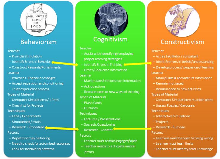
I like that it gives a comparison of behaviorism, cognitism and constructivism (even though we aren't looking at that school) and it also gives information about the teachers, learner and techniques, etc.

Susmita Dhungel's curator insight,
September 14, 2017 12:03 PM
This article explains the differences between behaviorism, cognitivism, and constructivism. It shows differences in each school's teachers, learners, types of materials, techniques, and factors. 
Krystal Robles's curator insight,
September 21, 2017 11:54 AM
I don't get as to why they all can share these things. The arrows indicate that the things relate to each other.

Calendars come in all sorts of forms, from the purely functional apps on our smartphones to the propped-up desktop ones that are mostly just a means of delivering a new Far Side joke every day. The Units of Measure Calendar Poster, as its name suggests, isn’t the most straightforward one to categorize. Or even one that’s easy to recognize as a calendar at all.
It doesn’t leave any room for you to jot down appointments, though it does include all 365 days, which you can notch off one by one. Mostly, it’s just an exquisite graphical compilation of 12 different units of measurement, a tightly packed collection of diagrams and conversion tables and other neat looking things of the sort. Via Lauren Moss

Deb Nystrom, REVELN's curator insight,
July 27, 2013 8:34 PM
Useful for thinking about measurement AND its limitations. ~ D

We’ve previously explored time and the scale of the universe, but what about the scale of time? Do we fully understand the 2.5 billion seconds most of us will experience in an average lifetime? That’s precisely what prolific science author and illustrator Steve Jenkins playfully probes in Just a Second, a lovely and refreshing book for kids, doubling as a curious and enjoyable trivia compendium for grown-ups, and a fine addition to the year’s best children’s books. From the 5,085-foot water journey of a whale’s song to the 50 beats of a hummingbird’s wings to the 300-foot plunge of a peregrine falcon, the charmingly illustrated pages weave a kind of alternative metric system for telling time through the surprising things that happen in a single second — a measure that, as Jenkins points out, is a human invention... Via Lauren Moss
Visualized content is popping up all over the web lately, and it's no surprise. But does every piece of visual content you produce have to be as complex as a full-blown infographic? No way. And does every piece of visual content even have to highlight data? Negative. Sometimes the concept you're trying to explain just lends itself to a more visual representation, and these types of portrayals can often make the concept much easier to follow and understand by your audience. There are many ways you can make your content more visually appealing and effective. Some are simple, and some are more complex. Either way, visualized content is hot. Here are some awesome examples of content visualization to motivate you to start thinking more with your eyes. Via Lauren Moss
|
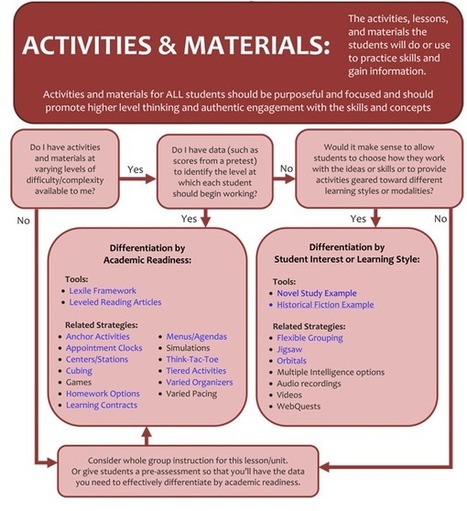
"Differentiation is adjusting and modifying what skills and concepts student learn, what materials the use, and/or how their learning is assessed based on the needs of the students. Our students are not all the same, so we cannot expect that teaching a lesson one way will reach every student." Via Beth Dichter

Drora Arussy's curator insight,
November 17, 2014 8:11 AM
We hopefully are all trying to differentiate, but sometimes we need that creative push and encouragement. This is a wonderful resource with printable infographics for coming work areas and links to concepts and other resources to really get you thinking in every direction outside of the box - each student will gain something out of you using this. 
Janet McQueen's curator insight,
November 17, 2014 6:57 PM
These differentiation flowcharts will prompt teachers to make good decisions around scaffolding of student learning. 
Becky Roehrs's curator insight,
November 17, 2014 7:08 PM
Check out concepts, assessments, and activities for differentiation...
"So much in learning is subjective, which makes sense because so much in life itself is also subjective, and we learn in order to live. So it’s natural. Grey areas abound–the usefulness and quality of the Common Core Standards. The importance of curiosity in learning. The evaluation of technology in learning. The utility of letter grades. (And alternatives to letter grades.)"
Via Beth Dichter

Beth Dichter's curator insight,
July 9, 2013 8:27 PM
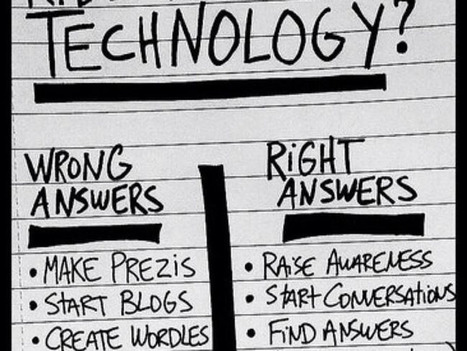
What is the best way to use technology in your classroom? We know that students like to use technology but are they using it constructively? Are you using technology constructively? This post explores these issues, not ing that there are some right and wrong answers in how technology should be used? I believe that technology is a tool, a tool that can be used to reinforce, enhance and extend the curriculum; a tool that allows students to use critical thinking skills; to find answers to questions. Check out the graphic that accompanies the discussion of this topic and consider how you will be using technology in your class. 
Diego Sánchez's curator insight,
July 10, 2013 8:15 AM
Technology is a tool, not a learning outcome...

About.me was one of the very first services which made it easy to create a landing page for users online, featuring links to all of your social profiles. We have since seen a whole slew of similar services catering to niche markets. There’s Nogen0 for musicians, Central.ly, AboutOurWork and JustAbout.co for businesses. Re.vu adds a new dimension, by allowing you to add a CV, import details from LinkedIn, and create an infographic representing your career, milestones, online presence and more.While we’ve taken a look at a Visualize.me, which offers a similar service using your LinkedIn data, Re.vu allows you to add more data manually. Re.vu is a great tool for freelance writers, designers and photographers who want to showcase their work, or can also be the ideal accompaniment for someone who is looking for a job in a forward thinking company, that will be willing to veer away from the traditional CV... Via Lauren Moss
|