
Via mrhill
Get Started for FREE
Sign up with Facebook Sign up with X
I don't have a Facebook or a X account


 Your new post is loading...
 Your new post is loading...
Your new post is loading...

Oxford Internet Institute has visualised Earth’s online population, showing web usage concentrated in Europe and North America Via mrhill 

Viljenka Savli (http://www2.arnes.si/~sopvsavl/)'s curator insight,
April 15, 2014 9:58 AM
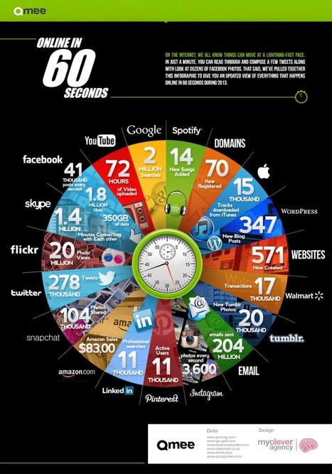
This is what life today looks like :). The statistic is incredible and the distances ar 
José Antônio Carlos - O Professor Pepe's curator insight,
April 15, 2014 11:28 AM
A velocidade de nossos dias em um simples gráfico. |
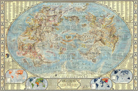
An artist has created a hand-drawn map of the Internet, where Google, Apple, and porn are continents. The world of the Internet mirrors the real-world in myriad ways: there are members (we call them populations), websites (destinations to visit), acquisitions of companies (redrawn political boundaries). So what if the Internet could be visualized like our global politics? That’s exactly what designer Martin Vargic did in this cartographic experiment which treats mega-companies such as Google, Microsoft, HP, and Apple like empires, on a classic world map. To explain the dominance and relationships of these entities, Vargic created a visual hierarchy that gives prominent treatment to companies with the most users (or sites with the most visitors), surrounding them with smaller states and townships named after adjacent businesses.
More details at the link... Via Lauren Moss, Mark P, Mike Busarello's Digital Storybooks
|