

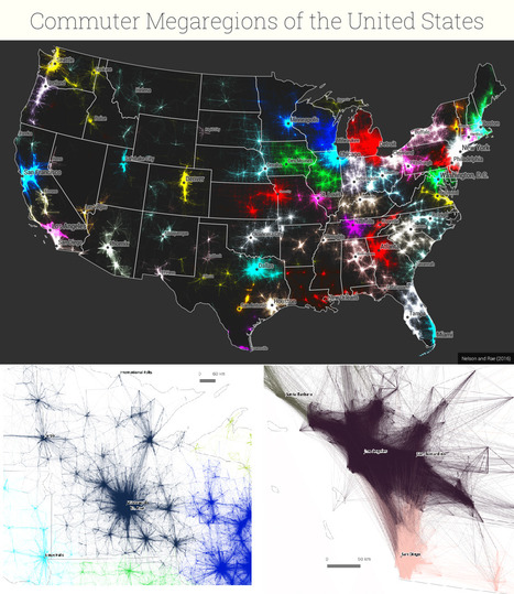
New maps use math to define the amorphous term.
Get Started for FREE
Sign up with Facebook Sign up with X
I don't have a Facebook or a X account


 Your new post is loading...
 Your new post is loading...
Your new post is loading...


PIRatE Lab's curator insight,
December 10, 2016 10:30 AM
Another example is the long line of defining the new geography.

Boris Limpopo's curator insight,
December 11, 2016 1:43 AM
Le macroregioni americane con i dati del pendolarismo

Tom Cockburn's curator insight,
December 13, 2016 3:53 AM
Plenty of space in the middle it seems
Sign up to comment
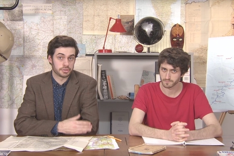
Mark Cooper-Jones and Jay Foreman, the Map Men, tap into a rich vein of geographical quirks to teach through comedy Via Mike Busarello's Digital Storybooks

Jeremy Hansen's curator insight,
August 29, 2016 12:43 PM
Holy heck these guys are good! I'd like to see more of these Map Men videos. I'm sure at least some of my 8th graders can appreciate some British wit.
From
www

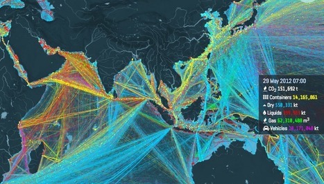
"Ships carry 11 billion tons of goods each year. This interactive map shows where they all go. About 11 billion tons of stuff gets carried around the world every year by large ships. Clothes, flat-screen TVs, grain, cars, oil — transporting these goods from port to port is what makes the global economy go 'round. And now there's a great way to visualize this entire process, through this stunning interactive map from the UCL Energy Institute."

Caitlyn Scott's curator insight,
June 14, 2016 10:25 PM
This resource shows great detail into where are products travel when they are imported but also shows us what and where Australian products are going. Good source in regards to showing how large Australia's export market is. Article contains a good amount of information as to why the routes shown on the map are taken as well as having in-depth data showing the different cargo on board ships. This data helps high light what different countries are renowned for in their exports as well as giving so information into why some countries are poorer than others when analysing their exports. Planned use within unit regarding the cost of Australian exports and its sustainability for the future.

James Piccolino's curator insight,
January 18, 2018 7:35 PM
This is incredibly interesting. I am a History guy, I love the subject and I love finding things I did not know about it. This fun interactive map did not so much contribute to direct knowledge of shipping/trade history as much as it has sparked my interest in it. There are old trade routes, who traveled down them and with what, and the ways those trade routes changed civilization and even sometimes started new ones. I never expected to say the words "Wow trade routes are fun!" but here I am. By the way, if you turn on absolutely everything at once, it creates this beautiful image. It is almost oddly relaxing. Sort of in the way some paintings can be.
|
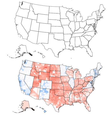
Can you tell what’s wrong with this map of the United States? I’ll give you a hint: Look near the Great Lakes and the Gulf of Mexico. Spot the problem yet? A further hint: Look at the border of Wisconsin and Illinois as well as the Florida Panhandle. See it now? The Wisconsin-Illinois border is slightly more southern and the Florida Panhandle is slightly shorter.

Corey Rogers's curator insight,
December 13, 2018 4:14 PM
The electoral college is such a mess that it shouldn't be relied on for figuring out the President. With the misrepresentation of the map and the continuous gerrymandering the United States should use the popular vote category instead of the Electoral College.

The country opted to become the first ever to leave the 28-member bloc in a result that will send economic and political shockwaves across the globe. Via Mike Busarello's Digital Storybooks

David G Tibbs's curator insight,
February 28, 2018 1:29 PM
With Britain leaving the EU it changes the landscape of Europe. This would be the spark that would light the nationalist fire in Europe. This threatens to break up the supernational organization. This was a massive split in the British politicians. |


