Your new post is loading...
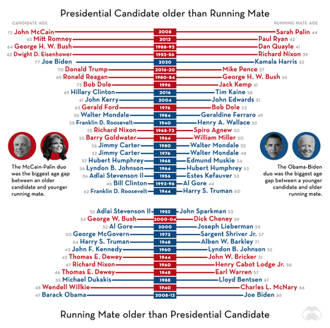
Snapshots of the infographics which are available on EAPFoundation.com.
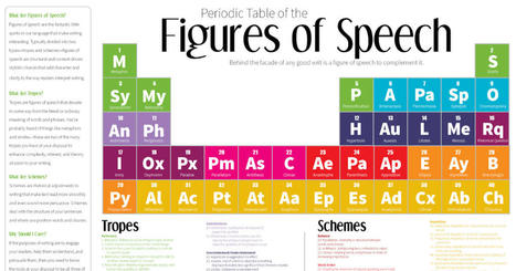
Figures of speech are important literary tools that can help improve your writing. Here are 40 different types, and how to use them.
In a complex world, the combined forces of data and visual communication take on new importance. See our top 20 visualizations for 2020.
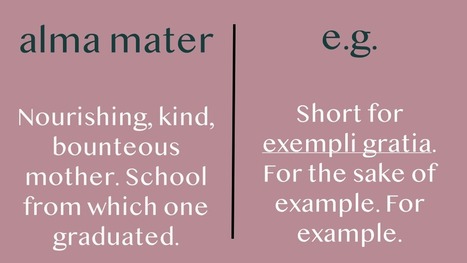
It’s guaranteed that you have or will run into some of these Latin terms in anything including the lightest reading. That’s because they’re everywhere. In newspapers, textbooks, m…
Images from the National Archives Catalog show striking parallels to today’s crisis, from masks to emergency hospitals.
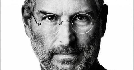
It's not often that we get to experience someone changing the world in real time. Many artists, inventors, scientists, and creators aren't appreciated or revered in the way that they should be until well after their death. Steve Jobs was a rare exception. We were lucky enough to be able t
The Zooniverse is the world’s largest and most popular platform for people-powered research.
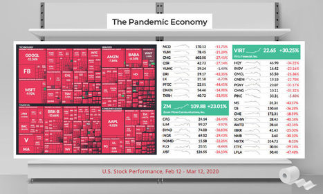
In the pandemic economy, the soup, toilet paper, and bleach companies are reigning supreme. See the stocks that have avoided the bug.
Over time, infectious diseases have been humanity's constant companion. We've visualized the history of pandemics, from the Antonine Plague to COVID-19
FYI: If you work in a university impacted by COVID-19, Coursera invites you to leverage their course catalogue. The company's CEO writes:
The spread of the coronavirus (COVID-19) is the most serious global health security threat in decades.
Balls, pendulums, apples and magnets all played their part in the story of modern physics, but then things got weird. And when Albert Einstein combined
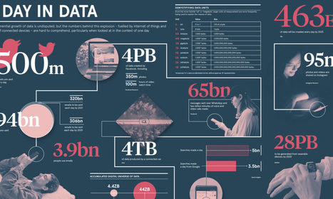
By 2020, there will be 40x more bytes of data than there are stars in the observable universe. See how much data gets added to the mix each and every day.
|
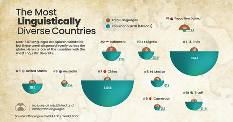
Thousands of languages are spoken globally, but they aren't evenly dispersed. Here's a look at countries with the most linguistic diversity.
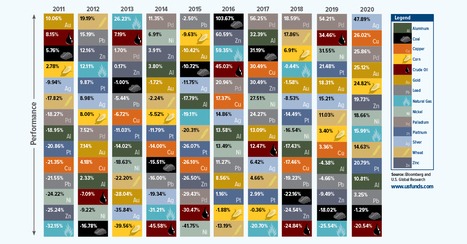
Which commodity had the best returns in 2020? From gold to oil, we show how commodity price performance stacks up over the last decade.
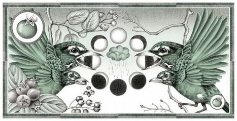
As Robin Wall Kimmerer harvests serviceberries alongside the birds, she considers the ethic of reciprocity that lies at the heart of the gift economy.
Universal Basic Income is one potential way to combat poverty and encourage economic activity, and a global map of basic income experiments shows that this trendy idea isn’t new.
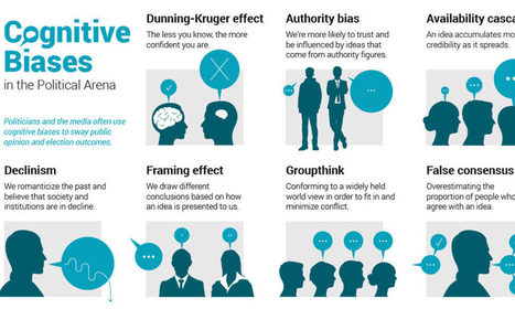
Humans are hardwired to make mental mistakes called cognitive biases. Here are common biases that can shape political opinion, and even elections.
Market cycles can often send investors on an emotional roller coaster. We illustrate the herd mentality with this chart on investor sentiment.
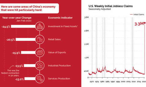
China has seen a severe economic impact from COVID-19, and it may be a preview of what's to come for countries in the early stages of the outbreak.
How a devastating series of cholera outbreaks in the 19th century inadvertently spurred innovation in the field of data visualization.
All of us have tried to come to grips with the coronavirus in different ways. Here on Open Culture we've featured online courses to get you conversant in the science around the pandemic, but readers of this site will also have sought out the most pertinent works of history and literature.
See the world's 100 biggest islands in a side-by-side comparison. Then, we look to see which islands have the highest population densities.
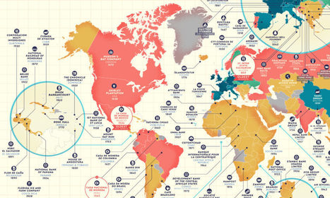
Which companies have stood the test of time? This detailed map highlights the oldest company in every country that is still in business.
|