


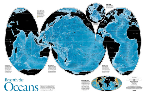
Nothing is where you think it is.
Get Started for FREE
Sign up with Facebook Sign up with X
I don't have a Facebook or a X account


 Your new post is loading...
 Your new post is loading...
Your new post is loading...

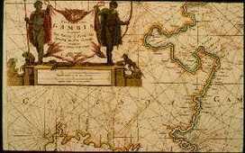
The easy-to-use getaway to historical maps in libraries around the world. 
TED Talks Map designer Aris Venetikidis is fascinated by the maps we draw in our minds as we move around a city -- less like street maps, more like schematics or wiring diagrams, abstract images of relationships between places.
This video touches on numerous themes that are crucial to geographers including: 1) how our minds arrange spatial information, 2) how to best graphically represent spatial information in a useful manner for your audience and 3) how mapping a place can be the impetus for changing outdated systems. This is the story of how a cartographer working to improve a local transportation system map, which in turn, started city projects to improve the infrastructure and public utilities in Dublin, Ireland. This cartographer argues that the best map design for a transport system needs to conform to how on cognitive mental mapping works more so than geographic accuracy (like so many subway maps do).
Tags: transportation, urban, mapping, cartography, planning, TED, video, unit 7 cities.
Home page of USGS Topographic Maps...
The last paper editions of USGS topographic masp came out in 1973 and 1992. If you are waiting for the next print edition, you'll be waiting a long time. Like so many other agencies with information distribution, the USGS topo maps have gone digital. In 2001 the USGS announced the production of a current, seamless digital National Map. You can still quadrangle chunks of the National map and download them for free as PDFs (with geospatial extensions for measuring).
Tags: mapping, cartography, geospatial.
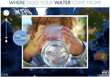
This interactive map documents where 443 million people around the world get there water (although the United States data is by far the most extensive). Most people can't answer this question. A recent poll by The Nature Conservancy discoverd that 77% of Americans (not on private well water) don't know where their water comes from, they just drink it. This link has videos, infographics and suggestions to promote cleaner water. This is also a fabulous example of an embedded map using ArcGIS Online to share geospatial data with a wider audience.
Tags: GIS, water, fluvial, environment, ESRI, pollution, development, consumption, resources, mapping, environment depend, cartography, geospatial.
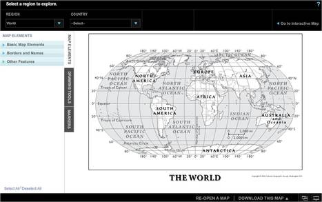
Customize one-page maps and download, email, print, or share!
Want to make a custom map don't have a cartographic background or access to GIS software? This online program will give you what you need.
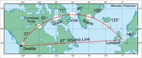
While the web mapping world still relies too much on the Mercator projection for my preference, it is a testament to the enduring impact that his ideas have had in literally shaping our World. When discussing map projections, this article has some valuable materials.
"The AFRITERRA Foundation is a non-profit Cartographic Library and Archive assembling and preserving the original rare maps of Africa in a definitive place for education and interpretation. This unique cartographic galleries links art, technology, and history." The Afriterra Foundation connects people to the land, history, heritage and legacy of Africa.
We live in a world steeped in graphic information. From Google Maps and GIS to the proliferation of infographics and animated maps, visual data surrounds us. While we may think of infographics as a relatively recent development to make sense of the immense amount of data available on the Web, they actually are rooted in the 19th century. Two major developments led to a breakthrough in infographics: advances in lithography and chromolithography, which made it possible to experiment with different types of visual representations, and the availability of vast amounts of data, including from the American Census as well as natural scientists, who faced heaps of information about the natural world, such as daily readings of wind, rainfall, and temperature spanning decades. But such data was really only useful to the extent that it could be rendered in visual form. And this is why innovation in cartography and graphic visualization mattered so greatly... Via Lauren Moss, Beth Kanter
|
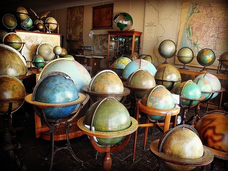
With 24,000 maps and 760 globes, Murray Hudson's cartographic stash is full of treasures.

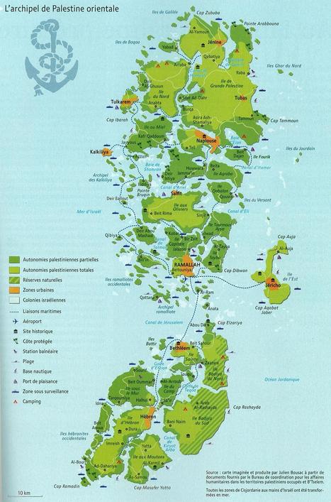
The shape of a state can greatly impact the political cohesion of a country as well as it's economic viability. While this is obviously a fictitious map, it draws our attention to the logistic difficulties that confront Palestine with the Israelis controlling crucial transportation access points and corridors.
Questions to Ponder: How is this a 'persuasive map?' What are some of the geographic impacts of this fragmentation on Palestine? For Israel?
Tags: cartography, MiddleEast, political, states, territoriality, unit 4 political.
Video. Cartographers at National Geographic discuss how they select an appropriate map projection for the September 2012 magazine map supplement.
There is no one perfect map projection that fits all circumstances and situations. Think a situation in which this map projection would be an ideal way to represent the Earth and another situation where it is an incredibly limited perspective.
Tags: cartography, K12, geospatial, NationalGeographic, water.
MapMaker Kit. Download, print, and assemble maps of the United States in a variety of sizes. The mega map occupies a large wall, or can be used on the floor.
Have you every wanted to create a giant map but aren't sure if you can logistically pull it off? The National Geographic's MapMaker kit is just that, a kit for you to create wall maps from a standard printer and tile them together. The assembly itself is a great spatial thinking and fun exercise for students (and there are large world maps as well).
Tags: NationalGeographic, cartography, mapping, K12.
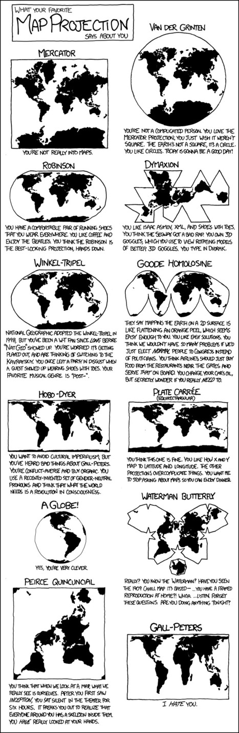
From
xkcd

Geo-geek humor -- A cartoon strip on the projector in the 3 minutes before class can be a good thing. I'm a Robinson.

Emily Bian's curator insight,
September 28, 2014 8:36 PM
This cartoon strip shows the different types of map projections, and has a caption of what your personality is like if you like the map projection. I thought this was really funny, especially the caption for the Peters Projection. I'm a Robinson for sure, because I just like the way it looks. I think all the different types of maps are good and useful in their own way, even the Peters... I guess... We also learned all the different types of map projections in class, which helped me recognize these maps. This is also a humorous way for people who don't know the different map projections to learn it while still having a fun and good time. Maps are an important element in APHUG, because everyone should know how to read maps. It's part of Unit 1, because it shows the landmasses, and some maps can show different perspectives on things. This quirky and humorous map will help the students in next year's APHUG class the different map projections, while having fun and finding out their personality that goes along with the different maps. 1) key geographical skills 
Elle Reagan's curator insight,
September 28, 2014 11:37 PM
This is a good overview of some different types of map projections and it has some humor too! I like how all the different types of map are all in one place. Also, each picture is fairly detailed so that I can really see how one map is different from the next. I'm hoping this will be a good study tool in studying for the AP exam if there are any questions about different types of map projections.
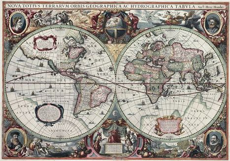
I typically would not link to a Wikipedia article, but this one is not only well crafted, but represents an academic collaborative work in its own right. This a fabulous cartographic gallery that explores the history of geographical thought through the ages (as archived in the earliest maps). Enjoy the maps, and even more, the intellectual context that this article provides for each of these images.

There are many amazing examples of artists who turn to cartography and geography for inspiration. Whether through the lens of a camera, paint, ...
This series of cartographically-inspired art works changes how we look at maps. Some of these artists also make us think of places that are on the Earth as explicitly "mappable" features. I think the Google Maps push-pin in the city center is my favorite. Which do you prefer?
Tags: art, mapping, place, cartography.

GeoMapGames's curator insight,
March 4, 2014 12:47 AM
Amazing map art! I like Google Maps push-pin in the city center :) |


