IELTS, ESP, EAP and CALL
18.5K views | +0 today
Follow
IELTS, ESP, EAP and CALL
Interesting links and articles related to IELTS, ESP, EAP and E-learning.  Available to teach ESP, EAP, Research Skills, IELTS, TOEFL and General English.
Curated by Dot MacKenzie
Your new post is loading...
Scooped by Dot MacKenzie
Scoop.it!

Mind42: Free online mind mapping software

Mind42: Free online mind mapping software | IELTS, ESP, EAP and CALL | Scoop.it
Get an overview about the different kind of mind map created on Mind42. Mind42 is a free online mind mapping software that allows you to collaborate on and publish your mind maps with others.
No comment yet.
Scooped by Dot MacKenzie
Scoop.it!

50 Great Examples of Data Visualization

50 Great Examples of Data Visualization | IELTS, ESP, EAP and CALL | Scoop.it
Wrapping your brain around data online can be challenging, especially when dealing with huge volumes of information. And trying to find related content can
No comment yet.
Rescooped by Dot MacKenzie from Just like every drop of rain...
Scoop.it!

The top 20 data visualisation tools

The top 20 data visualisation tools | IELTS, ESP, EAP and CALL | Scoop.it

From simple charts to complex maps and infographics, Brian Suda's round-up of the best – and mostly free – tools has everything you need to bring your data to life...

A common question is how to get started with data visualisations. Beyond following blogs, you need to practice – and to practice, you need to understand the tools available. In this article, get introduced to 20 different tools for creating visualisations: from simple charts to complex graphs, maps and infographics. Almost everything here is available for free, and \you may have installed already...


Via Lauren Moss, sofilab
Randy Rebman's curator insight, January 28, 2013 12:33 PM

This looks like it might be a good source for integrating infographics into the classroom.

Rescooped by Dot MacKenzie from Visualization Techniques and Practice
Scoop.it!

11 of the Most Influential Infographics of the 19th-Century...

11 of the Most Influential Infographics of the 19th-Century... | IELTS, ESP, EAP and CALL | Scoop.it
We live in a world steeped in graphic information. From Google Maps and GIS to the proliferation of infographics and animated maps, visual data surrounds us.

While we may think of infographics as a relatively recent development to make sense of the immense amount of data available on the Web, they actually are rooted in the 19th century.

Two major developments led to a breakthrough in infographics: advances in lithography and chromolithography, which made it possible to experiment with different types of visual representations, and the availability of vast amounts of data, including from the American Census as well as natural scientists, who faced heaps of information about the natural world, such as daily readings of wind, rainfall, and temperature spanning decades.

But such data was really only useful to the extent that it could be rendered in visual form. And this is why innovation in cartography and graphic visualization mattered so greatly...


Via Lauren Moss, Beth Kanter
No comment yet.
Scooped by Dot MacKenzie
Scoop.it!

Gliffy Editor - Online

Gliffy Editor - Online | IELTS, ESP, EAP and CALL | Scoop.it
Gliffy is a powerful HTML5 online diagram creation tool. Make a flowchart, network diagram, uml diagram, org chart, or wireframe with ease!
No comment yet.
Scooped by Dot MacKenzie
Scoop.it!

The Best Tools for Visualization

The Best Tools for Visualization | IELTS, ESP, EAP and CALL | Scoop.it
Visualization is a technique to graphically represent sets of data. When data is large or abstract, visualization can help make the data easier to read or understand. There are visualization tools for search, music, networks, online communities, and almost anything else you can think of. Whether you want a desktop application or a web-based tool, there are many specific tools are available on the web that let you visualize all kinds of data.
No comment yet.
Rescooped by Dot MacKenzie from Visualization Techniques and Practice
Scoop.it!

2012 Winners of the Information is Beautiful awards

2012 Winners of the Information is Beautiful awards | IELTS, ESP, EAP and CALL | Scoop.it

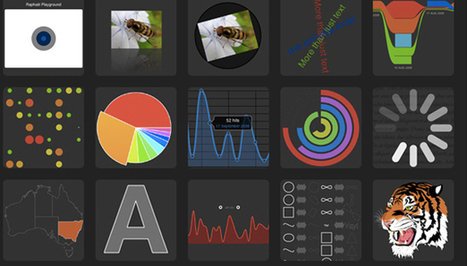
On September 27th, the world's best examples of visually stunning information was recognized at the inaugural Information is Beautiful awards.

The event, held at London's Institute of Contemporary Arts, awarded designers from all over the world in a variety of categories, including data visualisation, infographics and data journalism.

When David McCandless, author, data journalist and founder of the IIB data-visualisation studio, announced in early 2012 that IIB was looking for award applicants, he was inundated with over 1,000 entries.

"I've just been amazed by the sheer quality of the creative work submitted to the awards from around the world," McCandless told Wired.co.uk. "There are a number of criteria we look for when judging these awards. Not only do they have to have the right visual quality and be easily understood, they have to have that invisible element of story telling as well."


Read the complete article for a closer look at all the winners, selected by a panel of judges including musician and visual artist Brian Eno, senior curator of the Museum of Modern Art Paola Antonelli, BrainPickings.org editor Maria Popova and Guardian Datablog editor Simon Rogers.


Via Lauren Moss, Beth Kanter
No comment yet.
Rescooped by Dot MacKenzie from Visualization Techniques and Practice
Scoop.it!

How To Assess Quality of Infographic

How To Assess Quality of Infographic | IELTS, ESP, EAP and CALL | Scoop.it

Curatored by Beth Kanter

http://www.bethkanter.org


Is an infographic good or not?

(1)  Graphics - look/feel

(2)  Are there insights shared based on data?


Via Lauren Moss, Beth Kanter
No comment yet.