

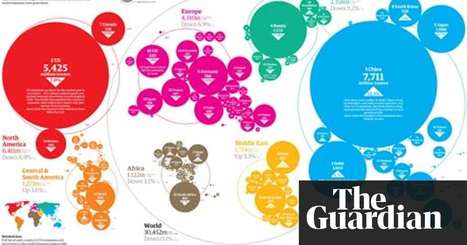

Continuing expansion of China has offset the reduction in carbon emissions in recession-hit western countries
Get Started for FREE
Sign up with Facebook Sign up with X
I don't have a Facebook or a X account


 Your new post is loading...
 Your new post is loading...
Your new post is loading...
Continuing expansion of China has offset the reduction in carbon emissions in recession-hit western countries 
No comment yet.
Sign up to comment
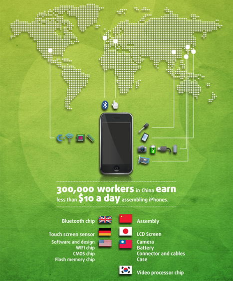
If you have ever seen an advertisement for an Apple product you know that they like selling how green their products are, but how green are they really? Each iPhone produces 45 kilograms of carbon dioxide, 57% of which is released during production. In 2010 the iPhones purchased are responsible for 2,350 million kilograms of carbon dioxide being released into the atmosphere. However, Apple, is attempting to reduce the amount of CO2 evidenced by an 18% reduction in emissions in the iPhone 4.
Apple is not the only one that should be expected to go green. We, the consumer, should be doing our part as well. Currently only about 10% of phones are recycled, of the 47 million iPhones sold in 2010 only 4,700,000 were recycled. Which is minuscule when compared to the 42,300,000 that were trashed. Apple, in fact, offers free recycling of their phones... Via Lauren Moss, Greenroom Dweller
|
As Sustainability month draws to a close, we've dug up a gem from the Coroflot archives: Stanford Kay's excellent infographic of global carbon emissions. Kay's design succeeds in representing a potentially overwhelming set of data on several levels: some 200+ different countries are represented by bubbles, color-coded by continent, where the size of each is proportional to its carbon emissions. Moreover, the arrangement of the bubbles completes the metaphor, adding a further dimension of scale to the graphic: it is difficult, if not impossible, to see the big picture when one is perusing the names of the individual countries. Thus, Kay's infographic also reminds us not to miss the forest for the trees. Via Lauren Moss
|


