Interesting links and articles related to IELTS, ESP, EAP and E-learning. Available to teach ESP, EAP, Research Skills, IELTS, TOEFL and General English.
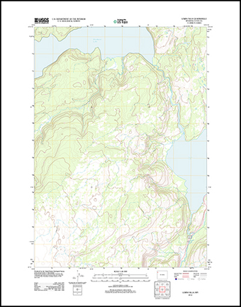
The last paper editions of USGS topographic masp came out in 1973 and 1992. If you are waiting for the next print edition, you'll be waiting a long time. Like so many other agencies with information distribution, the USGS topo maps have gone digital. In 2001 the USGS announced the production of a current, seamless digital National Map. You can still quadrangle chunks of the National map and download them for free as PDFs (with geospatial extensions for measuring).
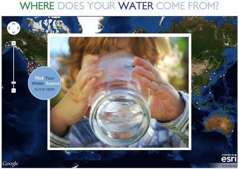
This interactive map documents where 443 million people around the world get there water (although the United States data is by far the most extensive). Most people can't answer this question. A recent poll by The Nature Conservancy discoverd that 77% of Americans (not on private well water) don't know where their water comes from, they just drink it. This link has videos, infographics and suggestions to promote cleaner water. This is also a fabulous example of an embedded map using ArcGIS Online to share geospatial data with a wider audience.
"Mapping is a huge and growing sector, from social maps for sharing with friends, to mashing up Google Maps in every possible way."
You know that the technology exists for you to link your online information with maps...but not sure how to go about it? This link from mashable.com lists over 50 sites that specialize is visually representing your data, information or projects. Online mapping is not just for the experts, but being democratized ...online mapping for the masses!
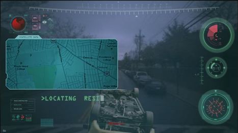
This is a ridiculous advertisement for State Farm Insurance (a robot seeks to destroy a particular address--but the one that YOU select)...but this uses geospatial technologies and online mapping instruments very well. Low on content, but could be a fun "hook" to start a lesson.
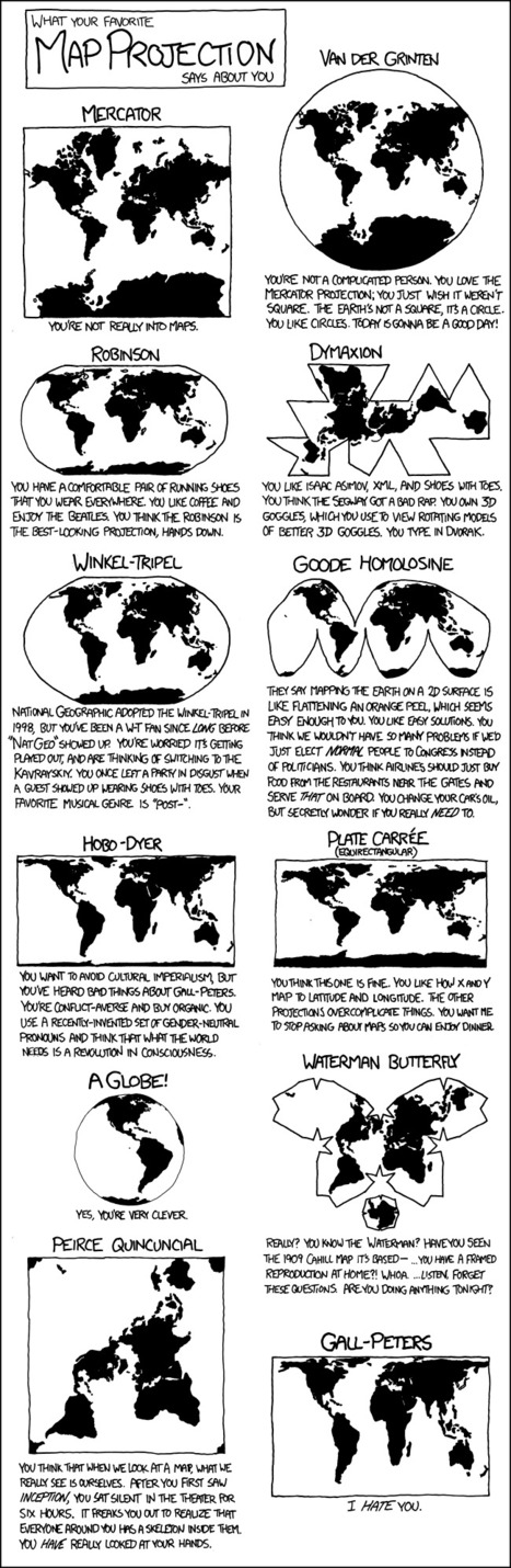
This cartoon strip shows the different types of map projections, and has a caption of what your personality is like if you like the map projection.
I thought this was really funny, especially the caption for the Peters Projection. I'm a Robinson for sure, because I just like the way it looks. I think all the different types of maps are good and useful in their own way, even the Peters... I guess...
We also learned all the different types of map projections in class, which helped me recognize these maps. This is also a humorous way for people who don't know the different map projections to learn it while still having a fun and good time. Maps are an important element in APHUG, because everyone should know how to read maps. It's part of Unit 1, because it shows the landmasses, and some maps can show different perspectives on things.
This quirky and humorous map will help the students in next year's APHUG class the different map projections, while having fun and finding out their personality that goes along with the different maps.
This is a good overview of some different types of map projections and it has some humor too! I like how all the different types of map are all in one place. Also, each picture is fairly detailed so that I can really see how one map is different from the next. I'm hoping this will be a good study tool in studying for the AP exam if there are any questions about different types of map projections.
Encyclopedic entry. A geographic information system (GIS) is a computer system for capturing, storing, checking, and displaying data related to positions on Earth’s surface. GIS can show many different kinds of data on one map.
This informative webpage (and accompanying features) simply answer the question, "What is GIS and how is it a useful way to work with spatial data?"
Amazing things about Google Earth - news, features, tips, technology, and applications...
This blog post will link you to numerous educational uses for Google Earth, including "GIS-like" overlays. This is a great resource that can be adapted for various grade levels.
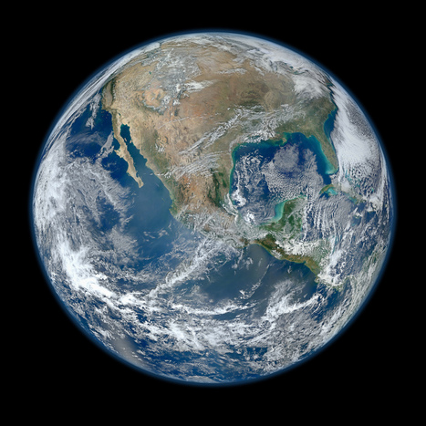
NASA has released a new Blue Marble image, showing the United States of America. According to them, it's the "most amazing, highest resolution image of Earth ever." Blue Marble 2012 bests the 2010 edition and the original one.
Beautiful image...follow the link for a video of the image at a variety of scales as well as the specs and production that went into it. There is an 8000 x 8000 pixel version as well as many lower resolution versions.
This provies the basic overview of the layout and function of http://geteach.com . The video unlocks some great features that are not intended to be hidden, but many first time visitors tend to miss.
This is a phenomenal site, designed by an AP teacher to bring geospatial technologies into the classroom in a way that is incredibly user-friendly. This site allows you to use Google Earth with clickable layers. With multiple data layers of physical and human geography variables, this interactive globe puts spatial information in powerful, yet fun, student-inspired platform.
World Atlas is an educational resource for world maps, atlases, and in-depth geography information. Teachers and students: free maps of Europe, USA, Canada, Florida, Caribbean Islands and much more.
This World Atlas, in addition to have many maps at a variety of scales as is very common these days, has the added feature of embedding facts and other informative features based on your scale and regional context. Students can explore this at their own pace to learn about what every region of the world that interests them the most.
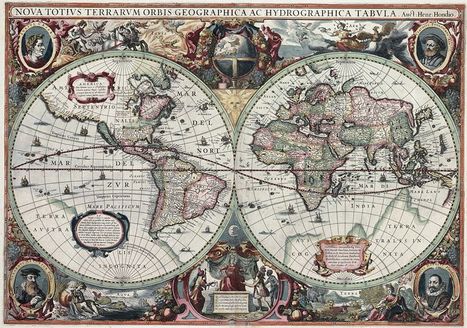
I typically would not link to a Wikipedia article, but this one is not only well crafted, but represents an academic collaborative work in its own right. This a fabulous cartographic gallery that explores the history of geographical thought through the ages (as archived in the earliest maps). Enjoy the maps, and even more, the intellectual context that this article provides for each of these images.
J-Track 3D Satellite Tracking is an online educational tool that maps hundreds of satellites as they orbit Earth. One of the ironies of the space program is that it's greatest scientific advances from the space program is in observing our own planet instead of deep space. J-Track 3-D should appear in its own window and plot the satellites in an interactive panel. This is a great way to learn more about the remote sensing platforms that give us all the beautiful imagery of our planet.
Video. Cartographers at National Geographic discuss how they select an appropriate map projection for the September 2012 magazine map supplement.
There is no one perfect map projection that fits all circumstances and situations. Think a situation in which this map projection would be an ideal way to represent the Earth and another situation where it is an incredibly limited perspective.
TED Talks In this short talk, TED Fellow Sarah Parcak introduces the field of "space archeology" -- using satellite images to search for clues to the lost sites of past civilizations.
The uses of geospatial technologies is NOT limited to studying geography, but it is the bedrock of many research projects that involve spatial thinking (as demonstrated in this TED talk). Geographic principles and geographers can be very important members of interdisciplinary teams.
This sounds really intruging to me; I have heard of astroarchiology before in the aplication of finding undiscovered large objects (cities, towns sttlements) by using satellites to map deviations in teh earths surface accurately enough to distingush structures like a building foundation. I just find this sort of thing fascinating. I am still in awe that this dort of thing is possible.
A time-lapse taken from the front of the International Space Station as it orbits our planet at night. This movie begins over the Pacific Ocean and continues...
This is an extraordinary view of the Earth that captivates students and often gives them a sense of awe and wonder for the planet we call home.
"Google Fusion Tables is an excellent way to create and share visualizations of data in map, chart, and tabular formats. Today we’re starting a new series of blog posts designed to get you up to speed with using this fantastic platform. We’ll also be releasing a free e-learning course called Bringing Data to Life with Google Fusion Tables to all our newsletter subscribers."
This is a video introduction to www.historypin.com which might just prove to be a very useful and important project. It's historical geography powered by collaborative mapping that is infused with social media dynamics. Backed by Google, they are geo-tagging old photos to recreate the historical geographies of all places and comparing them with current street view images. You can search by topic, place or date...this has the potential to be very big.
A free Resource for Teachers who use Google Earth. Providing everything from lesson ideas to complete lesson plans for both single computer classrooms to full computer labs.
If you were thinking about using Google Earth, but not sure how to get started, consider this your starting point. You will find tutorials, sample data sets, lesson plans, etc. Very well put together and incredibly helpful.
Google Earth's Timeline, if you haven't discovered that feature will allow you to compare and contrast imagery from an area from the present 2010/11 to 1993-1995 images. Click the 'clock' button and a timeline that you can slide to the past appears. Nice historical possibilities with this option.
"The World Bank eAtlas of Global Development maps and graphs more than 175 thematically organized indicators for over 200 countries, letting you visualize and compare progress on the most important development challenges facing our world. Most indicators cover several decades, so you can see, for example, how 'life expectancy at birth' has improved from 1960 up through the latest year." This tool should greatly enhance student projects as they will add more data, and see bigger patterns. To go to the link visit: http://www.app.collinsindicate.com/worldbankatlas-global/en
Free site dedicated to help teachers educate and engage students using Google Earth...
This is a phenomenal site, designed by an AP teacher to bring geospatial technologies into the classroom in a way that is incredibly user-friendly. This site allows you to use Google Earth with clickable layers. With multiple data layers of physical and human geography variables, this interactive globe puts spatial information in powerful, yet fun, student-inspired platform. The video tutorial can be found at: http://www.youtube.com/watch?v=hUei7bth0MY
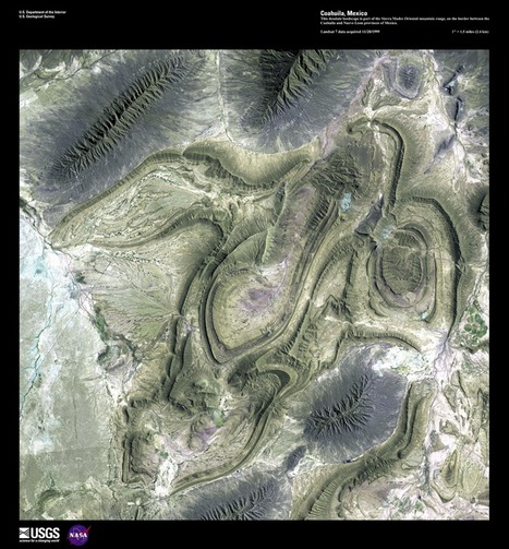
Program by having a competition to select the top 5 "Earth as Art" images from the more than 120 scenes from their curated collection. All readers can select 5 images on the USGS website and the poll closes on July 6, 2012 (The image above is from Coahuila, Mexico).
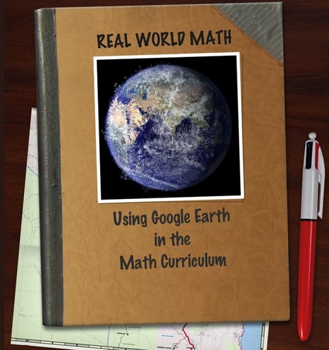
"Real World Math: Using Google Earth in the Math Curriculum." Back to my interdisciplinary approach to strengthening geographic education, image hearing that there is a Math teacher at your school using this, wouldn't you want to be a part of it? Too often knowledge is taught within disciplinary silos; students need opportunities to make real world connections between the disciplines to breath life into how they are taught. This site reminds me of http://www.googlelittrips.org/ which allows real world geography to be a part of literature/English classes.
To get content containing either thought or leadership enter:
To get content containing both thought and leadership enter:
To get content containing the expression thought leadership enter:
You can enter several keywords and you can refine them whenever you want. Our suggestion engine uses more signals but entering a few keywords here will rapidly give you great content to curate.


 Your new post is loading...