
Beta: A vision of Britain throug
Get Started for FREE
Sign up with Facebook Sign up with X
I don't have a Facebook or a X account


 Your new post is loading...
 Your new post is loading...
Your new post is loading...
A collection of articles from the publisher of Nature that discusses statistical issues biologists should be aware of and provides practical advice to improve the statistical rigor and reproducibility of their work. 

Not every state is equally impacted by migration, and the demographic profile of migrants is different for every state. This is an online mapping tool to search a large database that can give the user state specific information about the impact of economics and politics based on migration from Latin America and Asia on any given state.
Tags: Immigration, unit 2 population, migration, economic, statistics, mapping, political.

Miles Gibson's curator insight,
November 26, 2014 12:43 PM
Unit 2 population and migration This map shows the population of migrants in certain states and compares them to other states. This demographic specifically highlights Texas and shows its migrant information. Texas has the highest immigrant income out of all of the states. Also Texas has very few naturalized citizens who used to be an immigrant. This map relates to unit 2 because it shows the illegal immigration. And immigration theories. This proves ravensteins laws correct because it shows how people move a short distance to migrate, knowing that most migrants to America come from Latin America. This map is a great example of ravensteins theories and unit 2
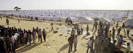
The key facts and figures about refugees, IDPs, asylum seekers and stateless people from UNHCR's annual Global Trends report.
Not all migation is voluntary. Refugees and other non-voluntary migrants often are in their situation due to complex geographic factors beyond their control at the national scale.
Tags: migration, population, development, conflict, statistics, war, unit 2 population.

Mr Ortloff's curator insight,
January 22, 2013 12:20 AM
Good source for stats on non-voluntary migrants.
This mind blowing information shows how the virtual and online world is changing so rapidly. Did you know there are 31 billion searches on Google every singl...
Globalization, education and the changing technological landscape are all major themes in this video.
"The World Bank eAtlas of Global Development maps and graphs more than 175 thematically organized indicators for over 200 countries, letting you visualize and compare progress on the most important development challenges facing our world. Most indicators cover several decades, so you can see, for example, how 'life expectancy at birth' has improved from 1960 up through the latest year." This tool should greatly enhance student projects as they will add more data, and see bigger patterns. To go to the link visit: http://www.app.collinsindicate.com/worldbankatlas-global/en
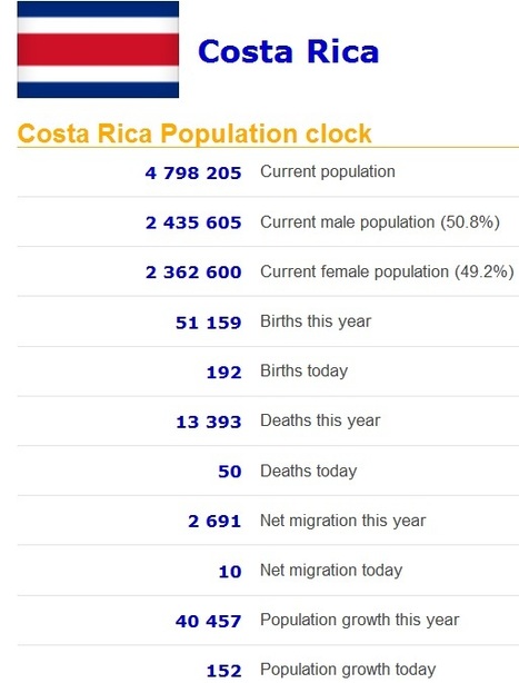
Real time statistics for current population of any country. Real time data on population, births, deaths, net migration and population growth.
This site shows various demographic statistics for every country including some based on projections in demographic trends in the given country. If the current trends hold (which they won't, but that is still an interesting measure), the entire Japanese population will disappear in 1,000 years according to this Global Post article.

Scott D.Warner, PLS's comment,
August 3, 2013 5:03 PM
Population density dependent malfunctions in societies include crime, disease, and even war.

Riley Tuggle's curator insight,
September 10, 2014 9:51 AM
I believe India has more men than women because sometimes when women can't have a son for their first or second child, the men would beat the women to death, or in some instances women are captured and sold for wives, and they may commit suicide they are so depressed. Also, some pregnant women find out their baby is a girl, they would aport or abandon her because sons are apparently more important and successful because they would stay home and take care of their parents when they are elderly and they would carry on the families name. -rt 
MissPatel's curator insight,
December 16, 2014 3:22 AM
This is fantastic - have a look at various countries and their 'rate' of growth
This is the truly global project that asks the children of the world to introduce us to the people of the world. We've seen videos and resources that ask the question, "if there were only 100 people in the world, what would it look like?" This takes that idea of making demographic statistics more meaningful one step further by asking student in schools for around the world to nominate some "representative people" and share their stories. The site houses videos, galleries from each continent and analyze themes that all societies must deal with. This site that looks at the people and places on out planet to promote greater appreciation of cultural diversity and understanding is a great find.
Tags: Worldwide, statistics, K12, education, comparison.

savvy's curator insight,
September 3, 2014 12:57 PM
This just makes me realize how the world would be if we only had 100 people rather than the billions we have now. |

Live world statistics on population, government and economics, society and media, environment, food, water, energy and health. Interesting statistics with world population clock, forest loss this year, carbon dioxide co2 emission, world hunger data, energy consumed, and a lot more
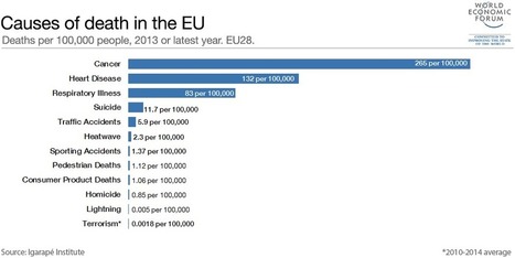
While the threat of terrorism in Europe is genuine, it is dramatically lower than just about anywhere else in the world.

Someone always asks the math teacher, "Am I going to use calculus in real life?" And for most of us, says Arthur Benjamin, the answer is no. He offers a bold proposal on how to make math education relevant in the digital age.

Discover all statistics and data on Online Gaming Industry now on statista.com!
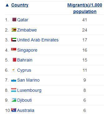
List of the countries with the most migrants in the world as measured by net migration rate. Which countries have the most migrants per capita living there? What spatial or development patterns do you see on this list? Tags: Migration, population, Immigration, statistics, worldwide, unit 2 population.

Lauren Sellers's curator insight,
May 22, 2014 12:04 PM
This is an interesting little chart because it reveals to us which countries have the highest percentage of migrants that make up their general population. Definitely suprised me to see Qatar as the number one on the list, I would have expected the US to be at the top, but it is not even in the top 10! 
Lona Pradeep Parad's curator insight,
May 28, 2014 7:26 PM
This shows the net migration of immigrants. 
Adrian Bahan (MNPS)'s curator insight,
September 30, 2014 4:04 PM
Remember this is based on a % of the total population, and not total #. Which countries have the most migrants per capita living there? What spatial or development patterns do you see on this list?
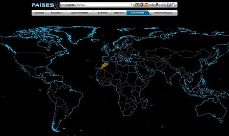
The Brazilian government's geographic department (Instituto Brasileiro de Geografia e Estatística-roughly equivalent to the U.S. Census Bureau) has compiled an fantastic interactive world factbook (available in English and Spanish as well as Portuguese). The ease of navigation allows the user to conduct a specific search of simply explore demographic, economic, environmental and development data on any country in the world.
Tags: population, worldwide, statistics, mapping, zbestofzbest.

Map and compare global trends. Explore related essays, photo galleries, and information graphics.
This is a simple way to have a map analysis exercise without any GIS software or skills needed on this interface.

World Atlas is an educational resource for world maps, atlases, and in-depth geography information. Teachers and students: free maps of Europe, USA, Canada, Florida, Caribbean Islands and much more.
This World Atlas, in addition to have many maps at a variety of scales as is very common these days, has the added feature of embedding facts and other informative features based on your scale and regional context. Students can explore this at their own pace to learn about what every region of the world that interests them the most.
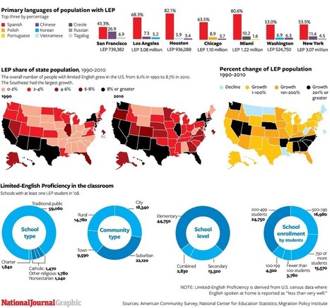
Although English is America’s common tongue, immigrants’ efforts to learn it present challenges to institutions and individuals alike. These graphics compare regions, schools, and communities where newcomers have settled to learn and integrate.
The interactive map feature of language and the accompanying spatial patterns reveal much about the major migrational patterns in the United States.
Tags: Migration, USA, statistics, language, immigration, unit 2 population.
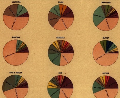
Do you want some inspiration to create a visually stunning - yet fully optimized - data graphic? Well, let's go back about a 140 years... Handsome Atlas developed by Jonathan Soma of Brooklyn Brainery, provides a stunning new online interface to a large collection of beautiful data visualizations from the 19th century.
TR: Taking into account the age of these visualizations, one has to wonder if they intended them to be used by our generation in this way. I see potential for a "web 2.0" update of these charts to make them interactive . . .
Tags: infographic, historical, visualization, statistics.
|