Interesting links and articles related to IELTS, ESP, EAP and E-learning. Available to teach ESP, EAP, Research Skills, IELTS, TOEFL and General English.
This is an interesting little chart because it reveals to us which countries have the highest percentage of migrants that make up their general population. Definitely suprised me to see Qatar as the number one on the list, I would have expected the US to be at the top, but it is not even in the top 10!
Remember this is based on a % of the total population, and not total #. Which countries have the most migrants per capita living there? What spatial or development patterns do you see on this list?
"3 guys, 44 days, 11 countries, 18 flights, 38 thousand miles, an exploding volcano, 2 cameras and almost a terabyte of footage."
This video beautifully encapsulates the spirit of a globalized educational experience and the value of geographic understanding in an ever-interconnected world. Geography is about broadening our minds to other places, other cultures and other ways of doing things. In a three part series including 'Eat' and 'Move.'
This is great because it shows people are round the world what great people and cultures are available for people to explore. It also shows that great spirit that people are exposed to. It also shows that people are outgoing and do not let nothing bring them down.
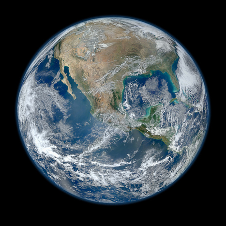
NASA has released a new Blue Marble image, showing the United States of America. According to them, it's the "most amazing, highest resolution image of Earth ever." Blue Marble 2012 bests the 2010 edition and the original one.
Beautiful image...follow the link for a video of the image at a variety of scales as well as the specs and production that went into it. There is an 8000 x 8000 pixel version as well as many lower resolution versions.
This is old enough that have been some changes to the political maps since this was produced 1993. What listed countries would now be marked incorrect? Which ones, even then would be politically contentious to categorize as a country?
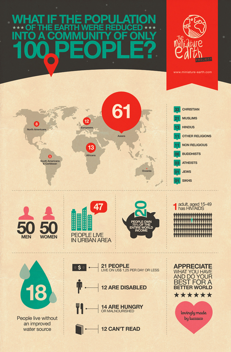
What if the world's population were reduced to 100 people community?
Reminicent of the picture book, "If the World were a Village" by David Smith, this video attempts to make large statistics more meaningful to young learners. For more information see: http://www.miniature-earth.com/
This is the site for the United Nations at a Glance. Here you will find information and links on history, members, visitis, employement and other details.
While some critize the ineffectiveness of the organization, the United Nations remains a key organization to get understanding modern geopolitics. Through their UN voting patterns, we can assess the geopolitical motivations, interests and alliances of member states. Also, initiatives (whether successful or not) and highlight the important issues of the day that globally aware students should understand.
Amazing animated infographic look at various world statistics in Oceania vs. Europe vs. America vs. Africa vs. Asia, from population to homicides to number of billionaires – a fine example of how to...
The video doesn't have captions to denote which continent is which, otherwise this is an excellent data visualization of global and regional differences, using the theme of the Olympics as it's symbolic motif.
i thought this was very cool and interesting to see different classes all around the world and how their culture is i would really like to see a video on the classes to see how they learn...cool article and good pictures
Technology bridges distance and borders. Individuals today can keep in touch with their friends and family in completely new ways — regardless of where they live. We explored these internatio...
People can be digitally connected with anyone around the world these days, without any limitations by distance or culture. Yet, by analyzing peoples social networks, it is clear that geographic factors are still a crucial factor in mediating our scoial interactions. The internet can, but doesn't fully conquer space.
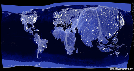
Earlier I have posted the classic image of "Earth Lights at Night," and discussed the classroom uses of the image. This cartogram helps take that analysis one step further. This cartogram helps students to visualize the magnitude of population (with the cartogram adjusting area for population) and then to see the patterns of energy use, global consumption and urbanization with in a new light.
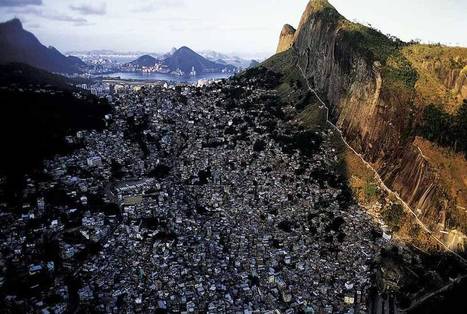
I'm a huge fan of Yann Arthus-Bertrand's artistic aerial photography. This image of Rio de Janeiro and the favela is a striking one. I am also posting this to show the how easy the website justpaste.it is to use. Students with no website creation training can produce sharable materials online. Now this isn't the most professional outlet, but I envision some middle school or high school students producing a class project that can be transformed into something that reaches a bigger audience as it is shared with a broader community.
The Brazilian government's geographic department (Instituto Brasileiro de Geografia e Estatística-roughly equivalent to the U.S. Census Bureau) has compiled an fantastic interactive world factbook (available in English and Spanish as well as Portuguese). The ease of navigation allows the user to conduct a specific search of simply explore demographic, economic, environmental and development data on any country in the world.
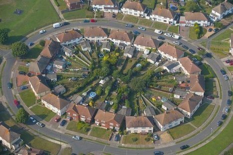
View Homes across the world seen from up high pictures on Yahoo!. See Homes across the world seen from up high photos and find more pictures in our photo galleries.
This aerial photography gallery shows distinct types of urbanism and is a good portal to introduce a class to suburban landscapes.
The Geographical Association has produced numerous resources specifically for the 2012 Olympic and Paralympic Games being held in London. The Olympics as an event work as an important teaching moment that operates on numerous scales. What local developmental projects reshaped the urban fabric of London in preparation for these Games? Do international events such as the Olympics foster a global community? Is this idea of a global community perfectly harmonious?
Miniature Earth. What if the population of the world were reduced into a community of only 100 people?
Reminicent of the picture book, "If the World were a Village" by David Smith, this infographic and website attempts to make large statistics more meaningful to young learners.
World Atlas is an educational resource for world maps, atlases, and in-depth geography information. Teachers and students: free maps of Europe, USA, Canada, Florida, Caribbean Islands and much more.
This World Atlas, in addition to have many maps at a variety of scales as is very common these days, has the added feature of embedding facts and other informative features based on your scale and regional context. Students can explore this at their own pace to learn about what every region of the world that interests them the most.
This website is especially good for elementary school teachers that are looking for ways to globalize their students educational experiences. They have activities and resources that are regionally organized--check it out!
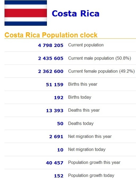
Real time statistics for current population of any country. Real time data on population, births, deaths, net migration and population growth.
This site shows various demographic statistics for every country including some based on projections in demographic trends in the given country. If the current trends hold (which they won't, but that is still an interesting measure), the entire Japanese population will disappear in 1,000 years according to this Global Post article.
I believe India has more men than women because sometimes when women can't have a son for their first or second child, the men would beat the women to death, or in some instances women are captured and sold for wives, and they may commit suicide they are so depressed. Also, some pregnant women find out their baby is a girl, they would aport or abandon her because sons are apparently more important and successful because they would stay home and take care of their parents when they are elderly and they would carry on the families name. -rt
This is the truly global project that asks the children of the world to introduce us to the people of the world. We've seen videos and resources that ask the question, "if there were only 100 people in the world, what would it look like?" This takes that idea of making demographic statistics more meaningful one step further by asking student in schools for around the world to nominate some "representative people" and share their stories. The site houses videos, galleries from each continent and analyze themes that all societies must deal with. This site that looks at the people and places on out planet to promote greater appreciation of cultural diversity and understanding is a great find.
NASA's Visible Earth catalog of NASA images and animations of our home planet...
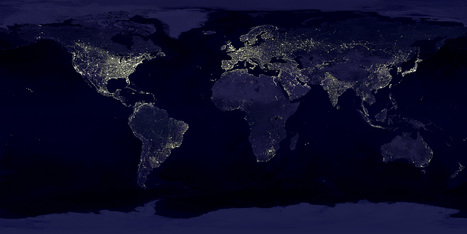
This classic image is full of classroom applications. The first impulse of most students is to note that this image will show us where people live, where the cities are or some other comment that speaks to the magnitude of the population in the white areas. Let them analyze this for more time, and they'll notice that population isn't the whole story of this image. A place like India shines, but less brightly than the eastern part of the United States. I like to point out that South Korea appears to be an island (because North Korea is literally blacked out). Politics, development, affluence and population information are all embedded in this image. As with all maps, the more information you have about the place in question (in this case, Earth), the more meaningful information you can extract out of the map.
From technology to equality, five ways the world is getting better all the time...
This article by former President of the United States Bill Clinton, outlines numerous ways that globalization can improve the world, especially in developing regions. He uses examples from around the world and includes numerous geographic themes.
Technology-Phones mean freedom Health-Healthy communities prosper Economy-Green energy equals good business Equality-Women rule Justice-The fight for the future is now
To get content containing either thought or leadership enter:
To get content containing both thought and leadership enter:
To get content containing the expression thought leadership enter:
You can enter several keywords and you can refine them whenever you want. Our suggestion engine uses more signals but entering a few keywords here will rapidly give you great content to curate.


 Your new post is loading...

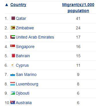


This is an interesting little chart because it reveals to us which countries have the highest percentage of migrants that make up their general population. Definitely suprised me to see Qatar as the number one on the list, I would have expected the US to be at the top, but it is not even in the top 10!
This shows the net migration of immigrants.
Remember this is based on a % of the total population, and not total #. Which countries have the most migrants per capita living there? What spatial or development patterns do you see on this list?