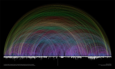
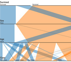
For many data visualization projects, information comes from a source that has already done some aggregation. This is both a blessing and a curse. Aggregation definitely simplifies the analysis and visualization process, but it can also greatly reduce the visualization and analysis options. This is because aggregation often destroys connections in data. For this reason, it's critical to have an in-depth and thorough knowledge and understanding of the information from aggregated information. There are several different visualization techniques that open up once we have the original data, such as Euler diagrams and parallel sets.
The extra information that can be obtained from visualizations is important to gaining a full understanding of the data, and it can lead to a much more interesting story, as well as far better visualizations and more accurate connections and links within those visualizations.
So, when gathering data about something, remember to dig deeper into it, as there are many important connections that happen within data that can provide knowledge beyond just a simple average or total.
To learn more about the value of these connections, sourcing accurate data, and how it is transformed into useful graphics, read the complete article and check out the case study used to convey the main points outlined above...
Via
Lauren Moss


 Your new post is loading...


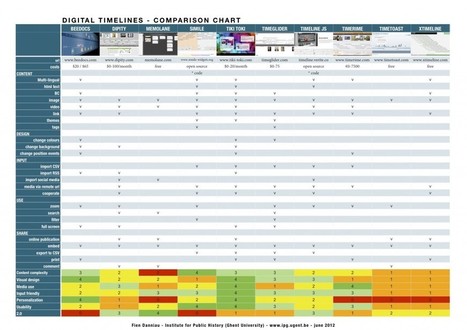


Une liste intéressante d'outils, qui mélange cependant des outils de curation "automatique" (l'outil fait le tri entre les informations) et curation "manuelle", où l'usager fait son tri.