information analyst
43.8K views | +0 today
Follow
information analyst
km, ged / edms, workflow, collaboratif
Your new post is loading...
Rescooped by michel verstrepen from Business Brainpower with the Human Touch
Scoop.it!

The Simplest Way To Know What Everyone's Doing At Work

The Simplest Way To Know What Everyone's Doing At Work | information analyst | Scoop.it

One of the biggest challenges of knowledge work is its lack of visibility. Getting a clear picture of what’s going on in a collection of minds, including your own, is much more difficult than seeing the visible progress of constructing a house or assembling a physical product. And when you can’t see what you’re building together as a company, it takes extra time, effort, and work to manage problems, progress, and processes.


So how do you make the invisible visible?


Via The Learning Factor
The Learning Factor's curator insight, November 21, 2013 6:45 PM

In the modern often remote workplace sharing work is essential to an efficient and collaborative team. Writing is the simple powerful tool that can.

Lisa Armstrong's curator insight, November 23, 2013 12:11 AM

It's a confronting notion. Of all the hours dedicated to team meetings,  review workshops, project review meetings .... across our organisations. And we still don't know what employees and teams are truly doing. A poor ROI indeed!

Social media enables employee and team connectivity beyond the confines of any meeting. Employees can post pix and videos of their lunch and others can like, comment or share their experiences. Challenge is how we have them connect and interact about deeper content than their lunch. Connect and interact with content about their job. That's the leadership knack!

Rescooped by michel verstrepen from visual data
Scoop.it!

Even simple charts can tell a story

Even simple charts can tell a story | information analyst | Scoop.it
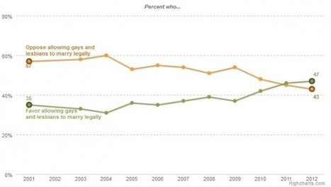
Regardless of your politics, this chart is a great example of how data can tell a story. It's a very simple graph by the Pew Forum on Religious and Public Life showing the changing attitudes about same-sex marriage. It shows that in the past couple of years, people have begun to be in favor of same-sex marriage.

I'm showing this chart because it so clearly represents the story of the data. The eye is immediately drawn to where the "oppose" and "favor" lines cross. Other obvious choices for this data would have been a stacked bar chart or a side by side bar chart as shown here (which I created with the source data just as examples)...


Via Lauren Moss
No comment yet.