information analyst
43.8K views | +0 today
information analyst
km, ged / edms, workflow, collaboratif
Your new post is loading...
Rescooped by michel verstrepen from visual data
Scoop.it!

30 Tools for Data Visualization

30 Tools for Data Visualization | information analyst | Scoop.it

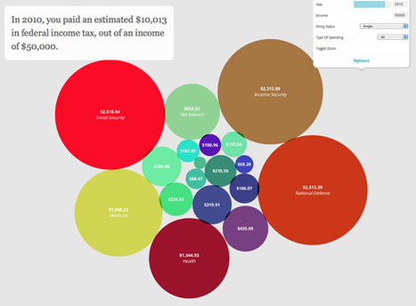
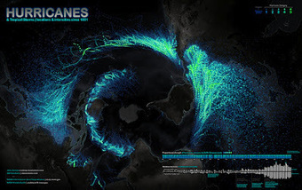
During the past few years the demand regarding Data Info-graphics has increased in volume and demand as well as in clarity. The range of technologies available by which to collect and examine data is constantly on the rise- both in web and desktop applications, which provide several great interfaces.
From a technological aspect , such tools have created efficiency based models which have gone onto disrupting existing paradigms of the past. These vary and range from data synthesis to data visualization encompassing every type of data.

Within this scope, such new tools are continually emerging whose main purpose is to- simplify the process within being able to harness data in lending impact and insight generation...


Via ghbrett, Lauren Moss
No comment yet.
Rescooped by michel verstrepen from eLearning Innovations
Scoop.it!

Vintage Data Visualization: 35 examples from before the Digital Era

Vintage Data Visualization: 35 examples from before the Digital Era | information analyst | Scoop.it

Graphics, charts, diagrams and visual data representations have been published on books, newspapers and magazines since they've existed, not to mention old maps and scientific illustrations...


Despite the lack of tools such as the ones we have at our disposal nowadays, they are as inspiring and important as the best contemporary visualizations. Visit the article link for a gallery of vintage visualizations...


Via Lauren Moss, Bucky Dodd
Mariana Soffer's comment, July 20, 2013 9:39 AM
my pleasure
Charlley Luz's curator insight, July 20, 2013 10:26 AM

muito legal, os Infográficos antes de existir a internet. 35 exemplos de infográficos no papel :) Achei falta do Marcha para Moscou do Minard http://www.datavis.ca/gallery/re-minard.php ;

Leoncio Lopez-Ocon's curator insight, July 20, 2013 2:57 PM

El brasileño Tiago Veloso, fundador de Visual Loop, nos ofrece 35 interesantísimas representaciones visuales de distintos fenómenos y eventos que permiten hacer un paseo por la historia de la ilustración científica.

Rescooped by michel verstrepen from visual data
Scoop.it!

Visualizing Connections In Data & Analyzing Information

Visualizing Connections In Data & Analyzing Information | information analyst | Scoop.it

For many data visualization projects, information comes from a source that has already done some aggregation. This is both a blessing and a curse. Aggregation definitely simplifies the analysis and visualization process, but it can also greatly reduce the visualization and analysis options. This is because aggregation often destroys connections in data. For this reason, it's critical to have an in-depth and thorough knowledge and understanding of the information from aggregated information. There are several different visualization techniques that open up once we have the original data, such as Euler diagrams and parallel sets.


The extra information that can be obtained from visualizations is important to gaining a full understanding of the data, and it can lead to a much more interesting story, as well as far better visualizations and more accurate connections and links within those visualizations.

So, when gathering data about something, remember to dig deeper into it, as there are many important connections that happen within data that can provide knowledge beyond just a simple average or total.


To learn more about the value of these connections, sourcing accurate data, and how it is transformed into useful graphics, read the complete article and check out the case study used to convey the main points outlined above...


Via Lauren Moss
kurakura's comment, November 15, 2012 5:17 AM
the last graph on that page is really useful for understanding the data?
Rescooped by michel verstrepen from visual data
Scoop.it!

Why Infographics Are Visual Thinking

Why Infographics Are Visual Thinking | information analyst | Scoop.it

Beth Kanter

http://www.bethkanter.org


Another way to articulate the importance of sense-making.


Think about it this way: Tools are not always actual objects designed to help us with physical activities. A notebook, whether it is a Moleskine or an Evernote digital document, is a tool that expands our memory. A digital calculator, whether it is an inexpensive machine bought in the nearest Dollar Tree or an app downloaded to your iPhone, frees you from the burden of having to retain and execute many complex mathematical algorithms. Non-physical tools (or sets of tools and practices), such as statistics and the scientific method, evolved to let us gaze beyond what we would normally see, and to overcome our deepest biases and lazy habits of mind. The same is true for great visual displays of information...


Via Lauren Moss
No comment yet.
Rescooped by michel verstrepen from Knowmads, Infocology of the future
Scoop.it!

Between Science & Art: Connectograms and Circos Visualization Tool

Between Science & Art: Connectograms and Circos Visualization Tool | information analyst | Scoop.it

The point is to show how advances in imaging and data visualization technologies enable inter-disciplinary research which just a decade ago would have been impossible to conduct. There is also a somewhat artistic quality to these images, which reinforces the notion of data visualization being both art and science.


CONNECTOME: http://www.scoop.it/t/science-news?tag=connectome


Via Sakis Koukouvis, Wildcat2030
No comment yet.
Rescooped by michel verstrepen from visual data
Scoop.it!

What Is Visualization?

What Is Visualization? | information analyst | Scoop.it

This seems like a straightforward question, but it’s proven to be a difficult one to answer. Even visualization researchers – people who think about the subject all day and every day – don’t have a clear definition of what visualization is. Is it synonymous with information graphics? Does visualization have to be computer generated? Does data have to be involved, or can it be abstract? The answers vary depending on who you ask.

To me, visualization is a medium. It’s not just an analysis tool nor just a way to prove a point more clearly through data.

Visualization is like books. There are different writing styles and categories, there are textbooks and there are novels, and they communicate ideas in different ways for varied purposes. And just like authors who use words to communicate, there are rules that you should always follow and others that are guidelines that you can bend and break...


Via Lauren Moss
Fàtima Galan's curator insight, September 12, 2013 6:50 AM

"Visualization is like books. There are different writing styles and categories, there are textbooks and there are novels, and they communicate ideas in different ways for varied purposes. "

Patrice Mitrano's curator insight, January 30, 2014 5:16 AM

De très nombreux exemples d'infographies, malheureusement pas toujours aboutis. A croiser avec d'autres infographies ou représentations sur des sujets identiques ou bien à rapprocher des données sources.

Sang Lee's curator insight, June 17, 2014 9:57 PM

Visualization

Rescooped by michel verstrepen from Educational tools and ICT
Scoop.it!

Journalistic Mindmap Helps Curate Context Around a Story: Mattermap

Journalistic Mindmap Helps Curate Context Around a Story: Mattermap | information analyst | Scoop.it


Via Robin Good, Let's Learn IT, Maria Palaska
Kenneth Mikkelsen's curator insight, April 7, 2013 7:28 AM

This is an excellent tool. 

David Sallinen (WAN-IFRA)'s comment, September 29, 2013 3:14 PM
Excellent ;-)
TeresaSiluar's curator insight, April 27, 2014 11:28 AM

Uso de mapas mentales en la curación de contenidos.

Rescooped by michel verstrepen from visual data
Scoop.it!

Solving Wicked Problems: Using Systems Thinking in Design

Solving Wicked Problems: Using Systems Thinking in Design | information analyst | Scoop.it

My classmates and I are in the Design for Social Innovation program because we identified problems in our communities, companies, or cultures and are keen to figure them out. But before talking about any solution or outcome, one must first frame the problem—by thoughtfully examining the system it’s part of to understand where and how to get involved.

 Learning to use systems thinking, a holistic approach to problem solving that emphasizes contextual understanding, has helped me with team management, project planning, creative work, and even relationships. And for wicked problems like healthcare that confront business, nature, and society, it’s proving to be imperative.So, where to even begin? “We have to invent boundaries for clarity and sanity,” advises systems thinking pioneer Donella Meadows. Sometimes a simple infographic works to tell the story. Designing visual maps and models helps us immediately find connections and describe relationships. Creating models helps in seeing the big picture and one's place within it.


Via Lauren Moss
Martin (Marty) Smith's comment, January 28, 2013 7:14 PM
I think "design" and "programming" are rushing at each other at light speed. Web pages will be made from branching if,then,else algorithms soon. Can't just drip paint on a canvas, so design's function will be making those algorithms make visual sense.
Gordon Shupe's curator insight, February 8, 2013 6:38 AM

Info graphics don't really include digital photography, generally, but they are a fascinating way of displaying understanding, telling a story, and implying solutions.

Rescooped by michel verstrepen from visual data
Scoop.it!

OneZoom: open source data visualization tools for science & education

OneZoom: open source data visualization tools for science & education | information analyst | Scoop.it

OneZoom Tree of Life Explorer... An excellent way of visualizing data... Good usage of fractals.


"Big data" is a growing issue in science and industry, as modern computing has enabled large amounts of data to be captured and stored, revolutionizing many branches of science. These advances, however, also lead to challenges, such as how to explore and visualize large data sets.

The very first blue-skies idea that could have been identified with OneZoom was that of a mind map so vast that it could contain all human knowledge. The concept involved making the information easy to explore by laying it out in ever smaller bubbles using a fractal structure and a zooming interface so that the computer never runs out of space to put the information no matter how much there is.


OneZoom is committed to heightening awareness about the diversity of life on earth, its evolutionary history and the threats of extinction. This website allows you to explore the tree of life in a completely new way: it's like a map, everything is on one page, all you have to do is zoom in and out. OneZoom also provides free, open source, data visulation tools for science and education.


Via Lauren Moss
Edward C. Krug's curator insight, August 19, 2013 1:38 PM

 The mind map concept is also showing up in a project and upcoming conference and book for organizing and making available the diversity of research information in neurobiology.  From the link below you can track down that information.  Also you can go to newsroom.ucla.edu and search for Dr. Silva, below.  


I believe that the visual representation of complex systems is going to percolate progressively into fields less friendly to or organized as a science.


"Alcino Silva, a professor of neurobiology at the David Geffen School of Medicine at UCLA and professor of psychiatry at the Semel Institute for Neuroscience and Human Behavior at UCLA. "

UCLA researcher invents new tools to manage 'information overload' threatening neuroscience

Before the digital age, neuroscientists got their information in the library like the rest of us. But the explosion of neuroscience research has resulted in the publication of nearly 2 million papers — more data than any researcher can read and absorb . . .


Have fun,

Ed

Rescooped by michel verstrepen from visual data
Scoop.it!

The Functional Art: Information Graphics & Visualization: Multiple shapes and projections

The Functional Art: Information Graphics & Visualization: Multiple shapes and projections | information analyst | Scoop.it

A few days ago, I tweeted about the beautiful map shown- Hurricanes and Tropical Storms since 1851. I added a note about the projection, which may be unusual for someone who was born in Europe, the US, or Continental Asia, as it is centered on the South Pole. Rob Simmon, a data visualizer at NASA Earth Observatory, replied: "I disagree with the map projection choice, far too much distortion of the data, especially in the Northern Hemisphere." That's a legitimate concern. Distorsion is a major challenge when designing maps.

I gave Rob's comment some thought, as it is somehow related to the core idea in The Functional Art: Information graphics are tools; before choosing visual shapes to encode data we should define the tasks our graphics should help readers with.

Additionally, in interactive visualizations we may want to explore information from different angles. In the video lectures that you get with the book, I point out that designers usually forget that sometimes it may be necessary to represent data more than once, with different kinds of charts, maps, and diagrams, each adapted to a particular function...


Via Lauren Moss
No comment yet.
Rescooped by michel verstrepen from Twitter Toolbox
Scoop.it!

TweetBeam

TweetBeam | information analyst | Scoop.it

A unique visualization of live twitter updates. Delve into what Twitter users around the world are sharing about any topic. Capture the feeling of an event with TweetBeam.


Via Manuel Thomas
No comment yet.
Rescooped by michel verstrepen from visual data
Scoop.it!

Information Visualization Animation

Information Visualization Animation | information analyst | Scoop.it

Information visualization is all the rage recently with everyone trying to turn their data (or any data really) into a beautiful piece of art. Typically most of these projects fail at doing justice to the data they’re trying to visualize.

Enter data hero Michael Rigley, BFA of California College of the Arts’ graphic design program. His data visualization animation is does truth to the numbers in his piece about tracing what happens to the data that we spew into the digital landscape every day. Take a look at some of the sample screens from his animation and be sure to catch the video.


Via Lauren Moss
No comment yet.