

Learn about tools you can use to design almost all of your marketing materials.
Via Brian Yanish - MarketingHits.com
Get Started for FREE
Sign up with Facebook Sign up with X
I don't have a Facebook or a X account


 Your new post is loading...
 Your new post is loading...
Your new post is loading...
Learn about tools you can use to design almost all of your marketing materials. Via Brian Yanish - MarketingHits.com
Alfredo Corell's insight:
Design isn't something that every marketer feels comfortable doing, but the reality is every one of us will need to design something at some point in our careers. Whether it's a website, some sales collateral, or an ebook, there will be some design expertise required to finish the project. 
Vivimos en un mundo donde la información rápida y gratuita se encuentra a sólo unos clics de distancia. Aunque esto parece ser algo bueno, el problema aparece cuando se quiere interpretar la gran cantidad de datos disponibles a nuestro alrededor.
Alfredo Corell's insight:
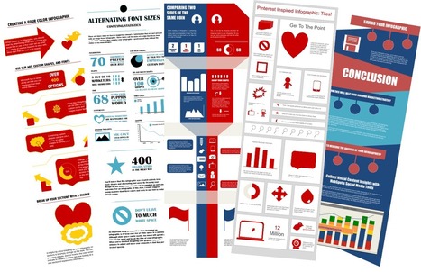
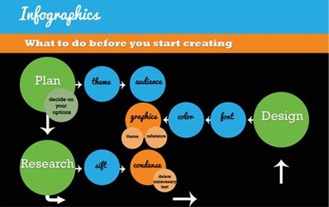
hay 7 consejos clave para crear sus propias infografías: 1. Haga un plan2. Agregue valor primero; estética después3. Cuente una historia4. Sea un gran diseñador … O busque uno. 5. Use la teoría del color6. Pida una opinión7. Hágala fácil de compartir
|
Una presentación con 16 herramientas online gratuitas para crear infografías.
Alfredo Corell's insight:
Una selección de herramientas gratuitas online para crear infografías. Algunas tienen opciones de pago para herramientas avanzadas
From
ht

Let’s be honest, we don’t like to read big pieces of text. Text-heavy graphs are rather difficult for understanding, especially when dealing with numbers and statistics. That is why illustrations and flowcharts are often used for such kind of information. An infographic, or a visual representation of study or data, like anything else, can be done right or wrong. How to create a successful infographic? A good idea and a good design.
Stop by the link for more on what defines an infographic, what contributes to its popularity, as well as the various types of infographics and references for tutorials and best practices.
Additional topics covered include: The major parts of an infographic How to create an infographic Developing ideas & organizing data Research & sources Typography, graphics & color Facts & conclusions Designing & Editing Via Lauren Moss, Monique Walhof, THE OFFICIAL ANDREASCY, Jimi Paradise, Alazne González
|


Visual is just too important to ignore... if you find a reasonably priced good source or tool - use it. http://goo.gl/4hdJZA
Photo editing simply. Am already using Canva and will try these others esp the infographic tool.
add your insight...
998