


You don’t need to be a seasoned data scientist or have a degree in graphic design in order to create incredible data visualisations.
Via Baiba Svenca
Get Started for FREE
Sign up with Facebook Sign up with X
I don't have a Facebook or a X account


 Your new post is loading...
 Your new post is loading...
Your new post is loading...
You don’t need to be a seasoned data scientist or have a degree in graphic design in order to create incredible data visualisations. Via Baiba Svenca
Alfredo Corell's insight:
A super list of tools for creating digital content (infographics, word clouds, conceptual maps, chartas, etc...) for your Digital presentations. 

Two Pens's curator insight,
May 13, 2013 1:14 PM
Piktochart is easy to work with and creates a fair Infographic. I still prefer to hire an art director. It's worth the money to have an intelligent designer with you :-) 
Eddie Thornton's curator insight,
May 13, 2013 3:29 PM
Don't forget to add your perspecitve, your insight as to why this infographic add up to more than just numbers and figures on a chart. 
Ness Crouch's curator insight,
May 14, 2013 4:09 PM
Another great link to help create infographics. I'd like to get more time to create these for class... |

That we have evolved our favorite forms of communication is obvious without more than simply watching our students walk through the hallways. It would be easy to demonize social media and each medium that it provides for human interaction. But it would be educationally valuable to embrace it, turning it into an opportunity for our students to develop an appreciation for the advanced cognitive skills they employ on a daily basis. Why not study the highly visual communication models connecting the thoughts that mean the most to them with the social networks where they live their lives? Via Nik Peachey
Alfredo Corell's insight:
Visual literacy matters Visual literacy is the ability to:
Ness Crouch's curator insight,
March 28, 2014 9:00 PM
Visual Literacy has a new emphasis in the Australian Curriculum. This is certainly a good article to give ideas for embedding some good quality practice in digital learning. 
Rebekah Crouch's curator insight,
August 4, 2015 10:15 PM
Visual Literacy has a new emphasis in the Australian Curriculum. This is certainly a good article to give ideas for embedding some good quality practice in digital learning. 
Nelda Reyes's curator insight,
January 27, 2019 2:52 PM
This article encompasses the use of technology and social media in the classroom as a form of communication. More and more we are creating sites like facebook pages for campuses in order to communicate with parents and community members since that seems to be what we are doing on and off our free time. Always on facebook, snap chat, twitter, etc. so why not use it in education. If the sites are properly and efficiently formed they can be a very resourceful tool to use with students and facilitate learning as well as teaching. The fact that students are able to see a full colored picture or photograph to infer from or make meaning is very different then the typical black and white copy. There is better conferencing and making meaning for textual evidence. Students as well have a more expandable source of resources in order to create their own projects and presentations.

Innovative design crosses over all aspects of education. The American Society for Innovation Design in Education, or ASIDE, seeks to infuse curriculum with new approaches to teaching and thinking. Via juandoming
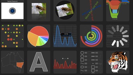
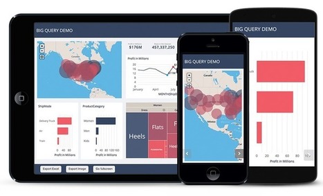
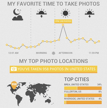
From simple charts to complex maps and infographics, Brian Suda's round-up of the best – and mostly free – tools has everything you need to bring your data to life... A common question is how to get started with data visualisations. Beyond following blogs, you need to practice – and to practice, you need to understand the tools available. In this article, get introduced to 20 different tools for creating visualisations... Via Lauren Moss, Baiba Svenca

Randy Rebman's curator insight,
January 28, 2013 12:33 PM
This looks like it might be a good source for integrating infographics into the classroom. |


Ca donne envie d'essayer : nuage de mots, graphiques, cartes... Par Christopher Ratcliff @ Econsultancy publié le 25/02
Check out how to add visualisations to your presentations.
197