Into the Driver's Seat
454.0K views | +15 today
Follow
Into the Driver's Seat
Building learners' independence through thoughtful technology use
Curated by Jim Lerman
Your new post is loading...
Rescooped by Jim Lerman from iPads, MakerEd and More in Education
Scoop.it!

An Interesting App for Adding Maps to Photos - Educators Technology

An Interesting App for Adding Maps to Photos - Educators Technology | Into the Driver's Seat | Scoop.it
Photo Mapo is a cool iPad app that allows you to add maps to your photos.You can use it to add context to photos you include in your instruction and create mapped collections that can be easily shared with others. Photo Mapo, as we have indicated in an earlier post, is on sale now for free and only for a limited period of time. This deal is valid at least in the Canadian and American iTunes App Stores. Hopefully it will be still free by the time you are reading this post.

Via John Evans
No comment yet.
Rescooped by Jim Lerman from visual data
Scoop.it!

It's Never Been This Easy to Find a Great Topographical Map

It's Never Been This Easy to Find a Great Topographical Map | Into the Driver's Seat | Scoop.it
The USGS is on a open-access roll with topoView, an advanced new map-finding tool.

The cartography arm of the U.S. Geological Survey has been on an open-access roll. First they send their constantly updating stream of satellite imagery to what's basically a public dropbox, so that anyone can use Landsat-8 photographs for free. And now they're introducing topoView, an online archival tool that makes truly accessible the agency's 178,000 topographical maps, dating from 1880 (shortly after the USGS started mapping the country) to 2010.


Via Lauren Moss
Marco Favero's curator insight, May 8, 2015 6:34 AM

aggiungi la tua intuizione ...

Rescooped by Jim Lerman from visual data
Scoop.it!

Infographic: The Literal Meaning Of Every State Name In The U.S.

Infographic: The Literal Meaning Of Every State Name In The U.S. | Into the Driver's Seat | Scoop.it

The New Navel of the Moon. It’s so poetic, isn’t it? (And sure, maybe a bit anatomically confusing.) That’s the real meaning behind the state name New Mexico, and it’s one of many etymological gems uncovered by cartographers Stephan Hormes and Silke Peust while they were creating this U.S. map depicting the original, literal meanings behind the states and cities we know today.


“The inspiration was my interest in etymology and my profession as a cartographer," Hormes tells Co.Design. "I started to exchange real names for rue names and the world became a strange romantic continent. It’s obvious to me that after five years of changing names on maps, I must do it. No map is safe.”


Via Lauren Moss
No comment yet.
Rescooped by Jim Lerman from visual data
Scoop.it!

A Guide to Infographic Elements

A Guide to Infographic Elements | Into the Driver's Seat | Scoop.it

When it comes to visualizing data, it’s important to pick the right graph and the right kind of data range. Make it too detailed, and information gets lost and the reader leaves confused. Too simplified, and your data’s integrity is weakened.


Choosing the right infographic element shouldn’t be an art but common sense. After all, it’s an infographic – readers should get the gist of things at first glance and not have to get crossed-eyed in making sense of things...


Via Lauren Moss
Lauren Moss's curator insight, April 10, 2013 6:55 AM

General reference for basic visualization design elements, applications, and best practices...

Rescooped by Jim Lerman from Curriculum Resources
Scoop.it!

New map reveals the world's most toxic countries

New map reveals the world's most toxic countries | Into the Driver's Seat | Scoop.it
The Eco Experts created a world map ranking the most toxic countries in the world and said Saudi Arabia tops the list.

Via Tania Gammage
No comment yet.
Rescooped by Jim Lerman from Marc's private collection
Scoop.it!

Total World Population

Total World Population | Into the Driver's Seat | Scoop.it

Via Marc Rougier
Marc Rougier's curator insight, August 23, 2013 12:51 PM

Honey, I shrunk Canada and Russia!


Via Jérôme Bouscaut

Rescooped by Jim Lerman from visual data
Scoop.it!

Why Historical Maps Still Matter So Much, Even Today

Why Historical Maps Still Matter So Much, Even Today | Into the Driver's Seat | Scoop.it

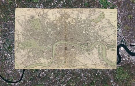
With 150,000 or so old print maps to his name, David Rumsey has earned his reputed place among the world's "finest private collectors." He continues to expand his personal trove as well as the digitized sub-collection he makes open to the public online — some 38,000 strong, and growing.


He's created a series of interactive maps that layer old prints onto the Google Earth and Google Maps platforms, and this summer he plans to launch a geo-referencing tool (similar to one recently introduced by the British Library) that lets users get involved in the digital mapping process themselves.

While preparing for this next expansion of his online map empire, Rumsey remains fascinated by "the power of putting these images up and letting them go," he says.

"Maps have a way of speaking to people very straightforward," he says. "You don't have to have a lot of knowledge of map history or history in general. To me they're perfect tools for teaching history to the public."


Via Lauren Moss
No comment yet.