


 Your new post is loading...

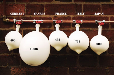

Real life data visualization is to be an upcoming trend, called physical infographics or real world visualization. They visualize data with real objects, often combined with typography.
Real Life Infographics are different than other inforgraphics in that they rely much more on photographs instead of a purely digital medium. Moving away from the Everthing-Is-Possible-Unicorn-Utopia of Illustrator is an interesting limitation, as well as a simplifying one. As designers we like to come up with creative ways to display information that will still blow your mind, despite any technical limitations. The real world isn't perfect, and therefore it may not be as accurate as abstract shapes like graph bars. Even though these visualizations still strive for accuracy, you will notice that the context of these graphics will become much more important than precision.
Via Lauren Moss


I have a thing for "real life" data viz.
Brilliant use of data and materials to create a 3D story. Wow.