


 Your new post is loading...

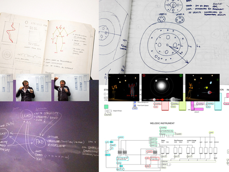

It’s been said that we’re living in the golden age of data visualization. And why shouldn’t we be? Every move we make is potential fodder for a bar chart or line graph. Regardless of how you feel about our constant quantification, its been a boon for designers who have made some exceptional infographics—and some not…
Via luiy


A new book from graphic guru and School of Visual Arts professor Steven Heller and designer Rick Landers looks at that the process of more than 200 designers, from first sketch to final product. The Infographic Designers Sketchbook is almost exactly what it sounds like. The 350-page tome is essentially a deep dive into the minds of data designers. Heller and Landers have chosen more than 50 designers and asked them to fork over their earliest sketches to give us insights into how they turn a complex set of data into coherent, visually stunning data visualizations. “You see a lot more unbridled, unfettered work when you’re looking at a sketchbook,” says Heller. “You might be looking at a lot of junk, but even that junk tells you something about the artist who is doing it.”