Journalisme graphique
142.0K views | +0 today
Follow
Journalisme graphique
La veille de Wedodata, studio de datavisualisations : wedodata.fr
Curated by Karen Bastien
Your new post is loading...
Rescooped by Karen Bastien from visual data
Scoop.it!

Nicholas Felton Had 95,000 Conversations Last Year And Mapped Each One

Nicholas Felton Had 95,000 Conversations Last Year And Mapped Each One | Journalisme graphique | Scoop.it
Life quantification pioneer Nicholas Felton's latest annual report is his most ambitious to date.

For the last nine years, Nicholas Felton--who you may know best for inspiring the Facebook timeline or creating the life-logging app Reporter--has been recording some aspect of almost every moment of his life. And each year, he turns this data into a elegant, printed book that visualizes the year called The Feltron Report...


Via Lauren Moss
Farid Mheir's curator insight, September 26, 2014 5:29 PM

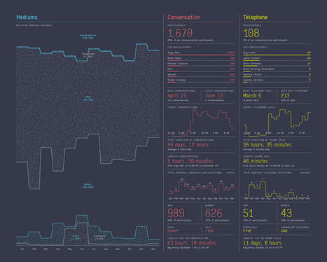
The Felton report is a beautiful peeping hole into someone's life when they start to quantify themselves. Focussed on fairly benign problem space - conversations during the year - it shows what possibilities, both good and bad, lie within the quantified-self movement which is bound to explode with the availability of Apple watch and others alike.


Of course it brings tremendous opportunities for monitoring someone's life in order to improve it. Whether it is by measuring exercice (as we do today with step trackers) or heart rate or glucose levels in order to improve health or medical diagnosis. In the context of business, organizations can monitor employees in order to minimize injuries or prevent illness and time loss due to sickness.


There is of course the dark side, where all this data, when made available without our consent or knowledge, can be used to track us and restrict our privacy or our rights. This is already happening in the contexte of government surveillance (ie. Edward Snowden http://sco.lt/5k4B29) or internet browsing tracking (ie. data brokers http://sco.lt/79yNZh)

Rescooped by Karen Bastien from visual data
Scoop.it!

40 Beautiful Infographic Designs

40 Beautiful Infographic Designs | Journalisme graphique | Scoop.it
An information graphic in its simplest form is a visual interpretation of data.

Though an incredibly useful form of data presentation, infographics have traditionally been an underwhelming sector of the design world.

That being said, there are some brilliant designers out there who have turned this form of data visualization into beautiful and creative works of art.

In appreciation of those designers who find beauty in data, here is a collection of 40 curated infographic designs that aim to inspire...


Via Lauren Moss
No comment yet.
Rescooped by Karen Bastien from visual data
Scoop.it!

The World as 100 People / Infographic

The World as 100 People / Infographic | Journalisme graphique | Scoop.it

A demographic portrait of humanity if the world were 100 people.


From data source, 100people.org:

The world population has now reached 7 billion people. This milestone inspired us to conduct research to update our statistics, and the changes over the past 5 years are remarkable. In 2006, only 1 person out of 100 would have had a college education-- today that number has jumped to 7 thanks in part to advances in higher education in Asia. The detailed research and source information can be found here and the statistics provided by Donella Meadows in 1990 that originally inspired our project can be viewed here.
Via Lauren Moss
Aurélia-Claire Jaeger's curator insight, March 29, 2013 6:03 AM

J'aime bien ce coup d'oeil sur notre monde ...

Rescooped by Karen Bastien from visual data
Scoop.it!

Interaction Design for Data Visualizations

Interaction Design for Data Visualizations | Journalisme graphique | Scoop.it
Interactive data visualizations are an exciting way to engage and inform large audiences. They enable users to focus on interesting parts and details, to customize the content and even the graphical form, and to explore large amounts of data. At their best, they facilitate a playful experience that is way more engaging than static infographics or videos.

Several ideas and concepts of interaction design for data visualizations are presented in this post, using 11 examples from the web. The overall concepts featured include:

The Basics: Highlighting and Details on Demand Making More Data Accessible: User-driven Content Selection Showing Data in Different Ways: Multiple Coordinated Visualizations Showing Data in Different Ways: User-driven Visual Mapping Changes Integrating Users’ Viewpoints and Opinions

Visit the complete article for numerous links, useful visuals and specific details on how to understand, implement and evaluate interactive design elements used in data visualization design.


Via Lauren Moss
Hans's comment, October 2, 2012 5:09 AM
Great article, I really like the idea of interactive information with details on demand. As an interaction designer I always try to balance content management and usability. Here are some interesting examples that made me consider a complete information surface vs a deep level on demand architecture.
JongWon Kim's comment, October 9, 2012 10:39 PM
really beautiful!!