Journalisme graphique
142.0K views | +0 today
Follow
Journalisme graphique
La veille de Wedodata, studio de datavisualisations : wedodata.fr
Curated by Karen Bastien
Your new post is loading...
Rescooped by Karen Bastien from visual data
Scoop.it!

Data Wall: IBM Think Exhibit

Data Wall: IBM Think Exhibit | Journalisme graphique | Scoop.it

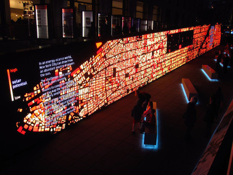
Located on Jaffe Drive at Lincoln Center in New York, the THINK exhibit combined three unique experiences to engage visitors in a conversation about how we can improve the way we live and work. 

The IBM data wall was the introduction to the Think Exhibit at the Lincoln Center. This exhibit celebrated its centennial year, and 100 years of human progress.

The wall aimed to educate the public about five areas of interest to the New York community. These included air quality, water waste, potential solar energy, fraud detection, and traffic sensing.


Visit the portfolio link to view detail images of the Data Wall, as well as concept sketches and explanations for the design for the solar and traffic sections...


Via Lauren Moss
Aji Black Stone's comment, November 16, 2012 11:11 AM
wow
Rescooped by Karen Bastien from visual data
Scoop.it!

Interaction Design for Data Visualizations

Interaction Design for Data Visualizations | Journalisme graphique | Scoop.it
Interactive data visualizations are an exciting way to engage and inform large audiences. They enable users to focus on interesting parts and details, to customize the content and even the graphical form, and to explore large amounts of data. At their best, they facilitate a playful experience that is way more engaging than static infographics or videos.

Several ideas and concepts of interaction design for data visualizations are presented in this post, using 11 examples from the web. The overall concepts featured include:

The Basics: Highlighting and Details on Demand Making More Data Accessible: User-driven Content Selection Showing Data in Different Ways: Multiple Coordinated Visualizations Showing Data in Different Ways: User-driven Visual Mapping Changes Integrating Users’ Viewpoints and Opinions

Visit the complete article for numerous links, useful visuals and specific details on how to understand, implement and evaluate interactive design elements used in data visualization design.


Via Lauren Moss
Hans's comment, October 2, 2012 5:09 AM
Great article, I really like the idea of interactive information with details on demand. As an interaction designer I always try to balance content management and usability. Here are some interesting examples that made me consider a complete information surface vs a deep level on demand architecture.
JongWon Kim's comment, October 9, 2012 10:39 PM
really beautiful!!