Journalisme graphique
142.0K views | +0 today
Follow
Journalisme graphique
La veille de Wedodata, studio de datavisualisations : wedodata.fr
Curated by Karen Bastien
Your new post is loading...
Rescooped by Karen Bastien from visual data
Scoop.it!

Top 10 Video Infographics of 2012

Top 10 Video Infographics of 2012 | Journalisme graphique | Scoop.it

In the great tradition of end of year blog posts, here's a feature on the top 10 video infographics of 2012.


Over the year, I’ve curated 222 videos on this site [videoinfographics.net], and reviewed hundreds more. As part of my process of watching and curating so many infographic videos, I started to keep my own 3-star ranking system of these videos in a spreadsheet to help me keep track of those that I think are the most outstanding. The result was about 60 3-star videos in 2012. That’s too many to feature in a top X list so I turned to the Likes and Comments of my top ranked videos (and in doing so eliminated videos only featured on YouTube since YouTube comments are pretty much trash). This resulted in a list of 10 videos that had triple digit Likes on their Vimeo pages.

Voila! A top 10 list. So, in a ascending order, here are the top 10 most liked animated video infographics featured here in 2012, including number of Likes and Comments for each (as of December 30, 2012).
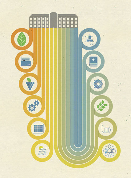

Via Lauren Moss
No comment yet.
Rescooped by Karen Bastien from visual data
Scoop.it!

40 Beautiful Infographic Designs

40 Beautiful Infographic Designs | Journalisme graphique | Scoop.it
An information graphic in its simplest form is a visual interpretation of data.

Though an incredibly useful form of data presentation, infographics have traditionally been an underwhelming sector of the design world.

That being said, there are some brilliant designers out there who have turned this form of data visualization into beautiful and creative works of art.

In appreciation of those designers who find beauty in data, here is a collection of 40 curated infographic designs that aim to inspire...


Via Lauren Moss
No comment yet.
Rescooped by Karen Bastien from visual data
Scoop.it!

The Intersection of Geography & Data: 2012's Best Maps

The Intersection of Geography & Data: 2012's Best Maps | Journalisme graphique | Scoop.it

It's been an eventful year for cartography.


Development and disaster continue to mold the physical world, but for mapmakers, keeping up with geographic changes is busy work -- a tweaked direction here, a freeway exit there. It's very important busy work, as we learned this September when Apple reminded us not to take a good map for granted.


The intersection of geography and data, though, is just beginning to fill out. Together with interactive functions like sliders, timelines, and embedded information, the best new maps resemble Rand McNally's about as much as movies look like photographs. Creating an accurate representation of geography and infrastructure is only the tip of the iceberg.

What happens when you integrate statistics about rising seas, gang affiliations, metaphors and beer?


A whole new understanding of the way the world works. And some pretty sweet maps. Without further ado, the top favorite maps of the year...


(visit the article link for the maps and associated links)


Via Lauren Moss
Lauren Moss's curator insight, December 20, 2012 4:40 PM

A gallery of different approaches to visualizing topics covering a broad range of data through cartography and mapping...

Examples are supplemented with a summary of the intent, process + graphics of each map, noting the elements that make for successful representations of specific concepts, ideas + data.

From urban issues to voting trends to navigation apps and software, maps are tools that can be highly effective in data visualization, as evidenced in this cartographic collection curated by the Atlantic Cities.