We live in a world steeped in graphic information. From Google Maps and GIS to the proliferation of infographics and animated maps, visual data surrounds us.
While we may think of infographics as a relatively recent development to make sense of the immense amount of data available on the Web, they actually are rooted in the 19th century.
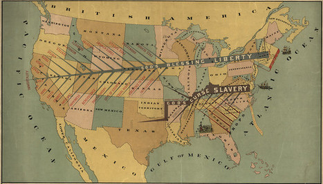
Two major developments led to a breakthrough in infographics: advances in lithography and chromolithography, which made it possible to experiment with different types of visual representations, and the availability of vast amounts of data, including from the American Census as well as natural scientists, who faced heaps of information about the natural world, such as daily readings of wind, rainfall, and temperature spanning decades.
But such data was really only useful to the extent that it could be rendered in visual form. And this is why innovation in cartography and graphic visualization mattered so greatly...
Via
Lauren Moss


 Your new post is loading...

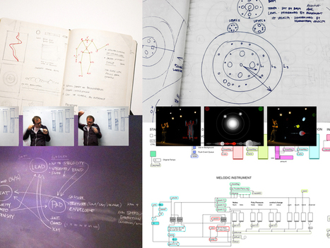


A new book from graphic guru and School of Visual Arts professor Steven Heller and designer Rick Landers looks at that the process of more than 200 designers, from first sketch to final product. The Infographic Designers Sketchbook is almost exactly what it sounds like. The 350-page tome is essentially a deep dive into the minds of data designers. Heller and Landers have chosen more than 50 designers and asked them to fork over their earliest sketches to give us insights into how they turn a complex set of data into coherent, visually stunning data visualizations. “You see a lot more unbridled, unfettered work when you’re looking at a sketchbook,” says Heller. “You might be looking at a lot of junk, but even that junk tells you something about the artist who is doing it.”