Journalisme graphique
142.0K views | +2 today
Follow
Journalisme graphique
La veille de Wedodata, studio de datavisualisations : wedodata.fr
Curated by Karen Bastien
Your new post is loading...
Rescooped by Karen Bastien from visual data
Scoop.it!

40 Beautiful Infographic Designs

40 Beautiful Infographic Designs | Journalisme graphique | Scoop.it
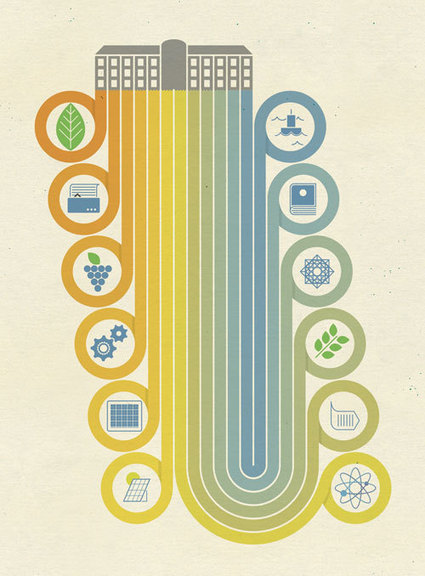
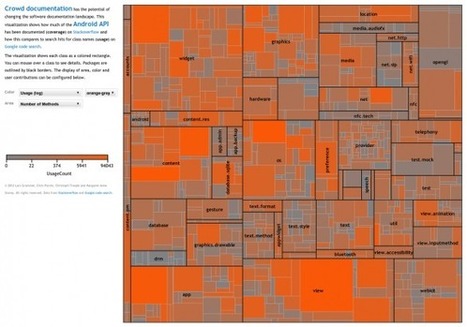
An information graphic in its simplest form is a visual interpretation of data.

Though an incredibly useful form of data presentation, infographics have traditionally been an underwhelming sector of the design world.

That being said, there are some brilliant designers out there who have turned this form of data visualization into beautiful and creative works of art.

In appreciation of those designers who find beauty in data, here is a collection of 40 curated infographic designs that aim to inspire...


Via Lauren Moss
No comment yet.
Rescooped by Karen Bastien from visual data
Scoop.it!

Interaction Design for Data Visualizations

Interaction Design for Data Visualizations | Journalisme graphique | Scoop.it
Interactive data visualizations are an exciting way to engage and inform large audiences. They enable users to focus on interesting parts and details, to customize the content and even the graphical form, and to explore large amounts of data. At their best, they facilitate a playful experience that is way more engaging than static infographics or videos.

Several ideas and concepts of interaction design for data visualizations are presented in this post, using 11 examples from the web. The overall concepts featured include:

The Basics: Highlighting and Details on Demand Making More Data Accessible: User-driven Content Selection Showing Data in Different Ways: Multiple Coordinated Visualizations Showing Data in Different Ways: User-driven Visual Mapping Changes Integrating Users’ Viewpoints and Opinions

Visit the complete article for numerous links, useful visuals and specific details on how to understand, implement and evaluate interactive design elements used in data visualization design.


Via Lauren Moss
Hans's comment, October 2, 2012 5:09 AM
Great article, I really like the idea of interactive information with details on demand. As an interaction designer I always try to balance content management and usability. Here are some interesting examples that made me consider a complete information surface vs a deep level on demand architecture.
JongWon Kim's comment, October 9, 2012 10:39 PM
really beautiful!!