Public Relations & Social Marketing Insight
444.4K views | +751 today
Follow
Public Relations & Social Marketing Insight
Social marketing, PR insight & thought leadership - from The PR Coach
Curated by Jeff Domansky
Your new post is loading...
Scooped by Jeff Domansky
Scoop.it!

29 new inspiring responsive designs on the web | The Next Web

29 new inspiring responsive designs on the web | The Next Web | Public Relations & Social Marketing Insight | Scoop.it

Everyone who is anyone is talking about responsive design these days — and everyone certainly has a strong opinion about it. But, whether you love it or hate it, responsive design is bound to go mainstream in 2013. Every business from Harvard to AOL are embracing responsive design as the wave of the future, and more websites are popping up on every device with an internet connection with conforming layouts.


Take a look at these new, smart and stylish responsive layouts and get inspiration for your next website. Spanning across different kinds of companies, strategies and aesthetics, all of these websites have one thing in common: great responsive design.


What’s your favorite responsive design website?

  
Jeff Domansky's insight:

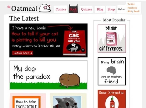
These are truly impressive designs. Browse and be inspired...

No comment yet.
Scooped by Jeff Domansky
Scoop.it!

Unforgettable: 10 Purple Cow Websites to Spark Your Imagination and Your Creativity

Unforgettable: 10 Purple Cow Websites to Spark Your Imagination and Your Creativity | Public Relations & Social Marketing Insight | Scoop.it
In today’s post we’re going to go over 10 websites that have left a lasting impression on their visitors. Now, they are not all business websites – but they are inspirational.


On this blog we talk a lot about websites that have effective calls to action, non-cluttered home pages, and trustworthy designs with the intention of showing what techniques help improve conversions.


After years of showing our readers examples of what works and what doesn’t, one thing we have noticed is an awful lot of similarity between website designs in the same space.


My hunch is that either:

1.  After years of people copying each other’s designs, SaaS businesses have determined that this is what a SaaS website should look like.
2.  Or, after years of individual A/B testing, this is the winning outcome of what an effective website should look like.


I guess I lean more toward point #1…


But why not make your site unforgettable?


[This is a terrific post by @seanvwork. The 11 examples show website design, creativity and usability best practices. Lots of great lessons! ~ Jeff ]

Ivan Ospina G's comment, October 31, 2012 8:52 PM
I like it
Scooped by Jeff Domansky
Scoop.it!

Concept shows how good Facebook could look with a clever redesign | memeburn

Concept shows how good Facebook could look with a clever redesign | memeburn | Public Relations & Social Marketing Insight | Scoop.it

While there’s always an outcry anytime Facebook changes anything, the essential structure of the social networking site hasn’t really radically altered over the years. The biggest change to data was Timeline, but if user interface designer Fred Nerby had his way, those updates would seem like nothing more than a tiny tweak.


Nerby decided to create a mockup of what Facebook could look like — on desktop or tablet — and posted the concept to his Behance profile. It features a more fluid, grid-like layout, greater emphasis on photos and a close friends panel which would allow you to cut out the rubbish updates and focus only on the people who are important to you. He also focused on creating options to hide clutter and expanded the dark messenger column in Facebook’s current apps to feature in other areas, like profile pages.


Nerby said he aimed to create a better understanding between user content and how it is displayed...

Jeff Domansky's insight:

Hate FB but this is a #creative WOW: Concept shows how good Facebook could look with a clever redesign...

No comment yet.