 Your new post is loading...
Online merchants could always use some free expert advice from the design community. There is a wide variety of free ebooks available to help. Here is a list of helpful ebooks on design. There are titles on typography, classic design, color theory, user-experience design, logos, brand building, creativity, and more. All of these ebooks are free.
As reported by Fast Company and Inc. Magazine, a new EyeQuant study has shown that there's a surprisingly strong relationship between the "visual clarity" of a website (as rated by an algorithm) and its bounce rate. In fact, the results suggest that up to one-third of a user's decision to stay or bounce comes down to a snap judgment of whether or not the page is too cluttered. In this post, we'll take a closer look at the data and the methodology behind the study.
Why study the impact of visual clarity?
Within the design community, there's been a definite trend towards simpler, more stripped-back design. At EyeQuant, we've seen many of our customers "de-clutter" their way to higher conversion rates, and even observed that amongst a collection of online retailers, the ones with "cleaner" design were growing the fastest.
What we wanted to understand is this: does "clean" design have a positive impact on user engagement across the board, or is it limited to specific cases like overly cluttered-sites or retail?
In terms of design, the minimalist aesthetic is the visual representation of this concept. Even if in the early days of this style it was very difficult for the designers to achieve its simplicity and clean lines, they have learned to “declutter” the visual to the point of it being the second nature. However, some of the designers take it a step further and cut out almost everything from the design.
Indeed, even if the latest web designs with loud color, trendy headers, and stunning imagery are really attractive, sometimes, it’s nice to see and admire the everlasting minimalist style. The ultra-minimalist websites in this list focus on composition and typography to create clean and simple visuals, and the naked designs are as beautiful as those full of glamour.
...But to help you narrow your search, we've done a bit of our own curation of the best Instagram accounts to follow for design inspiration. We've broken the list down by category: illustration, graphic design, pop art and installation, color palettes, street art, photography, typography, and calligraphy -- although, you might notice that some of the work below could fall onto more than one list. Check out how these artists are sharing their work with the world -- we're sure you'll find them as inspiring as we do....
Images are a vital component of any website, and using the right ones can enhance both your content and design. The problem lies in finding the right graphics without resorting to the same free stock images everyone else uses. If you really want to set your site apart, there’s an alternative to stock images – you can create your own. The best part is, you don’t need to be a designer to get it done. Nowadays, there are plenty of tools that can help you create stylish graphics with only a little practice, and they’re a great option if you don’t have the budget to hire a designer. In this article, we’ll talk about why images are so important for any website, then we’ll introduce you to three tools that can help you create your own custom graphics. Let’s get started!...
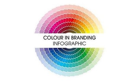
Are you in the process of choosing a colour scheme for your new website? Perhaps you’re wondering if your existing colour scheme is right for you? Iconic Fox share their guide to colour and branding in this infographic....
ON FRIDAY EVENING, inside an old-movie-house-cum-art-gallery at the heart of San Francisco's Mission district, Google graphics guru Blaise Agüera y Arcas delivered a speech to an audience of about eight hundred geek hipsters. He spoke alongside a series of images projected onto the wall that once held a movie screen, and at one point, he showed off a nearly 500-year-old double portrait by German Renaissance painter Hans Holbein. The portrait includes a strangely distorted image of a human skull, and as Agüera y Arcas explained, it's unlikely that Holbein painted this by hand. He almost certainly used mirrors or lenses to project the image of a skull onto a canvas before tracing its outline. "He was using state-of-the-art technologies," Agüera y Arcas told his audience. Neural networks are not only driving the Google search engine but spitting out art for which some people will pay serious money.His point was that we've been using technology to create art for centuries—that the present isn't all that different from the past. It was his way of introducing the gallery's latest exhibit, in which every work is the product of artificial neural networks—networks of computer hardware and software that approximate the web of neurons in the human brain. Last year, researchers at Google created a new kind of art using neural nets, and this weekend, the tech giant put this machine-generated imagery on display in a two-day exhibit that raised roughly $84,000 for the Gray Area Foundation for the Arts, a San Francisco nonprofit devoted to the confluence of art and tech....
Websites that are considered as modern and fresh today, will not be treated in the same manner tomorrow because Web design trends are changing constantly with time. Professionals associated with the industry are aware of the fact that every year brings new challenges and opportunities in the field of web design and development. Therefore, it is important to know how to make them flexible and adaptive towards the rapidly changing trends of website design. Here, we have put together a list of web design trends that will have a bigger impact in 2018....
The idea pops into my mind almost immediately. For weeks, amid my dad’s barrage of doctor’s appointments, medical tests, and treatments, I keep the notion to myself.
I dream of creating a Dadbot—a chatbot that emulates not a children’s toy but the very real man who is my father. And I have already begun gathering the raw material: those 91,970 words that are destined for my bookshelf....
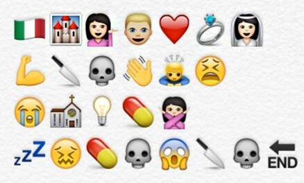
Many stories are told via emojis, but Twitter and London’s Royal Opera House are taking it to the next level on Monday, July 17, in honor of World Emoji Day, using them to tell the story of an entire opera. This isn’t the first collaboration between these unlikely partners: They first joined forces to tweet an opera in August 2009. On Monday, the Royal Opera House will be tweeting all day long using emojis—and only emojis—to share the story of famous operas and ballets. There will be a new tweet every 30 minutes....
Japan prides itself on ludicrous advertising. But every year, a few commercials go beyond—transcending the market’s typical weirdness and reaching a state of truly inspired lunacy. “Gravity Cat,” which won a silver Lion in Cannes, came close, but its oddness was relatively mild—and also wrapped in jaw-dropping craft. But thankfully, another silver Lion winner from Japan has stepped in to take the prize. Check out the spot below, from agency Asatsu-DK and production company Spoon. It would be a spoiler to reveal the advertiser, so just sit back and soak up all the screaming and yelling from actors whose true character reveals itself only at the very end....
As we said in the “9 graphic design trends you need to be aware of in 2017”, this is the year when we are witnessing a growing desire for counterbalancing the doubt with authenticity and simplicity. And we can see this not just for general graphic design trends, but also for web design, packaging, print design and especially for logo design trends. That said, let’s take a closer look at the logo design trends that define 2017. Some of them are new, other are older trends that confirmed the last year and will become more popular in 2017....
The principles of minimalism in web design are that a website (and other mediums as well) should be stripped down to their bare bones, while carefully making use of whitespace and improving readability with clearer typography. When implemented correctly, the result will allow users to focus on what’s truly important without being distracted by non-essential elements. While this may sound easy, it can be difficult deciding what the truly important elements are and what’s little more than decoration. It can also be risky. Accidentally removing a seemingly innocuous element could be deemed critical by the user and could result in the wrong message (or worse, no message at all) being delivered to your target audience....
|
Talking to people and potential customers is useful for learning but not validating. To validate your idea you need really need both acquisition and activation data. These are the first two metrics that matter when determining whether you have a product or business. Acquiring users through advertising channels and activating or converting them shows real validation. Because building a landing page requires less effort than starting a business or building a product, this can be an easier way to validate or invalidate an idea. By using learnings from customer interviews and basic market research one can look at setting up a landing page for further validating or invalidating your idea....
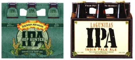
Ten years ago, a lot of breweries found they could get away with soliciting a friend to design their beer packaging. Not anymore.
With so many beers competing for attention on the shelves, standout beer labels have become a critical part of any brewery's marketing strategy.
So which breweries have come up with those really standout designs?
The logo is the most essential part of making any brand recognizable. Hiring a professional designer to create a custom logo can definitely be expensive, especially for most small business owners and individuals who don’t have the budget. Fortunately, there is a seemingly endless supply of Web-based solutions to help you create logos with relative ease - and these are some of our favorites. Once you're done, head on over to Logo Rank, an AI tool that critiques your new logo design. ...
Logo Crunch is a multi-resolution logo maker, it uses computer vision to make your high-res logo legible at lower resolutions. Use it for a website favicon, iOS app icon or Android app icon.
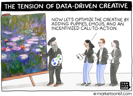
We need both art and science in marketing — the “MadMen” and “MathMen.” I think the most compelling campaigns of the future will bring together the greatest creativity and the greatest insight informed by data. But creatives and data scientists can make uneasy bedfellows. It’s one thing to optimize media; it’s another to optimize the creative itself. As marketing increasingly becomes data-driven, how will this impact creativity?...
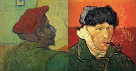
"Between two such beings as he and I, the one a perfect volcano, the other boiling too, inwardly, a sort of struggle was preparing." In February of 1888, a decade after Van Gogh found his purpose, he moved to the town of Arles in the South of France. There, he exploded into a period of immense creative fertility, completing more than two hundred paintings, one hundred watercolors and sketches, and his famous Sunflowers series. But he also lived in extreme poverty and endured incessant inner turmoil, much of which related to his preoccupation with enticing Gauguin — whom he admired with unparalleled ardor (“I find my artistic ideas extremely commonplace in comparison with yours,” Van Gogh wrote) and who at the time was living and working in Brittany — to come live and paint with him. This coveted cohabitation, Van Gogh hoped, would be the beginning of a larger art colony that would serve as “a shelter and a refuge” for Post-Impressionist painters as they pioneered an entirely novel, and therefore subject to spirited criticism, aesthetic of art. Van Gogh wrote to Gauguin in early October of 1888:I’d like to see you taking a very large share in this belief that we’ll be relatively successful in founding something lasting. Despite his destitution, Van Gogh spent whatever money he had on two beds, which he set up in the same small bedroom. Seeking to make his modest sleeping quarters “as nice as possible, like a woman’s boudoir, really artistic,” he resolved to paint a set of giant yellow sunflowers onto its white walls. He wrote beseeching letters to Gauguin, and when the French artist sent him a self-portrait as part of their exchange of canvases, Van Gogh excitedly showed it around town as the likeness of a beloved friend who was about to come visit.Gauguin finally agreed and arrived in Arles in mid-October, where he was to spend about two months, culminating with the dramatic ear incident....
A METRONOME TICKS time. Not for the student, but for the teacher, who plays a short piano melody. Without missing a measure, the student follows with an improvised, yet derivative, cello run. The student plays the same run again, and then again. "I have it looping, actually, so you can hear the response over and over again," says the teacher, Jesse Engel, a computer scientist with Google Brain. "And you can hear some similarities with what I played, but it’s not doing the job of trying to replicate what I played. It’s trying to continue it in a meaningful way." The student here is an artificial intelligence algorithm; the instrument, a synthesizer. And the real lesson is teaching an audience of hundreds how computers might someday become capable of producing real works of art. Engels is onstage at NYU's Skirball Center for the Performing Arts as part of the 2017 World Science Festival, along with three like-minded experts. Each of them is there to showcase how they nurture creativity in computers....
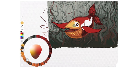
While many imaging apps’ tools closely resemble those used by artists in the real world – such as brushes and pens – the color picker feels like a completely digital device. A new project from the folks at Adobe Research and University of Toronto reimagines it as a skeuomorphic palette that’s designed to be more natural and intuitive, while allowing for the creation of harmonious color schemes and works of art. Instead of forcing users to choose from colors from across the entire spectrum, Playful Palette presents you with an interface that’s more like how you’d mix paint in real life. Pick a bunch of colors represented as paint blobs, make a puddle with them, blend them with lighter and darker hues by pushing in different directions and get a gradient of colors to work with. Hit ‘play’ on the clip for a better idea of what I’m talking about:...
If a 150-million-year-old Brachiosaurus could talk, what would it say?You can find out at Chicago’s Field Museum of Natural History, where many of the exhibits will soon tell their own stories using local voices, thanks to an initiative from local museum advertising specialist Leo Burnett. The agency wrote more than 100 short scripts, each a paragraph or two long, designed to capture the “voice” of various plants, animals and minerals in the museum’s permanent collection. The write-ups combine history and humor. For example, the Brachiosaurus bemoans its girth while also discussing the contributions of paleontologist Elmer Riggs. Everyday Chicagoans are invited to record the first-person monologues in a special pop-up audio booth that is traveling around the city this summer. (It visited Chinatown this weekend.) Ultimately, the best voiceovers will be accessible via smartphone for Field visitors to enjoy on audio tours....
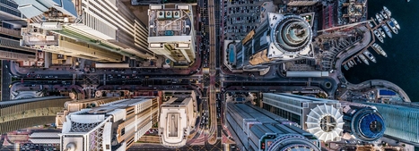
Dronestagram, a drone photography sharing website and community has collaborated with National Geographic to pick the best pictures out of thousands of entries. the categories – which include people, nature and urban context – showcase a selection of impressive perspectives. from the windings roads of transylvania to lily ponds in vietnam, the shortlist presents the best seen footage from way up high.
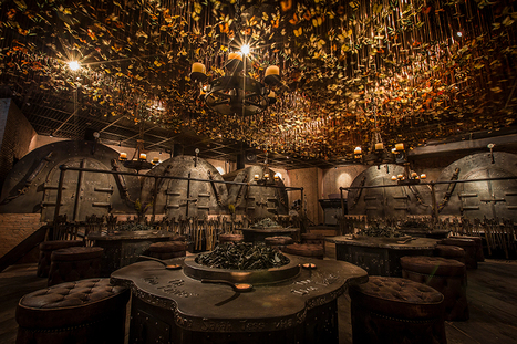
Named ‘the iron fairies’, the mysterious interiors of this bar conjures up scenes from a fairytale book or Lord of the Rings. With three locations: Bangkok, Hong Kong and Tokyo, the underground den is reminiscent of a blacksmith’s workshop; reflected in the iron, timber and leather materiality and the curious decorations all across the eclectic interior. Created by designer Ashley Sutton, a distinctive element of the iron fairies is the ceiling enveloped with 10,000 preserved butterflies that suspend over the main ‘workshop’ room furnished with low seating and circular tables. Rooms branch out to form individually designed ‘furnaces’ and ‘casting rooms’, offering private spaces for smaller groups. The element of enchantment is distilled into every detail of the bar interior, with the concept itself deriving from sutton’s days working in the underground iron-ore mines in Western Australia. With this, the décor follows a fantasy imagined by the designer where ore miners stumble upon little winged spirits, mixing roughly hewn wood, massive rusty cogs, rickety piping, and walls lined with vials of fairy dust....
Appealing to the emotions of your website users is nothing new and certainly something that marketers and branding experts will have plenty of experience and specialist knowledge of. But because the online world is becoming so saturated with content, and because first impressions count, making people feel instantly at home on your site has never been more important. With SEO copywriters working hard on telling that all-important brand story and stunning images that inspire and uplift your visitors, you might think you’ve got everything covered. But if you haven’t looked at your use of colours in a while, you might be missing a trick. The simple fact is that colour is the first thing that visitors assimilate when they arrive on your site. It comes before images, typefaces, body copy or other online content, and without people even realising it, can change the way they think and act. Humans are programmed to equate colours to emotions, so whether you aim to soothe, energise, excite or promote trust, it’s essential to choose your colours wisely....
|


Great design resources. Did I mention free?