


This article will guide you step-by-step how to create the split image effect. Breaking an image into multiple pieces gives a unique visual look to design.
Via Baiba Svenca, massimo facchinetti
Get Started for FREE
Sign up with Facebook Sign up with X
I don't have a Facebook or a X account


 Your new post is loading...
 Your new post is loading...
Your new post is loading...
This article will guide you step-by-step how to create the split image effect. Breaking an image into multiple pieces gives a unique visual look to design. Via Baiba Svenca, massimo facchinetti
michel verstrepen's insight:
Cool! Here's a tutorial that will teach you how to improve your slides visually. Works with PowerPoint 2013. 
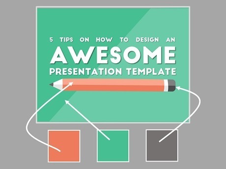
There are some fundamental truths to making really awesome presentation templates, and I am going to guide you through them in five easy steps. Via Baiba Svenca

Flaviu Fesnic's curator insight,
August 6, 2015 3:00 AM
5 great tips from Presentation Panda for those who design their own presentation templates. 
Muga's curator insight,
August 10, 2015 4:47 AM
5 great tips from Presentation Panda for those who design their own presentation templates. 
Roger L. Gill's curator insight,
August 30, 2015 7:49 AM
More great info on creating awesome presentations.

Is your website ready for 2015? Here are 5 of the new trends to look out for in the coming year. From Mobile Focus, Interactive, Flat, Simple, and Single Page Designs – stay ahead of the curve and get on trend for the New Year. Our easy to follow visual guide will show you the way. Via Lauren Moss, Alfonso Gonzalez

Tony Guzman's curator insight,
January 29, 2015 9:55 AM
This infographic shares five trends in web design for this year. 
Scott Wachtel's curator insight,
March 13, 2015 4:05 PM
Major points are spot on. if you're not optimized for mobile reach you are limiting your exposure and potential income.

HOW art director Adam Ladd shows us 10 more of the top design websites, many of which are sure to give you the graphic design inspiration you crave. Via Martin (Marty) Smith

Martin (Marty) Smith's curator insight,
January 5, 2015 4:36 PM
Great resources from one of my favorite web design teachers.

In case you are a part-time designer with little knowhow of communication design, below is an infographic that would work as a layperson’s handbook Via Audrey Bardon
Beautiful Unusual Navigation Designs for Inspiration. Selection of Awwwards websites with a strong presence of unusual navigation. An effective navigation design is crucial for a website Via Martin (Marty) Smith
Martin (Marty) Smith's curator insight,
June 26, 2014 9:29 PM
Navigation feels old and moldy. There are few things MORE critical than navigation. We've moved from left nav sitting firmly in the "golden triangle" to horizontal top navigation. 
BOUTELOUP Jean-Paul's curator insight,
June 27, 2014 2:21 AM
Merci ! il est bon de repenser aussi le webdesign pour une nouvelle expérience utilisateur

From
visual

UX Designers need to understand the basics of dimensionalizing and observing behavior of end-users in the context of their engagement, as well as tran

It's amazing what can be done with CSS these days. Support for the latest CSS3 properties is strong in the latest versions of all the major browsers - even Internet Explorer - and the possibilities for typography, animation and interactivity have never been greater. But finding web design inspiration can be tricky. Via Martin (Marty) Smith
Martin (Marty) Smith's curator insight,
February 15, 2014 9:12 PM
CSS3 has some cool applications as these 50 examples show.

Louise Robinson-Lay's curator insight,
August 4, 2013 5:24 AM
My favorite quote here is' I provide the tools, its up to you what you do with them'. This video certainly had me rethinking PowerPoint. Clearly I need to learn to use it better. This was a very skillful presentation that was created only using PowerPoint. 
Chelo Banal-Formoso's curator insight,
August 10, 2013 10:44 PM
Great tool for presentations inside or outside classrooms. 
technologytoteach's curator insight,
August 28, 2013 2:45 PM
Well for the fans of PowerPoint this is what can be done

Future of Web Design 1: http://sco.lt/7r6zkf
Future of Web Design 2: http://sco.lt/61eqNF
Future of Web Design 3: http://sco.lt/9AGC5R Via Martin (Marty) Smith

James's curator insight,
March 27, 2014 10:13 PM
This article speaks of what the future of Web Design will be, this source is great because it speaks of future trends and software that will be developed for Web Design.
Just like every other element of web design, color palettes follow fads that are constantly evolving. This year’s color trends are as diverse as they are Via Martin (Marty) Smith
Martin (Marty) Smith's curator insight,
May 23, 2013 4:08 PM
Great summary of evolving "color" best practices in web design.
![Color Is Master Of Us All: Color Preference By Gender [Infographic] | Rapid eLearning | Scoop.it](https://img.scoop.it/USFIxAcBv1MQMITgJK_9RTl72eJkfbmt4t8yenImKBVvK0kTmF0xjctABnaLJIm9)
From the day that babies are brought home and cradled in their pink or blue blankets, implications have been made about gender and color. Let's take a look at what they say about color and gender. Via Martin (Marty) Smith
Martin (Marty) Smith's curator insight,
May 19, 2013 4:15 PM
Find first Color Is Master of Us All Infographic here: http://sco.lt/7FcZ4T
Here's our take on some popular approaches to Presentation Design seen in some work by great presenters. Enjoy! Download here for a Tweet!: http://goo.gl/eV54K Via Baiba Svenca

Miriam Gilbert's curator insight,
May 30, 2013 5:47 AM
This works as a great summary reminder of tools, tips and tricks to make you communication (not just presenations!) more compelling 
Frans Droog's curator insight,
August 17, 2013 2:04 AM
Een mooi overzicht van de technieken gebruikt door een aantal bekende presentatoren: Kawasaki, Lessig, Godin, Jobs. |

[img] Via Steve Wilhite
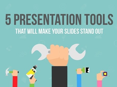
Presentation tools can make designing slides a heck of a lot easier. Here are 5 free tools for you to start using right now. Via Baiba Svenca, Rosemary Tyrrell, Ed.D.

Baiba Svenca's curator insight,
June 21, 2015 11:15 AM
Five great suggestions how you can improve and enhance your presentation slides. 
Sue Alexander's curator insight,
June 22, 2015 8:51 AM
Nice resource! I look forward to adding these tools to the toolbox. 
Hector Gonzalez's curator insight,
June 22, 2015 12:38 PM
estas herramientas podrían ser de utilidad

This article is written after a huge research about top web design trends for 2015. If you want to design an awesome website you should read this blog. Via Martin (Marty) Smith
Martin (Marty) Smith's curator insight,
December 26, 2014 9:59 AM
Just a few of the 2015 Web Design Trends discussed: * Storytelling

Responsive Web Designs Via Martin (Marty) Smith
Martin (Marty) Smith's curator insight,
September 29, 2014 12:06 PM
I like Salesforce and SquareSpace and was surprised I didn't hate the Microsoft design. 
Helen Stark's curator insight,
September 30, 2014 3:53 AM
Unusual and creative responsive designs that look great on a huge monitor and a tiny smartphone screen - that's great
![6 Best Practices of Responsive Web Design [Infographic] | Rapid eLearning | Scoop.it](https://img.scoop.it/GEiP8AlElwKVA2cIR8IpFDl72eJkfbmt4t8yenImKBVvK0kTmF0xjctABnaLJIm9)
Responsive design for a website is often used in the context of mobile users. Given the fact that more and more users are using mobile devices such as their smartphones and tablets to access the web, both for browsing and otherwise, it is extremely important that website designs become responsive towards all devices and screen sizes. Find more advantages, benefits and best practices of responsive design at the infographic and article link. Via Lauren Moss, Boyé

Massimo Petrucci's curator insight,
April 22, 2014 4:27 AM
Interessante infografica che mostra le dimensioni ideali degli oggetti web e delle immagini quando si progetta un template resposive. 
Mr Tozzo's curator insight,
April 23, 2014 5:42 AM
6 Best Practices of Responsive Web Design [Infographic]

Pallab Kakoti's curator insight,
April 24, 2014 4:56 AM
Responsive designs are the window into the future of web portability to drive higher per user engagement by embedding the concept of Probability Scores. An aggregate of Content Scores & Engagement Scores are debated prior to finalizing which sections gets a higher Probability Score that will eventually determine content position in the responsive design layout. Probability Scores aims at achieving better per user click through rate owing to its full width auto adaptive content display interface that adjust the landing page content based on the device.
Earlier websites used to feed different URLs for different devices. For example m.sitename.com or mobile.sitename.com indicated that the URL is for mobile or smart devices. But now things have changed thanks for responsive design attributes that determines the device that is trying to access the site URL before optimizing the content layout to adjust automatically with the device interface. This way the same URL is serving any device that is trying to access the website which again is compliance for search engine algorithm.
Responsive design has the advantage to every inch of the device or browser interface to maximize the user’s engagement intent possibility. Compelling visual storytelling theme powered by catchy headlines or titles richly feed with an interesting content copy furthermore elevates user interest to engage. This nature in elevating intent & urge to get involved have statistically indicated the favourability of lead generation & conversion rates from responsive designs.
Mobile devices will overtake PC user worldwide citing encouraging statistics to enthuse responsive design for websites, emails & landing pages. Responsive design layouts devised with #ProbabilityScores are based on the overall marketing objectives & branding goals. An implosive content marketing strategy with a creative team of visual storytellers delivers inspiring results and therefore the greater goodness is in the adoption of Responsive Site Design.
#ProbabilityScores <> #ContentScores <> #ContentEngagement Visit the blogs4bytes Responsive Content Design HomepageCheck out the Responsive Content Scores for the blogs4bytes Homepage
http://sonicrituals.brinkster.net/ps/probabilityscores.png
Responsive Design, Parallax Campaigns, Hashtag Marketing, SEO & SMO all blend into one to serve a hot cup of result driven digital marketing performance with #blogs4bytes // Follow the conversation.

Are you a web designer? If yes, then you are also a user interface designer, and in the near future, this role will become even more important for you. Whil
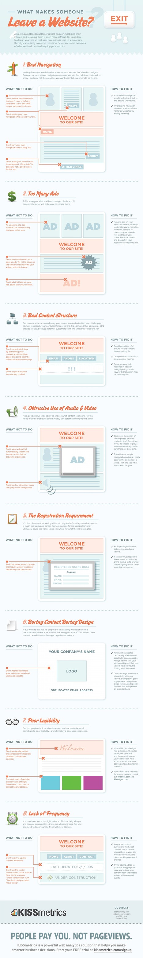
Attracting a potential customer is hard enough. Grabbing their interest and retaining them is even more difficult. It's important to design your site Via Martin (Marty) Smith, Michael Allenberg
Martin (Marty) Smith's curator insight,
November 9, 2013 9:57 AM
Of these 8 very deadly sins the most deadly in my experience is the first one. When customers don't know where you want them to go and what you want them to do or where they came from (within you site) they get confused. Confused customers do many things buying is never one of them. 
Michael Allenberg's curator insight,
November 13, 2013 7:36 PM
An info graphic about UX... WIN WIN!!!
Louise Robinson-Lay's curator insight,
November 15, 2013 3:53 PM
More on great design for maximum impact. This time, websites.
We threw the challenge to the studio "create something just for fun showing off your talented skills and the great capabilities of Prezi for storytelling and... Via Baiba Svenca, Alfredo Corell
All of the books, all of the blogs, all of the top Slideshare presentations on slide design make this common plea: simplify. But how simple is too simple? I had this conversation with a non-training... Via Baiba Svenca

Vernon Adrian Emuang's comment,
June 19, 2013 10:29 PM
I really appreciate your scoops! Thank you very much for sharing!

Lisa West's curator insight,
June 21, 2013 6:51 AM
For everyone who does not want their audience to be DOA by DBPP ( death by power point) here is a step by step approach to create professional and effective PPP.
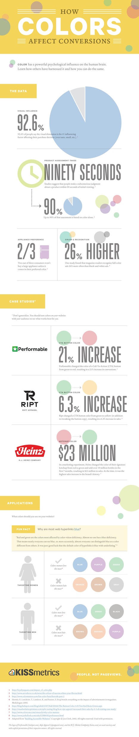
Color has a powerful psychological influence on the human brain. Learn how others have harnessed it and how you can do the same. Via Martin (Marty) Smith
Martin (Marty) Smith's curator insight,
May 19, 2013 4:28 PM
Color Is MASTER of Us All Infographics:
"Dear Lifehacker, I have been tasked to make a slideshow for an event at work. I don’t want to make a generic PowerPoint with just boring text or pictures. What are some ways I can enhance the slideshow so it looks impressive and knocks the socks off my audience?" Via Baiba Svenca, Nikos Amanatidis

Elke Watson's comment,
May 19, 2013 5:26 PM
I was an early adopter of Prezi (I think), and am now starting to get a bit tired of the predictable jumping around. It's like cinnamon or something. A wonderful spice but in small doses and not every day! I found that I returned to PPT, using punchy images (thanks Common creative section on Flickr!!) and short / one-word statements. Very powerful

Joaquín Ballester's comment,
May 19, 2013 5:32 PM
I agree with you, Elke. PPT is more customizable and powerful.

Marion Mulder's curator insight,
May 22, 2013 6:00 AM
Oke - if you work in the corporate world there is just no escaping from having to create powerpoints at one point or another. You might as well create amzing one's while your at it. Here are some handy tips, do's & don'ts worth looking at |


Cool! Here's a tutorial that will teach you how to improve your slides visually. Works with PowerPoint 2013.
Cool! Here's a tutorial that will teach you how to improve your slides visually. Works with PowerPoint 2013.
Cool! Here's a tutorial that will teach you how to improve your slides visually. Works with PowerPoint 2013.