

 Your new post is loading...

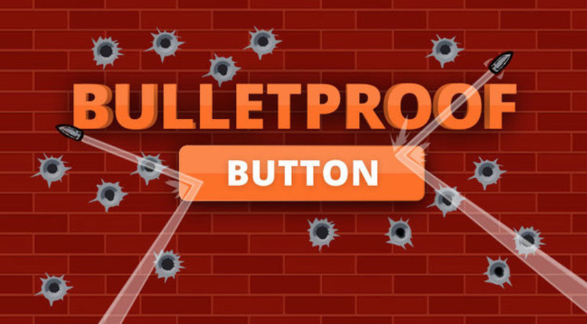

Buttons can be one of the most frustrating parts of email development. It has to look great (or at least look like a button) in every single client, because this little colored block is what all your high-conversions dreams are resting on. I built this button to use for our in-house mailings, and I thought I'd share it here.
This button accomplishes a few things. It includes spacers to help you control how much space appears before and after the button. It's also built so that the entire colored area of the button is clickable/touchable, not just the text. One advantage this button has, being code-based instead of image-based, is that it's always visible, even when image blocking is turned on. There are two versions of this button included, one centered and one left aligned.
Dark marketing clouds ahead? Let marketingIO help you see clearly.

![3 Steps to More Clickable Call-to-Action Buttons [Quick Guide] - FormStack | The MarTech Digest | Scoop.it](https://img.scoop.it/HAl9e4zZc82AiXbUAubh-_L6dadsvGA8m9WNoVsbzkY=)


The HTML is available when you click through.