The MarTech Digest
563.4K views | +0 today
Follow
Your new post is loading...
Scooped by Marteq
Scoop.it!

Responsive Web Design Is Not Mobile First - Forrester

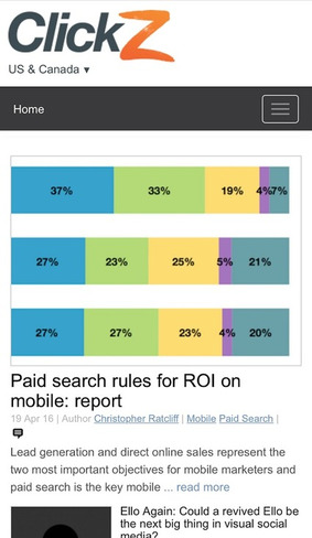
People do different things on their smartphones than on their desktops or tablets (see figure). To delight and serve your customers in their mobile moments of need, you need to give them exactly what they need to move forward in their immediate context. So if you can't reach all customers with an app – AND YOU WON’T! – you will need to deliver an app-like mobile web experience.

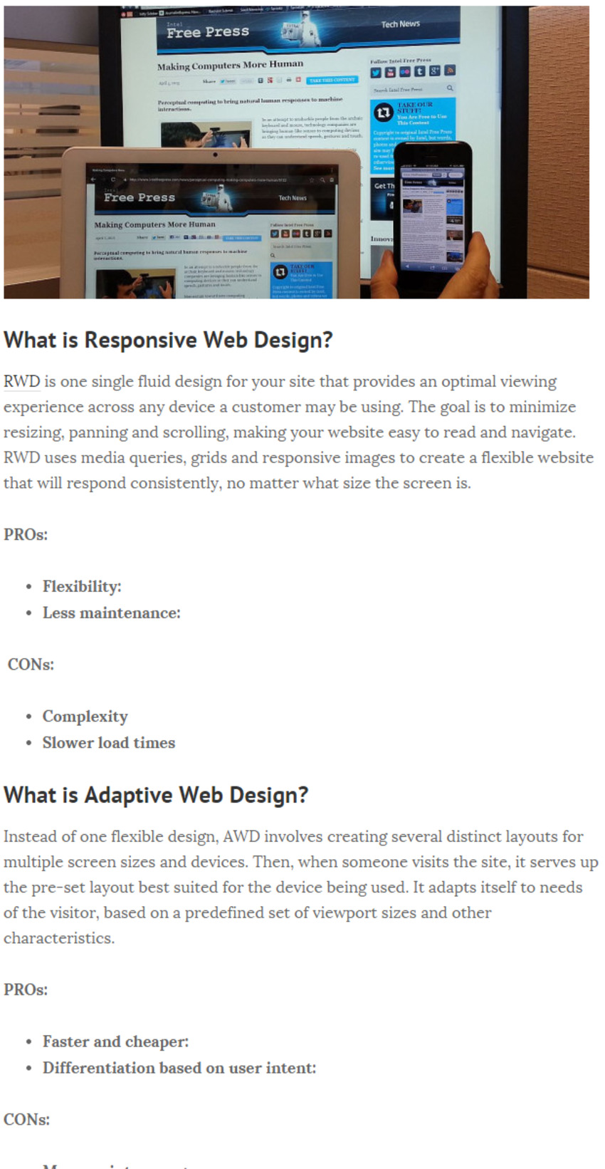
But mobile moments were never your design goal with desktop browsing, and responsive techniques alone don't magically fix that. More often than not, you must deliver a different experience on smartphones, one that is task-oriented, loads instantaneously, uses the available real estate wisely, works with one hand, and delivers service directly into the full context of a consumer’s mobile web moment.
Marteq's insight:

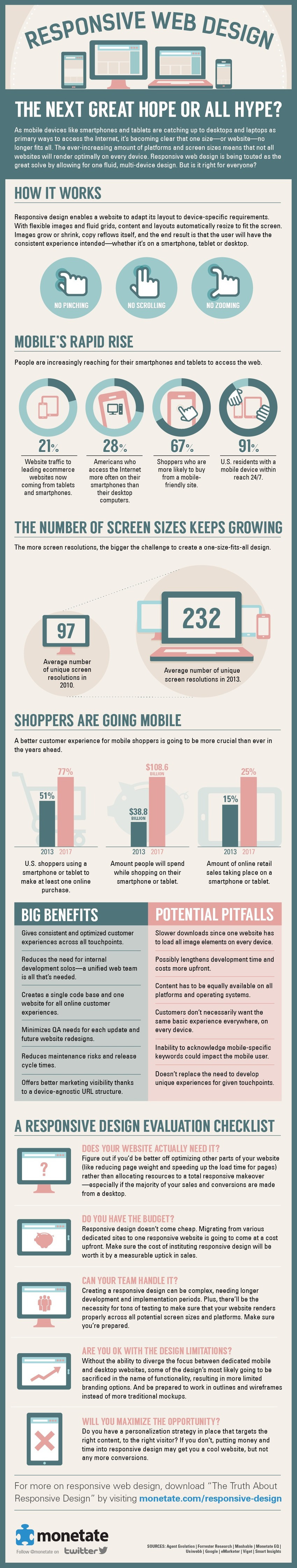
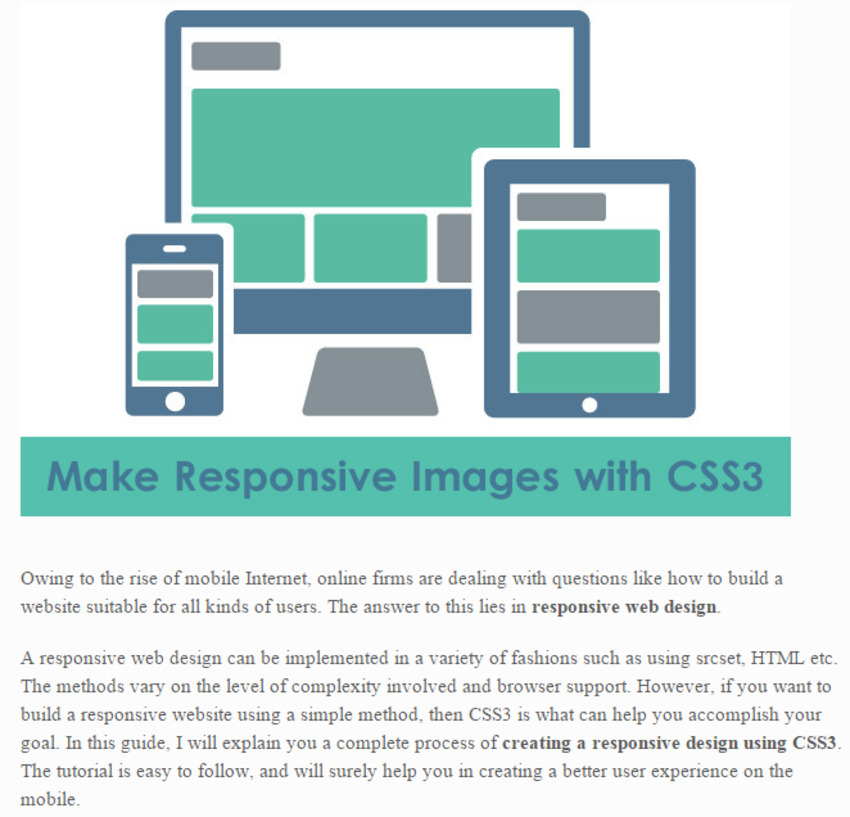
Hint: develop for the mobile device first, then adapt to the desktop.


NEW: Experience Remarkable Planning Accuracy With New, FREE Growth Hacking Tool. Go here: http://goo.gl/UjcA8x 

No comment yet.
Scooped by Marteq
Scoop.it!

What’s the difference between responsive, adaptive and mobile-friendly sites? | Search Engine Watch

What’s the difference between responsive, adaptive and mobile-friendly sites? | Search Engine Watch | The MarTech Digest | Scoop.it
Friendly vs. Responsive

Mobile-friendly sites aren’t necessarily designed specifically for a mobile device. Rather, they’re versions of sites that work across different devices. Think of a mobile-friendly site as mobile-optimized, whereas a responsive site is mobile-first. A site that’s mobile responsive changes – or responds – based on the device it’s viewed on. 

Responsive vs. adaptive

Responsive sites adjust to any layout. Adaptive sites, on the other hand, only adapt at select points.
Marteq's insight:

FWIW...stick with responsive.


marketingIO: One Source for All Marketing Technology Challenges. See our solutions.  

No comment yet.
Scooped by Marteq
Scoop.it!

Movable Ink | US Consumer Device Report 2015 Review [FREE REPORT]

Movable Ink | US Consumer Device Report 2015 Review [FREE REPORT] | The MarTech Digest | Scoop.it
Movable Ink's 2015 US Consumer Device Preference Report provides deep insight into consumers’ adoption and use of smartphones, tablets, and desktop computers, and how they engaged with email throughout 2015. 

The 2015 report covers how the holiday season compared to the rest of the year, as well as a slowing trend in mobile and tablet email opens. We also broke down data on user habits and trends including:

Conversions by device and vertical
When emails are opened during the day by device type
Time spent in email based on device

Download the free report today to access all of our research and analysis.


marketingIO: One Source for All Marketing Technology Challenges. See our solutions

No comment yet.
Scooped by Marteq
Scoop.it!

Infographic: responsive design for multiple devices - The Hub

Infographic: responsive design for multiple devices - The Hub | The MarTech Digest | Scoop.it

From MarTech 101 to Advanced Techniques, iNeoMarketing has you covered. Contact us.

No comment yet.
Scooped by Marteq
Scoop.it!

Ultimate guide: Adaptive vs responsive design - B2B News Network

Ultimate guide: Adaptive vs responsive design - B2B News Network | The MarTech Digest | Scoop.it

About Us: iNeoMarketing provides Marketing Technology services, applications and support to B2B companies who may not have the required resources, knowledge or expertise. Visit us at ineomarketing.com.

Marteq's insight:

If you have the resources and the ability to maintain the code for several different output devices, then AWD is important, especially considering speed (which Google favors).

No comment yet.
Scooped by Marteq
Scoop.it!

How to Make Responsive Images with CSS3: Complete Guide - DesignWebKit

How to Make Responsive Images with CSS3: Complete Guide - DesignWebKit | The MarTech Digest | Scoop.it

Receive a FREE daily summary of The Marketing Technology Alert

Marteq's insight:

As many of you know, creating responsive copy is one thing, but creating a responsive image is another. This is a quick guide that gives you the code you need for single, two and three column layouts.

Scooped by Marteq
Scoop.it!

Responsive Web Design (RWD) - What you should know? - Position²

Responsive Web Design (RWD) - What you should know? - Position² | The MarTech Digest | Scoop.it

Receive a FREE daily summary of The Marketing Technology Alert

Marteq's insight:

RWD is a must (not AWD), and responsive email design is a must. A nice, quick primer about RWD.

No comment yet.
Scooped by Marteq
Scoop.it!

Responsive Typography: Bigger, Brighter, Bolder - DesignWebKit

Responsive Typography: Bigger, Brighter, Bolder - DesignWebKit | The MarTech Digest | Scoop.it

Digest...


Despite the growing trend to visuality and great use of photos, pics and sketches to present data on the web, there is still much about text. Web is still 95% about typography and we still need to read lots of text to get all the necessary information. That’s why typography is still one of the main design elements that requires a lot of attention and thought-out approach.


In responsive web design typography plays essential part. People won’t stay long with the website if they need to strain their eyes to read the info. Responsive typography matters as much as responsive layout structure, customizing images and navigation comfort. And making a text responsive usually means more that simply resizing the text container and refill it with the same text.


˅˅˅˅˅˅˅˅˅˅˅˅˅˅˅˅˅˅˅˅˅˅˅˅˅˅˅˅˅˅˅˅˅

Receive a FREE daily summary

of The Marketing Technology Alert HERE

˄˄˄˄˄˄˄˄˄˄˄˄˄˄˄˄˄˄˄˄˄˄˄˄˄˄˄˄˄˄˄˄

Marteq's insight:

The author's absolutely correct: although your design may be responsive, your typography may be completely inappropriate for a mobile device (not to mention a wearable).  Click through for specific guidance.

No comment yet.
Scooped by Marteq
Scoop.it!

Beyond Responsive and Adaptive: Introducing "Adjustive" Web Design

Beyond Responsive and Adaptive: Introducing "Adjustive" Web Design | The MarTech Digest | Scoop.it

"In response to the continually changing device landscape, I propose a new concept - adjustive Web design. Core elements of adjustive Web design include:
>> Adaptive content is the foundation of everything
>> The display of content will responsively adjust to screen sizes
>> User interface elements can be adjusted by the user to a desired position

˅˅˅˅˅˅˅˅˅˅˅˅˅˅˅˅˅˅˅˅˅˅˅˅˅˅˅˅˅˅˅˅˅

Receive a FREE daily summary

of The Marketing Technology Alert.

Subscribe here: goo.gl/xSjgGT

(your privacy is protected).

˄˄˄˄˄˄˄˄˄˄˄˄˄˄˄˄˄˄˄˄˄˄˄˄˄˄˄˄˄˄˄˄


Here is how adjustive Web design will build upon and enhance its responsive predecessor:
Problem: As smartphones and tablets use increasingly larger displays, it can be cumbersome for hands. Responsive adjusted user interface controls - such as a site header with a "hamburger-style" menu - won't overcome this challenge, as their general positioning remains fixed.
Solution: Go beyond responsively adjusting user interface elements for varying screen sizes and enable users to place critical user-interface elements in a place they can easily reach. For years, Apple has allowed users running its desktop OS to select three positions for their Dock - left, bottom, and right.


Let's examine how adjustive Web design may work on wearables:
Problem: The stylish, sleek jewelry-like design of wearables has resulted in smaller screen sizes or absent displays. A responsively adjusted element, such as a site header with a "hamburger-style" menu, won't address a lack of screen real estate.
Solution: Hide user-interface components when they are not needed and maximize screen real estate for adaptive content. The device OS or hardware should allow a user to reveal the user interface through a simple gesture when needed. In the case of an absent display, alternative navigation can be enabled through navigation sounds."

Marteq's insight:

Smart approach, especially with the advent of wearables.

No comment yet.
Scooped by Marteq
Scoop.it!

Best practice for Responsive Web Design [Infographic] - Smart Insights Digital Marketing Advice

Best practice for Responsive Web Design [Infographic] - Smart Insights Digital Marketing Advice | The MarTech Digest | Scoop.it


___________________________________

Receive a FREE daily summary of The Marketing Technology Alert directly to your inbox. To subscribe, please go to http://ineomarketing.com/About_The_MAR_Sub.html  (your privacy is protected).

No comment yet.
Scooped by Marteq
Scoop.it!

How Responsive Web Design Works [Infographic] - HubSpot

How Responsive Web Design Works [Infographic] - HubSpot | The MarTech Digest | Scoop.it
This infographic illustrates what responsive web design is, how it works, and why you should make the switch.


__________________

Receive a FREE daily summary of The Marketing Technology Alert directly to your inbox. To subscribe, please go to http://ineomarketing.com/About_The_MAR_Sub.html  (your privacy is protected).

No comment yet.
Scooped by Marteq
Scoop.it!

Why a Responsive and Custom-Designed Website is a Good Investment? (Infographic)

Why a Responsive and Custom-Designed Website is a Good Investment? (Infographic) | The MarTech Digest | Scoop.it

__________________

Receive a FREE daily summary of The Marketing Technology Alert directly to your inbox. To subscribe, please go to http://ineomarketing.com/About_The_MAR_Sub.html  (your privacy is protected).


Scooped by Marteq
Scoop.it!

Image-heavy responsive sites drag down mobile performance: report - Research - Mobile Marketer | #TheMarketingTechAlert

Image-heavy responsive sites drag down mobile performance: report - Research - Mobile Marketer | #TheMarketingTechAlert | The MarTech Digest | Scoop.it

Basic/ Condensed...


An analysis of 155 responsive sites finds that only 32 — or 21 percent — of sites load in four seconds or less, according to a report from Trilibis launching today.


“This is particularly true for responsive design Web sites, where the same codebase and associated images are sent to all devices from PCs to mobile phones. It is best to optimize images for mobile devices at the server level, which delivers lighter pages, faster load times and a better user experience.” 


____________________________________________________

Receive a FREE daily summary of The Marketing Technology Alert directly to your inbox. To subscribe, please go to http://ineomarketing.com/About_The_MAR_Sub.html  (your privacy is protected).

Marteq's insight:

And you know that slow mobile load time kills. Answer: Adaptive Web Design. Yes: it's a pain, but it's literally a 50-50 shot that your site will be seen on a mobile device.


RingCentral's curator insight, June 30, 2014 6:23 PM

#images #survey #mobile

Scooped by Marteq
Scoop.it!

15% of Websites are Responsive - 'Net Features | #TheMarketingTechAlert

15% of Websites are Responsive - 'Net Features | #TheMarketingTechAlert | The MarTech Digest | Scoop.it

Basic/ Excerpt...


The most compelling findings reveal that 36% of all Websites are Responsive i.e. customized to work on mobile devices; 60% of these Responsive websites are hosted on dedicated mobile sub-domains, sub-folders, or domain names. This means that only about 15% of all Websites are Responsive to a single web address i.e. require no mobile redirection. In addition, only 6% of all Websites are considered Fast i.e. meet higher website performance optimization standards. Only 3% of all Websites are both Responsive and Fast. The report also finds that the majority of Websites require significant performance optimization with 67% requiring GZIP Compression and up to 83% requiring Minification of either HTML, CSS, or Javascript.


____________________________________________________

Receive a FREE daily summary of The Marketing Technology Alert directly to your inbox. To subscribe, please go to http://ineomarketing.com/About_The_MAR_Sub.html  (your privacy is protected).

Marteq's insight:

This is...ponderous. Does this not have sufficient visibility among B2B marketers?

No comment yet.
Scooped by Marteq
Scoop.it!

Is Responsive Design killing Content Marketing? - BrightInfo | #TheMarketingTechAlert

Is Responsive Design killing Content Marketing? - BrightInfo | #TheMarketingTechAlert | The MarTech Digest | Scoop.it

Basic/ Excerpt...


Responsive Design makes sense. It involves building one website that adapts to fit a variety of screen sizes/resolutions instead of building dedicated websites for each device type. But it presents two key challenges to your content marketing and specifically to getting leads from your custom content:

  1. There’s limited space on the page – by design. Responsive websites must be designed for the lowest common denominator when it comes to screen size. This means your page can hold just the must-haves in a small form factor to display well on tablets and mobile screens. There’s no room for sidebars with calls to action, suggested next steps, custom graphics or links to all those webinars, videos, case studies and e-books you’ve developed.
  2. Small mobile and tablet screens may not fully display your Resources section or Learning Center pages where you can serve your masses of content all at once.


____________________________________________________

FREE: AgileContent™ delivers more quality content to your market! Get your FREE 14 Day Trial NOW!: http://goo.gl/rzeg79. No credit card required!


Receive a FREE daily summary of The Marketing Technology Alert directly to your inbox. To subscribe, please go to http://ineomarketing.com/About_The_MAR_Sub.html  (your privacy is protected).


Marteq's insight:

The real issue is load time: heavier pieces require too much time for the visitor, so you'll want to keep content brief (unless, of course, it's a download).

No comment yet.
Scooped by Marteq
Scoop.it!

Top 5 Reasons to Adopt Responsive Web Design in 2014 | Genetech Solutions | #TheMarketingTechAlert

Top 5 Reasons to Adopt Responsive Web Design in 2014 |  Genetech Solutions | #TheMarketingTechAlert | The MarTech Digest | Scoop.it

____________________________________________________

FREE: AgileContent™ delivers more quality content to your market! Get your FREE 14 Day Trial NOW!: http://goo.gl/rzeg79. No credit card required!


Receive a FREE daily summary of The Marketing Technology Alert directly to your inbox. To subscribe, please go to http://ineomarketing.com/About_The_MAR_Sub.html  (your privacy is protected).


Marteq's insight:

As usual, be cautious about responsive as the load times are slower than adaptive web design.

No comment yet.
Scooped by Marteq
Scoop.it!

Responsive web design: five reasons why it may not be the right answer - Econsultancy | #TheMarketingTechAlert

Responsive web design: five reasons why it may not be the right answer - Econsultancy | #TheMarketingTechAlert | The MarTech Digest | Scoop.it

Intermediate/ Digest...


Five reasons to choose mobile over responsive

So why would some companies choose mobile specific over responsive? Here are some possible reasons...


1) Guarding the desktop conversion 

A responsive solution means having to make some compromises on either a desktop or tablet site in order to get the technology to work.

2) Companies focused on growing mobile conversion 

3) Large amounts of mobile traffic justifies having a dedicated team

4) Performance, performance, performance

5) Sites where mobile users have a different journey to desktop users 


____________________________________________________

FREE: AgileContent™ delivers more quality content to your market! Get your FREE 14 Day Trial NOW!: http://goo.gl/rzeg79. No credit card required!


Receive a FREE daily summary of The Marketing Technology Alert directly to your inbox. To subscribe, please go to http://ineomarketing.com/About_The_MAR_Sub.html  (your privacy is protected).


Marteq's insight:

The author is referring to adaptive web design over responsive, and if you have the resources and wherewithal, then yes, pursue AWD, if only to prevent performance slowdown.

No comment yet.
Scooped by Marteq
Scoop.it!

How to Optimize Email Content for Any Screen Size - CMI | #TheMarketingTechAlert

How to Optimize Email Content for Any Screen Size - CMI | #TheMarketingTechAlert | The MarTech Digest | Scoop.it

Intermediate/ Digest...


-- >  Use generous font sizes

-- >  A single-column responsive layout works best

-- >  Provide large CTAs: Your call to action (CTA) is the most important part of a marketing email. It should be eye-catching, well-placed, and — above all — usable. The criteria for creating a successful CTA vary, depending on whether it is to be selected by a cursor or a finger. Apple’s iOS Human Interface Guidelines recommend a minimum “tappable” target area of 44 × 44 px. That’s not to say that all buttons have to be 44 px, just that there shouldn’t be any buttons or links closer together than 44 px. Otherwise you run the risk of a “mistap.” Also, keep ergonomics in mind as you’re placing CTA buttons. For instance, they shouldn’t go in the lower right corner, where the user would find it uncomfortable to click.

-- >  Left-aligned text is preferred

-- >  Keep subject lines succinct

-- >  Consider using pre-headers

-- >  Always use clear, concise content

-- >  Create a vertical hierarchy

-- >  Take care with your use of images

-- >  Consider including click-to-call capabilities

-- >  Provide a plain-text version option

-- >  Carefully plan delivery times

-- >  Make it easy for readers to take the next step


___________________________________

FREE: AgileContent™ delivers more quality content to your market! Get your FREE 14 Day Trial NOW!: http://goo.gl/rzeg79. No credit card required!


Receive a FREE daily summary of The Marketing Technology Alert directly to your inbox:  http://ineomarketing.com/About_The_MAR_Sub.html (your privacy is protected).


Marteq's insight:

Applications are available to create responsive design for your emails and LPs. This post, however, focuses on how to design the email so that it maximizes reaction. Remember: over 50% of B2B email is read on a mobile device, so change your thinking. It's mobile first, then adapting to the desktop.

No comment yet.
Scooped by Marteq
Scoop.it!

[INFOGRAPHIC] Responsive Web Design | Square Melons | #TheMarketingTechAlert

[INFOGRAPHIC] Responsive Web Design |  Square Melons | #TheMarketingTechAlert | The MarTech Digest | Scoop.it
Responsive Website Design - What is responsive web design? Why you should use responsive web design? This Infographic provides insights on the concept


___________________________________

FREE: AgileContent™ delivers more quality content to your market! Get your FREE 14 Day Trial NOW!: http://goo.gl/rzeg79. No credit card required!


Receive a FREE daily summary of The Marketing Technology Alert directly to your inbox:  http://ineomarketing.com/About_The_MAR_Sub.html (your privacy is protected).

Marteq's insight:

Again, seriously consider AWD over RWD, as RWD has a load time issue (which kills mobile viewing).

No comment yet.
Scooped by Marteq
Scoop.it!

The Disadvantages of Responsive Web Design - OMI | #TheMarketingAutomationAlert

The Disadvantages of Responsive Web Design - OMI | #TheMarketingAutomationAlert | The MarTech Digest | Scoop.it
Responsive web design continues to grow in popularity. But before you invest it in, you must understand the disadvantages.


Intermediate/ Condensed...


Every time I look into this, I come down on the side of using device specific websites, not responsive design. Why? Because I believe that someone who is accessing your website from a mobile phone is in a different place in the buying process than someone who is using a desktop computer. And I think mobile users are looking for a specific level of information.


The other disadvantage I’ve read a lot about is that responsive sites take longer to load on mobile devices because of the way they are built. And long load times are bad for the consumer experience and something Google frowns upon. After just four seconds of waiting, you’ll have lost 25% of your visitors (KISSmetrics), and abandons are exponentially higher after that.


___________________________________

Receive a FREE daily summary of The Marketing Technology Alert directly to your inbox. To subscribe, please go to http://ineomarketing.com/About_The_MAR_Sub.html  (your privacy is protected).

Marteq's insight:

Load times will kill, and AWD may very well be the way to go.

No comment yet.
Scooped by Marteq
Scoop.it!

3 Reasons Why Responsive Web Design is the Best Option For Your Mobile SEO Strategy - Search Engine Watch | #TheMarketingAutomationAlert

3 Reasons Why Responsive Web Design is the Best Option For Your Mobile SEO Strategy - Search Engine Watch | #TheMarketingAutomationAlert | The MarTech Digest | Scoop.it
As smartphone and tablet adoption rapidly increases, so does the importance of mobile-friendly websites.


Intermediate/ Digest...


If SEO is a factor, here are three reasons why responsive web design is the best option for your mobile SEO strategy:


1. Recommended By Google

With 67 percent search market share, when Google speaks, search marketers listen. Google states that responsive web design is its recommended mobile configuration, and even goes so far as to refer to responsive web design as the industry best practice.


2. One Website, Many Devices

One of the most appealing aspects of responsive web design is that a responsive website can provide a great user-experience across many devices and screen sizes. This is an important characteristic, since it is impossible to anticipate all the devices and screen sizes searchers will use to access your site.


3. Easier to Manage

Having a separate desktop and mobile site requires having separate SEO campaigns. Managing one site and one SEO campaign is far easier than managing two sites and two SEO campaigns. This is a key advantage a responsive website has over a separate mobile site.


___________________________________

Receive a FREE daily summary of The Marketing Technology Alert directly to your inbox. To subscribe, please go to http://ineomarketing.com/About_The_MAR_Sub.html  (your privacy is protected).

Marteq's insight:

The factor against responsive: load time. The load time for responsive web sites kills. You need to evaluate AWD vs. RWD to come to a smart decision.

Gain Website's curator insight, January 24, 2014 7:52 PM

Indeed, SEO is one of the factors why website designs have these three options. Infact, most people are getting more techy these days and believe it or not even a person living in a remote place cannot live without a gadget (mobile phones and tablets) or a computer that can access the internet. 


Added to that, touch screen gadgets are more evenly rising and mostly use these days. If we say touch screen that means it should be interactive. So, new and old websites tend to incorporate with the latest trend of website design of today. 


At www.GainWebsite.com we support web design for mobiles and other gadgets and do upgrades for old websites the way that it can be accessible not only on desktops but also in any means that the internet can be access.

Scooped by Marteq
Scoop.it!

Why Responsive Design is Important: 10 Key Statistics | SEOcial | #TheMarketingAutomationAlert

Why Responsive Design is Important: 10 Key Statistics | SEOcial | #TheMarketingAutomationAlert | The MarTech Digest | Scoop.it

"Infographic outlining numerous reasons for why responsive design is a sound choice for most web design endeavors."


__________________________________

Receive a FREE daily summary of The Marketing Technology Alert directly to your inbox. To subscribe, please go to http://ineomarketing.com/About_The_MAR_Sub.html  (your privacy is protected).

Marteq's insight:

RWD vs. AWD. Watch out for the load times for RWD!

Lee Tonitto's curator insight, December 17, 2013 4:45 AM

Great stats on why responsive design matters

Sysico's curator insight, December 17, 2013 4:07 PM

Pourquoi le design devient de plus en plus important...

Scooped by Marteq
Scoop.it!

From Responsive to Adaptive design - Which is the best of 4 design options - Smart Insights | #TheMarketingAutomationAlert

From Responsive to Adaptive design - Which is the best of 4 design options - Smart Insights  | #TheMarketingAutomationAlert | The MarTech Digest | Scoop.it


__________________________________

NEW: iNeoMarketing makes content marketing easy with the new Q8 Content. Q8 fills your content pipeline daily with relevant articles that your audience wants to read. Learn more and sign up for the beta program: http://www.Q8content.com.


Receive a FREE daily summary of The Marketing Technology Alert directly to your inbox. To subscribe, please go to http://ineomarketing.com/About_The_MAR_Sub.html  (your privacy is protected).

Marteq's insight:

For your web site and other digital properties: I don't think there's any question that AWD is the way to go for the B2B marketer, who is 50-50 desktop to mobile. The response time alone, especially considering the impact on SERP, pays for itself.

No comment yet.
Scooped by Marteq
Scoop.it!

Adobe Digital Marketing Blog | Are B2B Marketers Missing the Boat on Responsive Mobile Design? | #TheMarketingAutomationAlert

Adobe Digital Marketing Blog | Are B2B Marketers Missing the Boat on Responsive Mobile Design? | #TheMarketingAutomationAlert | The MarTech Digest | Scoop.it

Intermediate/ Excerpt...


In the past year, the aver­age tech com­pany set aside only 3.8 per­cent of its mar­ket­ing bud­get for mobile opti­miza­tion, apps and ads. How­ever, some pre­dict a shift in the com­ing year because many B2B mar­keters are not entirely sat­is­fied with their mobile efforts. We’ve reached (and then sur­passed) a global tip­ping point in mobile use. In 2012 alone, smart­phone sales rose by 63 per­cent, and mobile’s over­all con­tri­bu­tion to total Web traf­fic jumped 117 percent.


Mov­ing for­ward, it would be a mis­take to focus only on mobile ads. The keys to boost­ing mobile con­ver­sion rates are the same we’ve used to unlock dig­i­tal: per­son­al­iz­ing sites, devel­op­ing use­ful and rel­e­vant con­tent mar­ket­ing, and deliv­er­ing true value to cus­tomers. Mobile tech­nol­ogy can be inte­grated with the entire mar­ket­ing chain and made to work hand in hand with dig­i­tal strate­gies already in place.


__________________________________

NEW: iNeoMarketing makes content marketing easy with the new Q8 Content. Q8 fills your content pipeline daily with relevant articles that your audience wants to read. Learn more and sign up for the beta program: http://www.Q8content.com.


Receive a FREE daily summary of The Marketing Technology Alert directly to your inbox. To subscribe, please go to http://ineomarketing.com/About_The_MAR_Sub.html  (your privacy is protected).

Marteq's insight:

You need to go beyond AWD for your web site, landing pages, etc., and obviously beyond responsive for your email. It's a state of mind, i.e., what can you do to cater to the mobile user. You're a mobile user: what would you want? Start there!

No comment yet.
Scooped by Marteq
Scoop.it!

Myths and Realities of Responsive Design and the Mobile Inbox - ClickZ | #TheMarketingAutomationAlert

Myths and Realities of Responsive Design and the Mobile Inbox - ClickZ | #TheMarketingAutomationAlert | The MarTech Digest | Scoop.it

Excerpt...


Adaptive design is extremely powerful, flexible and used by many top retailers... for websites. It is technically impossible when it comes to email.


Responsive design certainly isn't "magic" or a cure-all solution, but it can be a useful tool for marketers to meet the evolving expectations of today's device-hopping shoppers and it's definitely something you should start testing. It's important to remember there are many ways to design and code an engaging, functional and captivating static email without using responsive design. Responsive design goes a step further by enabling content to be presented in different ways based on the device, ensuring that the hard work you put into campaign creation and design has its intended impact on your audience regardless of the device they're using to open emails.


__________________________________

NEW: iNeoMarketing makes content marketing easy with the new Q8 Content. Q8 fills your content pipeline daily with relevant articles that your audience wants to read. Learn more and sign up for the beta program: http://www.Q8content.com.


Receive a FREE daily summary of The Marketing Technology Alert directly to your inbox. To subscribe, please go to http://ineomarketing.com/About_The_MAR_Sub.html  (your privacy is protected).

Marteq's insight:

Adaptive: website. Responsive: email. Got it.

No comment yet.