
marketingIO: One Source for All Marketing Technology Challenges. See our solutions.
Get Started for FREE
Sign up with Facebook Sign up with X
I don't have a Facebook or a X account


 Your new post is loading... Your new post is loading...
marketingIO: One Source for All Marketing Technology Challenges. See our solutions. 
No comment yet.
Sign up to comment
|

|
Scooped by Marteq |
"An image needs six elements to get shared:
A VERY good article, with details and examples. Pass this on to your graphics pro.
|
|
Scooped by Marteq |

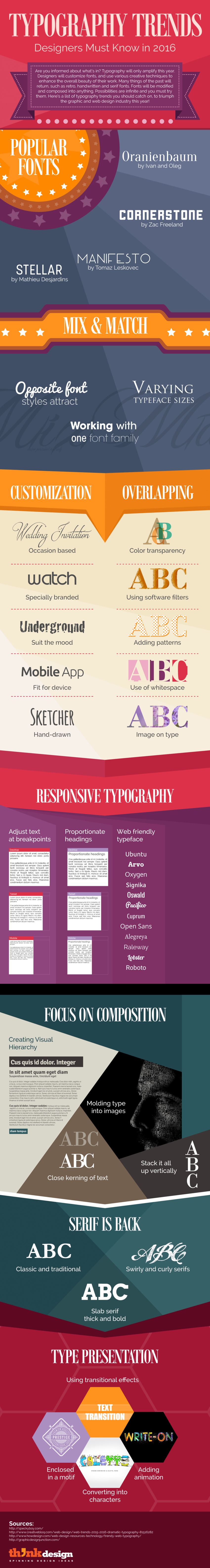
Typography is a subconscious type of judging, we all do it without even realizing it. The typography is hence, the first impression your critical viewers are getting of you and your page. In order to improve your first impression and gain more conversions you’ve got a lot to learn about typography.
► Receive a FREE daily summary of The Marketing Technology Alert ◄
|
|
Scooped by Marteq |
![24 Typography Terms Every Marketer Should Know [Infographic] - HubSpot | The MarTech Digest | Scoop.it](https://img.scoop.it/tUFAZpiK1ZHoCXnv8qsna_L6dadsvGA8m9WNoVsbzkY=)
This infographic illustrates the most important technical terms that describe the construction and layout of fonts.
↓↓↓↓↓↓↓↓↓↓↓↓↓↓↓↓↓↓↓↓↓↓↓↓↓↓↓
Receive a FREE daily summary
of The Marketing Technology Alert HERE
↑↑↑↑↑↑↑↑↑↑↑↑↑↑↑↑↑↑↑↑↑↑↑↑↑↑↑
|
|
Scooped by Marteq |
![A Handy Little Guide to Pairing Fonts [Infographic] | The MarTech Digest | Scoop.it](https://img.scoop.it/WEbLh0wfwf0nwXKCSYWQwvL6dadsvGA8m9WNoVsbzkY=)
__________________
► Receive a FREE daily summary of The Marketing Technology Alert directly to your inbox. To subscribe, please go to http://ineomarketing.com/About_The_MAR_Sub.html (your privacy is protected).
Very cool!

Having trouble choosing the right font combination for your print? Attached is an interesting table with what to match and what to avoid
|
|
Scooped by Marteq |

Basic/ Excerpt...
___________________________________
► Receive a FREE daily summary of The Marketing Technology Alert directly to your inbox. To subscribe, please go to http://ineomarketing.com/About_The_MAR_Sub.html (your privacy is protected).
I think we're passed the wonder of word processing, but these are decent tenets by which to abide.
|
|
Scooped by Marteq |
Excerpt...
Yesterday, Beyond the Envelope’s Paul Airy joined us for a guest webinar on using creative typography in email. Paul took a look at the role of typography in email design and development. In particular, he focused on the creative use of HTML text, so that email designers can make emails that look great without compromising on user experience.
__________________________________
► NEW: iNeoMarketing makes content marketing easy with the new Q8 Content. Q8 fills your content pipeline daily with relevant articles that your audience wants to read. Learn more and sign up for the beta program: http://www.Q8content.com.
► Receive a FREE daily summary of The Marketing Technology Alert directly to your inbox. To subscribe, please go to http://ineomarketing.com/About_The_MAR_Sub.html (your privacy is protected).
You could skip right through to about the middle of the deck to pick up the information you need. As an alternative, Litmus has the whole webinar posted to the web site for review should you need further details.
|
|
Scooped by Marteq |
![Guide to Professional Typography Usage [Infographic] - Cardprinting.us via Infographic Journal | The MarTech Digest | Scoop.it](https://img.scoop.it/pZskQDc7IYPtzGQMLi8D9_L6dadsvGA8m9WNoVsbzkY=)
Cardprinting.us introduces the following infographic which serves as guide to professional typography usage. It features sections on the basic typefaces, and how to enrich typography.


![How to Choose the Perfect Fonts for Every Project: A Detailed Guide [Infographic] - HubSpot | The MarTech Digest | Scoop.it](https://img.scoop.it/TblPS6hM3mN_xNRAIqTLUPL6dadsvGA8m9WNoVsbzkY=)


