

 Your new post is loading...


In this post I want to inspire you to think differently. I’ve curated sixteen extremely diverse visualization examples to do that. By design none of them from the world of digital analytics, though I’ll stay connected to that world from a how could you use this idea perspective. My primary goal is to expand your horizon so that we can peek over and see new possibilities.
The sixteen examples neatly fall into nine strategies I hope you’ll cultivate in your analytics practice as you create data visualizations:
1: The Simplicity Obsession
2: If Complex, Focus!
3: Venn Diagrams FTW!
4: Interactivity With Insightful End-Points
5: What-if Analysis Models
6: Turbocharging Data Visuals with Storytelling
7: The Magic of 2 x 2 Matrices
8: Close Contextual Clusters
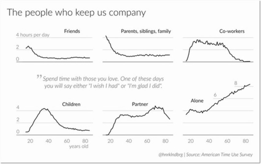
9: Multi-dimensional Related Line Graphs


DEFINITIVE!
RYZZ: It’s a new approach to MarTech for B2B Marketers.
#MarTech #DigitalMarketing