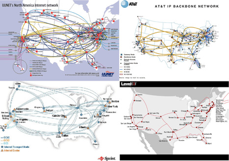
A good example of content curation at work is the Vox feature collection entitled "40 maps that explain the internet", which showcases in a highly digestible and visual format where the Internet came from, how it works, and how it's used by people around the world.
Although at first glance this may look just as a list of maps with descriptions, there's a lot of curation work that can be appreciated by looking just a bit beyond the surface.
a) Titles and descriptions are well crafted, short, focused, but consistently clear and to the point.
b) The 40 maps are intelligently organized into six different groups:
- How the Internet was created
- The Internet around the world
- Threats to the Internet
- The geography of online services
- How America gets online
- How we use the Internet
c) Images of maps sourced from elsewhere are properly credited and linked.
To the ignorant eye, this will look like "oh, just another collection of maps", but to the avid reader, scholar and to the curious enough to look beyond appearances, the value of this editorial work is on how it perfectly hides the amount of complexity and research work it has required while organizing and presenting an extremely clear and comprehensive body of valuable information on the chosen topic.
Curated by Timothy B. Lee together with editor Eleanor Barkhorn,
designer Uy Tieu and developer Yuri Victor.
A good example of curation at work. 8/10
Full feature: http://www.vox.com/a/internet-maps
Via Robin Good, Dr. Stefan Gruenwald


 Your new post is loading...


A good example of content curation at work is the Vox feature collection entitled "40 maps that explain the internet", which showcases in a highly digestible and visual format where the Internet came from, how it works, and how it's used by people around the world.
Although at first glance this may look just as a list of maps with descriptions, there's a lot of curation work that can be appreciated by looking just a bit beyond the surface.
a) Titles and descriptions are well crafted, short, focused, but consistently clear and to the point.
b) The 40 maps are intelligently organized into six different groups:
c) Images of maps sourced from elsewhere are properly credited and linked.
To the ignorant eye, this will look like "oh, just another collection of maps", but to the avid reader, scholar and to the curious enough to look beyond appearances, the value of this editorial work is on how it perfectly hides the amount of complexity and research work it has required while organizing and presenting an extremely clear and comprehensive body of valuable information on the chosen topic.
Curated by Timothy B. Lee together with editor Eleanor Barkhorn,
designer Uy Tieu and developer Yuri Victor.
A good example of curation at work. 8/10
Full feature: http://www.vox.com/a/internet-maps
Mapas sobre Internet en el mundo
40 mapas que explican INTERNET
Chulísimo!!