The images here are an assortment of figures that were published, are parts of a tutorial, or are one-off samples. These images were created over a 3-4 year period and some were done using old versions of Circos.
Via juandoming
Get Started for FREE
Sign up with Facebook Sign up with X
I don't have a Facebook or a X account


 Your new post is loading...
 Your new post is loading...
Your new post is loading...
The images here are an assortment of figures that were published, are parts of a tutorial, or are one-off samples. These images were created over a 3-4 year period and some were done using old versions of Circos. Via juandoming 
No comment yet.
Sign up to comment
I have been a fan of Visible Thinking Routines which were developed by Project Zero from Havard, for a while now. I have used these routines with students, as blogging routines and in professional development workshops. I have been a fan of Visible Thinking Routines which were developed by Project Zero from Havard, for a while now. I have used these routines with students, as blogging routines and in professional development workshops.
Silvia Tolisano shares updated visual thinking routines for: 1. Read > Write> Comment
Via Beth Dichter, Miloš Bajčetić, Jim Lerman

Vanessa Camilleri's curator insight,
January 27, 2015 6:09 AM
A really wonderful representation of what being digital in this era is all about - learning in the digital era, is more of a contribution rather than a passive absorption of online information. 
veroco's curator insight,
February 10, 2015 12:42 PM
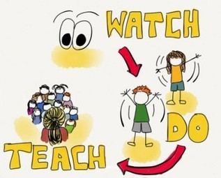
Nice vision : the "modern learning" routines => Read - Comment - Write / Watch - Do - Teach / Contribute - Feedback - Grow... 
Dr. Deborah Brennan's curator insight,
April 2, 2015 9:34 AM
These thinking routines can help teachers move toward teaching processes for learning rather than content alone. In the era of ever increasing knowledge, we need to help students learn how to learn.
That being said, these routines can also be used as a model for teachers by using them as options for professional development,

Beth Dichter's curator insight,
November 23, 2014 10:51 PM
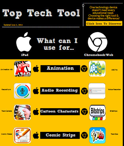
This interactive infographic provides 18 concepts and lists the "best" tool to use with the iPad or with a Chromebook or Laptop (and includes many web based tools). In the center you have the concept, to the left is the iPad app and to the right is one for the Chromebook/Notebook or a web tools. Below are some of the 18 concepts. * Video Collage * Interactive Posters * Show Me What You Know * Talking Images Each of the icons take you to the app/website. You will also find links at the bottom of the infographic. One provides a Google Document that lists all the resources and provide some additional information on the features. The second provides a Google Presentation of the resources. 
CTD Institute's curator insight,
December 4, 2014 9:21 AM
Absolutely indispensable for all using AT in the classroom! 
Ness Crouch's curator insight,
September 21, 2015 1:54 AM
A very useful infographic for those teachers wanting to learn more about tools for the classroom. The comparison from Apple to Chrome will allow you to find the tools you need.
Beth Dichter's curator insight,
August 16, 2013 10:55 PM
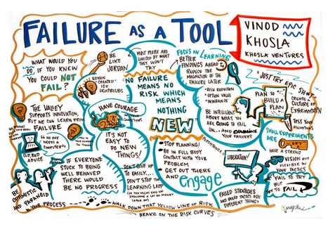
Check out the notes from the talk above, consider watching the video embedded within the post and think about new ways to work with your students this year about the concept of failure. If you are an engineer failure you understand that failure is a teaching tool, allowing you to improve the project, but in education most students consider failure just that...they have failed. A couple of quotes found in this visalization are below. What are your thoughts as you read them? * Have courage. It's not easy to do new things! * No failure means no risk which means nothing new.
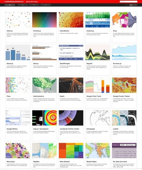
Robin Good: Here is a curated collection of "libraries for plotting data on maps, frameworks for creating charts, graphs and diagrams and tools to simplify the handling of data" to create interactive and dynamic data visualizations.
Useful. 8/10
Collection: http://datavisualization.ch/tools/selected-tools/
Via Robin Good

Dean Meyers's comment,
September 6, 2012 8:19 AM
I turn to this collection routinely for inspiration and to learn what's up and coming in the dataviz world. d3.js was probably my latest find through this site.

wildswans's curator insight,
May 5, 2013 12:08 AM
What an interesting selection of tools for data presentation, if only more of them were free.
From
vimeo

This visualization reveals the freshwater stores that NASA’s GRACE (Gravity Recovery and Climate Experiment) satellite detects from space and shows how that data can be used to evaluate groundwater gains and losses, critical information in the effort to conserve the water that people depend upon Via Sakis Koukouvis, kostasgeorgioy
|
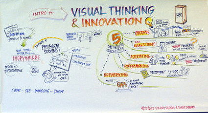
“Visual thinking is the foundation for being creative and solving some of the most complex problems,” explained author and founder of Innovation Studio Lisa Kay Solomon. Solomon and Emily Shepard of The Graphic Distillery discussed the key role of visual thinking in innovation at a recent Stanford GSB Mastery in Communication Initiative talk. Below, they share five visual-thinking based skills that disruptive innovators must master: Via Sharrock, Mark E. Deschaine, PhD, Stephania Savva, Ph.D
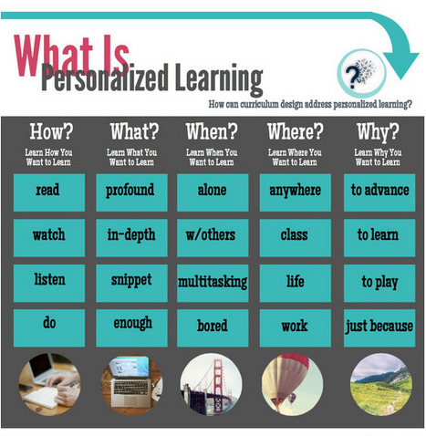
Some of the things we think about when designing personalized learning curriculum. What else do you think about? ~Mia Via Beth Dichter, Maria Palaska
Beth Dichter's curator insight,
November 26, 2014 9:00 PM
This infographic, byt Mia MacMeekin, looks at personalized learning and the three areas below. In each area the question is also "How can curriculum design address personalized learning?" What are the three areas? * What is personalized learning * How to personalize learning * Examples of personalized learning In each of these areas she also looks at the How, What, When, Where, and Why, providing key words or phrases that help you dig a little deeper into the subject. Mia MacMeekin has provided an infographic that you could share with others in your building. Today we are asked to personalize curriculum, but support is not always available. This visual will help you better understand some key concepts, and provide you with ideas on how you might move forward. 
Andrew Chiu's curator insight,
December 5, 2014 12:11 AM
A matrix to help consider and design learning resources for more personalised learning.

A simple Google image search on “big data” reveals numerous instances of three dimensional one’s and zero’s, a few explanatory infographics, and even the interface from The Matrix. So what does “big data” look like, within human comprehension? From the beginning of recorded time until 2003, humans had created 5 exabytes (5 billion gigabytes) of data. In 2011, the same amount was created every two days. It’s true that we’ve made leaps and bounds with showing earlier generations of data. However, when it comes to today’s big data, how it looks can help convey information but it needs to be more than just beautiful and superficial. It has to work, show multiple dimensions, and be useful. New software and technologies have enabled us to gain higher level access to understanding these enormous sets of data. However, the only way we’re going to truly gather and juice all the information big data is worth is to apply a level of relatively unprecedented data visualization. How do we get to actionable analysis, deeper insight, and visually comprehensive representations of the information? The answer: we need to make data more human. Via Lauren Moss, michel verstrepen

Ron Leunissen's curator insight,
January 13, 2014 7:27 AM
Drinking from a fire hose is not possible. Neither is reading in a data stream of about 2,5 billion gigabytes per day! 
Andreas Maniatis's curator insight,
January 13, 2014 12:05 PM
How do we get to actionable analysis, deeper insight, and visually comprehensive representations of the information? The answer: we need to make data more human.
From
ht
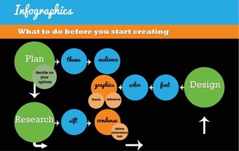
Let’s be honest, we don’t like to read big pieces of text. Text-heavy graphs are rather difficult for understanding, especially when dealing with numbers and statistics. That is why illustrations and flowcharts are often used for such kind of information. An infographic, or a visual representation of study or data, like anything else, can be done right or wrong. How to create a successful infographic? A good idea and a good design.
Stop by the link for more on what defines an infographic, what contributes to its popularity, as well as the various types of infographics and references for tutorials and best practices.
Additional topics covered include: The major parts of an infographic How to create an infographic Developing ideas & organizing data Research & sources Typography, graphics & color Facts & conclusions Designing & EditingVia Lauren Moss, Monique Walhof
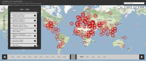
Browse the timeline of war and conflict across the globe.
This database of global wars and conflicts is searchable through space and time. You can drag and click both the map and timeline to locate particular battles and wars, and then read more information about that conflict. This resource would be a great one to show students and let them explore to find what they see as interesting. This site is brimming with potential.

olsen jay nelson's comment,
August 16, 2012 7:46 AM
This is just what I've been looking for, believe it or not:-)

Paul Rymsza's comment,
August 22, 2012 2:15 PM
the potential of this site is amazing between the interactive learning system and the correlation between the timeline and location. If the human geography class is anything like this i can't wait for it!
|