Daily Magazine
320.3K views | +10 today
Follow
Daily Magazine
Your new post is loading...
Scooped by THE OFFICIAL ANDREASCY
Scoop.it!

Follow Andreas Christodoulou (@_andreascy) on Instagram

Follow Andreas Christodoulou (@_andreascy) on Instagram | Daily Magazine | Scoop.it

I feel so alive.

THE OFFICIAL ANDREASCY's insight:
 
Big Shoutout and Thanks to our Founder & CEO Andreas Christodoulou for making THE OFFICIAL ANDREASCY possible, for us and for many others. His family prepared him for LIFE and we're beyond and forever grateful for his courage and heroism, in the name of freedom!
 
We love you and we're so proud of you!
No comment yet.
Rescooped by THE OFFICIAL ANDREASCY from Design, Science and Technology
Scoop.it!

30 Black And Blue Web Designs Inspire [examples]

30 Black And Blue Web Designs Inspire [examples] | Daily Magazine | Scoop.it

Details of the website as featured within CoolHomepages web design inspiration gallery.

Marty Note
Blue is a great color. There is a reason blue is many of your visitor's favorite color. Online blue is soothing, easy on the eyes and beautiful against black. My favorite is the UK design "un.titled.co.uk" (used as the image above).

Love using opacity to "hide" things in plain view as that kicks in the curiosity of visitors and gets the click. Current Un.titled site isn't as interesting or special as the design noted here. . Love blue online and these examples show why.


Via Martin (Marty) Smith, Antonios Bouris
Rescooped by THE OFFICIAL ANDREASCY from Must Market
Scoop.it!

Web Design = Game Design: Game UI Wireframes & Paper Prototypes

Web Design, Game Design
Game and web design are rushing at each other like speeding trains. This Slideshare from David Farrell only adds to that belief. As our websites become more dynamic, controlled by math in response to behaviors and business rules, we will want to STEAL things like the flow diagrams from this excellent "lecture" on Game Interface and Prototyping.

Paper prototyping sounds like Minimal Viable Product too. Your website is easier to move than the mountain of code needed to create a game. We need to transform our thinking to be more FRAMEWORKS and contingency based.

The difference between a game's contingencies is each one has to be thought out all the way to the end of the branch. With websites we can leave some room for customer expression. Once User Generated Content happens we can curate it back to our community so everyone is singing off the same sheet of music.

Fascinating deck (stay with it as the first read can be confusing for IMers) that looks to the future when websites are games and games are everywhere.

Ref: see Scoop I just posted about if mobile games get any hotter they melt the world: http://sco.lt/7R9cRd


Via Martin (Marty) Smith
No comment yet.
Rescooped by THE OFFICIAL ANDREASCY from Must Design
Scoop.it!

Future Of Web Design 2

Future Of Web Design 2 | Daily Magazine | Scoop.it

Web 3.0's Whaam!
Just as Roy Lichtenstein’s Whaam! 1963 seemed to blow abstract painting off the walls web 3.0 will change everything we call "website design". After creating The Future of Web Design #1 (http://sco.lt/7r6zkf) Haiku Deck I realized some shots were fired but not enough.

Web 3.0 powered by a ubiquitous web for people and things with semantic intelligence changes how we create websites and Internet marketing. Math will be a future web designer’s friend. 

Websites will float based on predictive analytics and real time behavior. Behavior responded to with tested creative designed for personas and segments to CONVERT is more Google-like than anything web designers create now.

David Merrill's siftables are the best demonstration of how content will become intelligently self aware AND agnostic to the kind of hubificaiton web designers practice now.

http://youtu.be/JP0w9lZoLwU Siftables

Hubificaiton is about bringing THEM to US. APP-ificaiton is about creating agnostic widgets. Widgets easily placed anywhere (as Amazon's mini-cart widget demonstrates here: http://sco.lt/4iahNZ).

Web 3.0's mobile ubiquitous web will reverse hubification's emphasis on traffic density (bring visitors into a hub). Distinctions will change too. THEM and US will fade in favor of relevant experience in a commons. 

In this context CONVERSION becomes an extension of an experience instead of the other way around. We rarely shop / search for things merely for the pleasure of the search.


We may start with one goal in mind and end up achieving a different set of goals, goals created on the fly in real time based on how the web responds to our journey, but our process feels like US.

Predictive analytics, personas, segments and an increasing amount of tested creative controlled by math means our unique feeling of US or ME may continue to exist, but THEIR sense of our next behavior make this feeling a distinction without a difference. 

If you fit a persona, that persona predicts what relevant content you need when the feeling of having Big Brother on your shoulder could be overwhelming. Mutual benefit is why consumers won't revolt.

When websites convert 40% of their traffic, as Schwan's does now, their efficiency trumps density. Efficiency trumping density describes Web 3.0 perfectly.  


Via Martin (Marty) Smith
No comment yet.
Rescooped by THE OFFICIAL ANDREASCY from Graphics Web Design & Development News
Scoop.it!

Contribute To The Web Design Revolution in 2015

Contribute To The Web Design Revolution in 2015 | Daily Magazine | Scoop.it

Design Is Revolutionary
Don't have to be Steve Jobs to know design is revolutionary. Our Web Design Revolution feed on Scoop.it is one of our favorites. We love THINKING visual because most of us (save one poor CTO) are marketing geeks who visualize in our sleep.

If you visualize in your sleep consider contributing a Scoop or two or three to The Web Design Revolution in 2015. Several easy ways to contribute:

1. If you are on @Scoop.ituse the Suggest Feature. We appreciate all the great suggestions we've already received and promise a new focus on collaboration in 2015.

2. If you aren't on Scoop.it you are missing one of the best "do less, get more" tools we know, but you can still contribute ideas for stories we should include by:

email: martin(at)Curagami.com

Twitter: @Curagami

Call For Help NOW
Right now we are interested in creating a year-end mashup of all the web design predictions for 2015. If you have a favorite prognosticator and they write about what they think is going to happen in web design next year send us the link and we will mash your contribution up into a summary with early views going to contributors.

Thanks for a great year and hope you will contribute to The Revolution in 2015.


Via Martin (Marty) Smith, Jakarta Web Developer
Rescooped by THE OFFICIAL ANDREASCY from Must Design
Scoop.it!

Funky Webdesign Ideas [some great, some horrible]

Funky Webdesign Ideas [some great, some horrible] | Daily Magazine | Scoop.it
If you spend enough time online, it's surprising how much most websites start to look alike. Sure, there are variations, but to a large extent, web design is


Via Martin (Marty) Smith
Martin (Marty) Smith's curator insight, July 27, 2014 4:35 PM

Wow, some cool web design ideas here and some HORRIBLE ones. I like Wolf & Badger: https://www.wolfandbadger.com/ Current site doesn't look like the FLASH example.

Never use Flash at this point as it kills SEO and its not "trending" in the right direction). Some of these ideas are a mess, but see which ones are your favorites. Always good to see where the line is. Some of these sites are well over the line.

New design isn't as funky, but it is solid. The idea of walking a customer into the middle of a strange fantasy seen and letting them find their links would not normally be something I would like since it obscures instead of makes clear.

The Online Shop (lower right) is what sold me on this fantasy. I also think we are in a time when sites are sites and so BORING. The Flash needed to be killed but check out the link to there new site and see if you don't still rock a good design.

Rescooped by THE OFFICIAL ANDREASCY from digital marketing strategy
Scoop.it!

10 Beautiful Websites for Your Inspiration - Can Beauty Win As A Strategy?

10 Beautiful Websites for Your Inspiration - Can Beauty Win As A Strategy? | Daily Magazine | Scoop.it

Design Beauty As Online Strategy
Beauty has a problem online. Imagine a line with pretty pictures on one end and makes money / converts on the other. As website design travels away from the balanced center out to either pole something is given up.

Beautiful sites often feel solipsistic and self referential. Commerce sites feel transactional and much like an not very special commodity. As visual marketing commands more and more of our attention, efforts and communication arresting imagery is important.

You can't sell someone who doesn't stop long enough to know who you are. Is beauty an effective strategy in and of itself? No. Is commerce an effective strategy in and of itself? No. Truth lies in the magic promise of a balanced approach as these 10 examples of somewhat practical beauty share.

My favorite and the one most centered between those two poles?
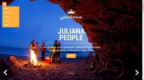
Juliana Bicycles - I don't typically like group scenes that aren't open to the viewer as they can send an exclusionary message. This bicycle site doesn't because of the magic of place pictured and the ancient desire to warm next to a fire with friends.

Would NEVER have thought Juliana Bicycles hero could feel so beautiful, friendly and inviting breaking several key rules - but it does.


Via Martin (Marty) Smith, malek
malek's curator insight, April 25, 2014 8:50 AM

One Unusual trend we ignore

In Digital strategy pay maximum attention to social media tools, digital tricks and marketing tips. But, we don’t always keep tabs on website design trends and evolution