Visualization Techniques and Practice
16.3K views | +0 today
Follow
Visualization Techniques and Practice
How to use visualization techniques for nonprofits in areas like data analysis, learning, facilitation, and innovation
Curated by Beth Kanter
Your new post is loading...
Rescooped by Beth Kanter from Measuring the Networked Nonprofit
Scoop.it!

Infographic Builders: 9 Free Tools To Create Great Visual Charts

Infographic Builders: 9 Free Tools To Create Great Visual Charts | Visualization Techniques and Practice | Scoop.it

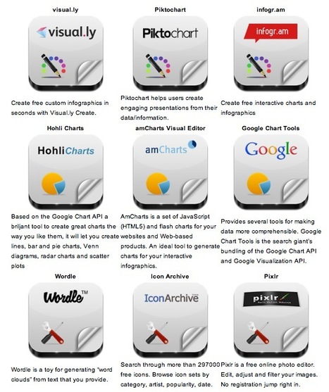
Robin Good: Here is a handy short guide to nine free infographic creation tools that can be utilized to create enticing visuals, word charts and data-based infographics without having special technical skills.


Useful. 8/10


Check them all out: http://www.infographicsarchive.com/create-infographics-and-data-visualization/ 


(Unearted by Andres Taborga)


Hey All -- sometimes in business we need to display/convey data with our storytelling. So how do you display data in engaging ways? I love this article because it shares 6 free tools to use, plus there's a little tutorial on how to make infographics.


We all know how important it is to have the right tool for the job at hand. Bookmark this article so when you need the tools you have them. Enjoy playing with your numbers and showing them in different ways!


Thank you Robin Good for curating this article.


Via Robin Good, Beth Kanter
Trude Burnett's curator insight, May 9, 2014 3:48 PM

Good tools to make Infographics

becool's curator insight, May 4, 2015 6:40 AM

Infographics voor zij die er nog steeds zot van zijn.

Sahana Chattopadhyay's curator insight, May 4, 2015 11:59 PM

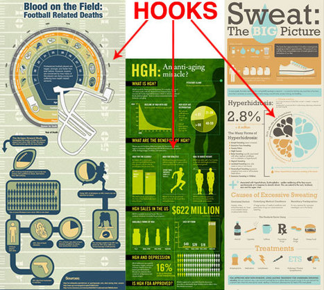
Infographics are great tools to present curated and focused content from a specific perspective. 

Scooped by Beth Kanter
Scoop.it!

Visual Storytelling--The Do's And Don'ts Of Infographic Design - Smashing Magazine

Visual Storytelling--The Do's And Don'ts Of Infographic Design - Smashing Magazine | Visualization Techniques and Practice | Scoop.it
Infographics are visual representations of information, or “data viz” as the cool kids call it these days.


Here's a great article on how to create infographics, or tell a story using 'data viz.'


Translating data into a story is tough work and this article gives us some fabulous tips on how to do it.


Not a graphic designer? Don't worry -- as a business person the more you know about how to create a great data viz story, the better you can tell a graphic designer or graphic scriber what you want.


Another reason I like this article is because it actually mentions the need to create a storyline for your visual, and know before had what the key message is you are trying to deliver.


The storytelling points the article leaves out are the storytelling devices of metaphor, analogy, contrast, and sensory material that are critical to a story's and an infographic's success.  These pieces are implied in the article, but need more direct discussion about.


Use this article as a great guide.  And if you want more detail, go dig into "Visualize This" by Nathan Yau (although it can be pretty technical).

No comment yet.
Rescooped by Beth Kanter from Measuring the Networked Nonprofit
Scoop.it!

Data visualisation success hinges on solid storytelling skills

Data visualisation success hinges on solid storytelling skills | Visualization Techniques and Practice | Scoop.it
Learn more about the value of data visualisation. Tableau's Jock Mackinlay explains why data is inert and worthless without the twin practices of visualisation and storytelling.


This is a quick piece that makes some valuable points. Frankly, I'm not a hard-core data head. Yet I love looking at spreadsheets, bar charts, line charts and other visual displays of data in order to make meaning of the material and spot trends. 


There is a whole science to displaying data in meaningful ways (see Edward Tufte's work) that we don't need to go into here. But what I like about this article is that it points to the fact that all the data in the world is meaningless until you can tell the story about what it is saying and what it means.


Storytelling and data go hand-in-hand.


Truly, those of us in the field of business storytelling need to build our data skills. And data-geeks need to develop their storytelling skills. Sounds like a match made in heaven!


Here's another aspect of storytelling that this article alludes to: yes, we all know it takes time to share a story and in this fast-paced world, it is not uncommon to hear "But who has the time?! Just give me the data to share. We've got to get moving!"  Ahhhhh -- huge mistake! Taking the time to share a story in the beginning makes projects go much more quickly. 


That sounds counter-intuitive, but I experience this phenomenon again and again.


Read the article for additional points on how the marriage of data and storytelling make for better decision making. They are worth remembering.


This review was written by Karen Dietz for her curated content on business storytelling at www.scoop.it/t/just-story-it 


Via Bas Kooter, Beth Kanter
No comment yet.