Visualization Techniques and Practice
16.3K views | +0 today
Follow
Visualization Techniques and Practice
How to use visualization techniques for nonprofits in areas like data analysis, learning, facilitation, and innovation
Curated by Beth Kanter
Your new post is loading...
Rescooped by Beth Kanter from visual data
Scoop.it!

2012 Winners of the Information is Beautiful awards

2012 Winners of the Information is Beautiful awards | Visualization Techniques and Practice | Scoop.it

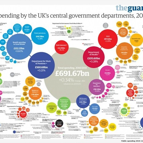
On September 27th, the world's best examples of visually stunning information was recognized at the inaugural Information is Beautiful awards.

The event, held at London's Institute of Contemporary Arts, awarded designers from all over the world in a variety of categories, including data visualisation, infographics and data journalism.

When David McCandless, author, data journalist and founder of the IIB data-visualisation studio, announced in early 2012 that IIB was looking for award applicants, he was inundated with over 1,000 entries.

"I've just been amazed by the sheer quality of the creative work submitted to the awards from around the world," McCandless told Wired.co.uk. "There are a number of criteria we look for when judging these awards. Not only do they have to have the right visual quality and be easily understood, they have to have that invisible element of story telling as well."


Read the complete article for a closer look at all the winners, selected by a panel of judges including musician and visual artist Brian Eno, senior curator of the Museum of Modern Art Paola Antonelli, BrainPickings.org editor Maria Popova and Guardian Datablog editor Simon Rogers.


Via Lauren Moss
No comment yet.
Rescooped by Beth Kanter from Content Curation World
Scoop.it!

A Curated Selection of Data Visualization Charts and Infographics: The Information Is Beautiful Awards

A Curated Selection of Data Visualization Charts and Infographics: The Information Is Beautiful Awards | Visualization Techniques and Practice | Scoop.it

Robin Good: David McCandlees, the author of the book Information is Beautiful celebrates great data visualization and information design work through the Information is Beautiful Awards.

Together with a jury of experts like Brian Eno, Paola Antonelli, Maria Popova, Simon Rogers and Aziz Kami, he has curated a unique selection of 300 designs and a short list of finalists in the following categories:


» Data visualization– A singular visualisation of data or information.» Infographic – Using multiple data visualisations in service to a theme or story


» Interactive visualization – Any viz where you can dynamically filter or explore the data.


» Data journalism – A combination of text and visualizations in a journalistic format.


» Motion infographic – Moving and animated visualizations along a theme or story.


» Tool or website – Online tools & apps to aid datavizzing.


The selection itself is worth a tour of the site and of this initiative.


Check: http://www.informationisbeautifulawards.com/


Longlist selection: http://www.informationisbeautifulawards.com/2012/07/our-longlist/


Shortlist selection: http://www.informationisbeautifulawards.com/2012/08/awardshortlist/


Via Robin Good
No comment yet.