Visualization Techniques and Practice
16.3K views | +0 today
Visualization Techniques and Practice
How to use visualization techniques for nonprofits in areas like data analysis, learning, facilitation, and innovation
Curated by Beth Kanter
Your new post is loading...
Rescooped by Beth Kanter from visual data
Scoop.it!

Is Data Visualization Art?

Is Data Visualization Art? | Visualization Techniques and Practice | Scoop.it

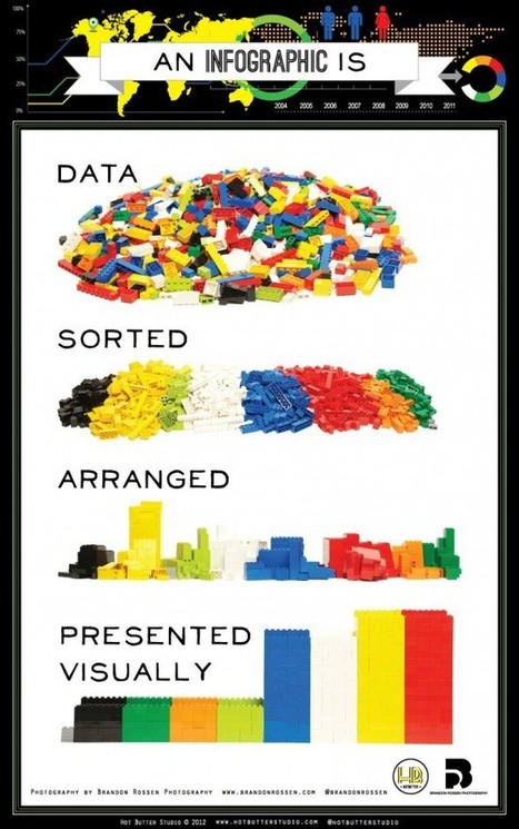
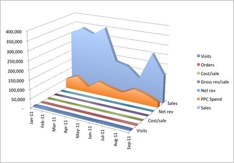
Data Visualization is driven by data. Its form is often derived from optimizing the efficiency of inputting data (and information about that data) into a human brain. It is a very pragmatic practice, built around numbers and logic.


And yet it is beautiful. It evokes emotions. It can be aesthetically pleasing, or hideous. It communicates complex concepts and provokes thought. It is consumed for enjoyment. Some visualizations even share similarities with poetry.

There are several stages in the life cycle of data visualizations, and while the core of the practice is driven by rational thinking, any number of stages in the process have opportunities for subjective decisions or artistic interpretations...
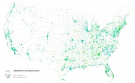

Via Lauren Moss
Lauren Moss's curator insight, January 24, 2013 7:42 PM

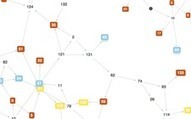
An overview of the creative and artistic processes involved in data visualization...

Rescooped by Beth Kanter from visual data
Scoop.it!

Lessons from Visualized: Cutting Through Hyperbole With Data Visualization

Lessons from Visualized: Cutting Through Hyperbole With Data Visualization | Visualization Techniques and Practice | Scoop.it

At the Visualized conference on November 9th, Neil Halloran posed an interesting question: Can DataViz lead to a data savvy society in the same way that the printing press lead to a literate one? One that is prepared to make tough decisions on complex issues?

Neil Halloran thinks so. That’s why he created VisualBudget.org to cut through hyperbole surrounding the what may be the most frequently misunderstood and pressing issue facing Americans today, our massive $16 trillion dollar deficit.

But how is a modern citizen supposed to make an informed decision on issues of tremendous scope and complexity, such as the fiscal cliff or the growing budget deficit without falling back on sound bites and punditry? Neil Halloran’s solution is to tell a story. Rather than simply presenting a static infographic or a set of tabular data on federal receipts and expenditures, VisualBudget.org takes you on a interactive tour...


Via Lauren Moss
No comment yet.
Rescooped by Beth Kanter from visual data
Scoop.it!

The top 20 data visualisation tools

The top 20 data visualisation tools | Visualization Techniques and Practice | Scoop.it

From simple charts to complex maps and infographics, Brian Suda's round-up of the best – and mostly free – tools has everything you need to bring your data to life...

A common question is how to get started with data visualisations. Beyond following blogs, you need to practice – and to practice, you need to understand the tools available. In this article, get introduced to 20 different tools for creating visualisations: from simple charts to complex graphs, maps and infographics. Almost everything here is available for free, and \you may have installed already...


Via Lauren Moss
Randy Rebman's curator insight, January 28, 2013 12:33 PM

This looks like it might be a good source for integrating infographics into the classroom.

Rescooped by Beth Kanter from visual data
Scoop.it!

11 of the Most Influential Infographics of the 19th-Century...

11 of the Most Influential Infographics of the 19th-Century... | Visualization Techniques and Practice | Scoop.it
We live in a world steeped in graphic information. From Google Maps and GIS to the proliferation of infographics and animated maps, visual data surrounds us.

While we may think of infographics as a relatively recent development to make sense of the immense amount of data available on the Web, they actually are rooted in the 19th century.

Two major developments led to a breakthrough in infographics: advances in lithography and chromolithography, which made it possible to experiment with different types of visual representations, and the availability of vast amounts of data, including from the American Census as well as natural scientists, who faced heaps of information about the natural world, such as daily readings of wind, rainfall, and temperature spanning decades.

But such data was really only useful to the extent that it could be rendered in visual form. And this is why innovation in cartography and graphic visualization mattered so greatly...


Via Lauren Moss
No comment yet.
Scooped by Beth Kanter
Scoop.it!

Visual Marketing Tips Tools Best Practices

Visual Marketing Tips Tools Best Practices | Visualization Techniques and Practice | Scoop.it

Curated by Beth Kanter

http://www.bethkanter.org


This is a great visual of how to visualize and make sense of your data.   

No comment yet.
Rescooped by Beth Kanter from visual data
Scoop.it!

How To Assess Quality of Infographic

How To Assess Quality of Infographic | Visualization Techniques and Practice | Scoop.it

Curatored by Beth Kanter

http://www.bethkanter.org


Is an infographic good or not?

(1)  Graphics - look/feel

(2)  Are there insights shared based on data?


Via Lauren Moss
No comment yet.
Scooped by Beth Kanter
Scoop.it!

Data Visualization: Simplicity

Data Visualization:  Simplicity | Visualization Techniques and Practice | Scoop.it

Curated by Beth Kanter

http://www.bethkanter.org  


A big hat tip to Lauren Moss, another visual data curator - http://www.scoop.it/t/visual-data for finding this post from Flowing Data blog on data visualization techniques for non graphic designers.


This points out the important of simplicity.  How can you illustrate your insight as simply and sharply as possible? 


No comment yet.
Rescooped by Beth Kanter from visual data
Scoop.it!

7 Data Visualization Tools You Can Use In The Classroom

7 Data Visualization Tools You Can Use In The Classroom | Visualization Techniques and Practice | Scoop.it

No matter what happens, there will always be a demand for data visualization tools. Data on its own can be pretty boring and brightening it up with images and other visual tools, it can make normally inaccessible information much easier to digest. (Editor’s Note: It’s also great for information reading literacy, and the new Common Core demand for multimedia “texts.”)


There are a number of fantastic tools out there that will present your data in an accessible manner. All of the tools listed below are free and chances are you’ve used one or two of the tools mentioned before.


Via Lauren Moss
bancoideas's curator insight, January 17, 2013 8:34 AM

Muy interesante!

Rescooped by Beth Kanter from visual data
Scoop.it!

Infographics: More Than Meets Eye...

Infographics: More Than Meets Eye... | Visualization Techniques and Practice | Scoop.it

The human brain processes visual information much faster and digests this type of content concurrently, whereas it takes more time to break text down. So, for many, it makes more than just sense to have your complex information delivered to your target audience in the most legible format...


Infographics make good use of brain’s ability to assimilate knowledge and information through the visual medium, making tough-to-crack-data appealing. Simply put, an infographic is a carefully composed collage of images, content, charts, stats, diagrams, animations & video to graphically represent information.

Infographics are used by various quarters such as educational institutions, acadamecians, businesses, newspapers, and just anybody who are serious about putting across their point in the most simplest manner. Infographics take different forms- venn diagrams, charts, timelines, maps and more. They are not merely a design or an image or random data; their purpose should be seen from every angle.


Visit the link to learn more about the process of creating infographics, how to implement online tools and resources, and best practices...


Via Lauren Moss
No comment yet.
Rescooped by Beth Kanter from visual data
Scoop.it!

2012 Winners of the Information is Beautiful awards

2012 Winners of the Information is Beautiful awards | Visualization Techniques and Practice | Scoop.it

On September 27th, the world's best examples of visually stunning information was recognized at the inaugural Information is Beautiful awards.

The event, held at London's Institute of Contemporary Arts, awarded designers from all over the world in a variety of categories, including data visualisation, infographics and data journalism.

When David McCandless, author, data journalist and founder of the IIB data-visualisation studio, announced in early 2012 that IIB was looking for award applicants, he was inundated with over 1,000 entries.

"I've just been amazed by the sheer quality of the creative work submitted to the awards from around the world," McCandless told Wired.co.uk. "There are a number of criteria we look for when judging these awards. Not only do they have to have the right visual quality and be easily understood, they have to have that invisible element of story telling as well."


Read the complete article for a closer look at all the winners, selected by a panel of judges including musician and visual artist Brian Eno, senior curator of the Museum of Modern Art Paola Antonelli, BrainPickings.org editor Maria Popova and Guardian Datablog editor Simon Rogers.


Via Lauren Moss
No comment yet.
Rescooped by Beth Kanter from visual data
Scoop.it!

6 Deadly Sins of Data Visualization

6 Deadly Sins of Data Visualization | Visualization Techniques and Practice | Scoop.it
You’re a marketer. And half your job is marketing your ideas. Like it or not, you have to be good at proving your point, ‘cause being right isn’t enough. You have to justify the time, dollars and effort required for your internet marketing campaign. In the meeting room struggle for resources, your best weapon is great data presentation.

Events tell a story. and people more easily follow a story told visually than one told verbally.

Want to get better? Avoid these six gigantic visualization mistakes...


Via Lauren Moss
No comment yet.
Rescooped by Beth Kanter from Content Curation World
Scoop.it!

A Curated Selection of Data Visualization Charts and Infographics: The Information Is Beautiful Awards

A Curated Selection of Data Visualization Charts and Infographics: The Information Is Beautiful Awards | Visualization Techniques and Practice | Scoop.it

Robin Good: David McCandlees, the author of the book Information is Beautiful celebrates great data visualization and information design work through the Information is Beautiful Awards.

Together with a jury of experts like Brian Eno, Paola Antonelli, Maria Popova, Simon Rogers and Aziz Kami, he has curated a unique selection of 300 designs and a short list of finalists in the following categories:


» Data visualization– A singular visualisation of data or information.» Infographic – Using multiple data visualisations in service to a theme or story


» Interactive visualization – Any viz where you can dynamically filter or explore the data.


» Data journalism – A combination of text and visualizations in a journalistic format.


» Motion infographic – Moving and animated visualizations along a theme or story.


» Tool or website – Online tools & apps to aid datavizzing.


The selection itself is worth a tour of the site and of this initiative.


Check: http://www.informationisbeautifulawards.com/


Longlist selection: http://www.informationisbeautifulawards.com/2012/07/our-longlist/


Shortlist selection: http://www.informationisbeautifulawards.com/2012/08/awardshortlist/


Via Robin Good
No comment yet.
Rescooped by Beth Kanter from Measuring the Networked Nonprofit
Scoop.it!

6 Great Interactive Data Visualization Tools for Nonprofits

6 Great Interactive Data Visualization Tools for Nonprofits | Visualization Techniques and Practice | Scoop.it

Beth Kanter

http://www.bethkanter.org


In this 2-part series, I'm going to focus on the rapidly changing world of interactive tools for data visualization, or dataviz. These tools are especially useful for nonprofits and financial organizations whose brands rely on sharing metrics to deliver impact and value. Recently, many exciting HTML/CSS/Javascript-based data visualization tools have emerged. Some focus their attention on traditional charting and graphing, but others delve into the world of geocharting, heatmaps, timelines, and more.

No comment yet.
Scooped by Beth Kanter
Scoop.it!

A Nicely Curated Collection of Data Visualization Tools

A Nicely Curated Collection of Data Visualization Tools | Visualization Techniques and Practice | Scoop.it

Curated by Beth Kanter

http://www.bethkanter.org  


A curated selection of data visualization tools from datavisualization.ch -- I like the visualization of this resource list.  It includes maps, charts, and data.


No comment yet.