


The quick reference guide to big data and data analytics; from the definition to the history and future applications of big data.
Via Lauren Moss
Get Started for FREE
Sign up with Facebook Sign up with X
I don't have a Facebook or a X account


 Your new post is loading...
 Your new post is loading...
Your new post is loading...
The quick reference guide to big data and data analytics; from the definition to the history and future applications of big data. Via Lauren Moss 

As the old saying goes about pictures being "worth a thousand words," so goes the story about infographics. Infographics are a compelling way to represent complex information quickly and clearly. In an infographic, visual symbols and numbers are used with colors, fonts, and labels to make the data more useful. With the flood of information and exponential data points, it is imperative to focus people's attention on not just the valuable data, but the implications as well. Storytelling is using a linear narrative to guide people- as the creative and performance marketing communities work together to make sense of data, we must not squander the opportunity that this format provides. We need to create meaningful infographics that minimize information anxiety by conveying the perspective in the most effective manner. Agencies are tasked with providing creative expressions that connect target audiences with meaningful content -- and infographics are by no means any different. Visit the complete article to learn more about the fundamental factors that contribute to successful infographics:.. Via Lauren Moss
Curatored by Beth Kanter Is an infographic good or not? (1) Graphics - look/feel (2) Are there insights shared based on data? Via Lauren Moss
|

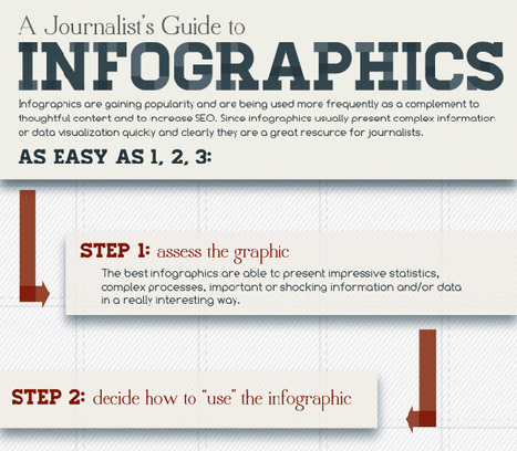
The last in a series of infographics about visual data design, we have covered why it's useful to create them, created an embed code generator for you and written an article on promoting infographics. We felt a fitting end to the series would be - you guessed it - an infographic. This infographic (about infographics of course) goes through 4 stages of creating an infographic: research, design, publishing and promotion offering tips at each stage. If you are thinking about making your own infographics this not only provides some great tips but acts as a good example of an infographic itself... Via Lauren Moss
From
ht

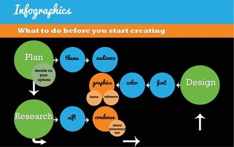
Let’s be honest, we don’t like to read big pieces of text. Text-heavy graphs are rather difficult for understanding, especially when dealing with numbers and statistics. That is why illustrations and flowcharts are often used for such kind of information. An infographic, or a visual representation of study or data, like anything else, can be done right or wrong. How to create a successful infographic? A good idea and a good design. Stop by the link for more on what defines an infographic, what contributes to its popularity, as well as the various types of infographics and references for tutorials and best practices. Additional topics covered include:
Via Lauren Moss
|


Superbe infographie pour un résumé en image !
Big Data clarity from Deloitte....