


BestYou really have no excuse to post a big block of text--and face it no one is going to click on it. Here's how to make your social media posts more...
Get Started for FREE
Sign up with Facebook Sign up with X
I don't have a Facebook or a X account


 Your new post is loading...
 Your new post is loading...
Your new post is loading...
BestYou really have no excuse to post a big block of text--and face it no one is going to click on it. Here's how to make your social media posts more...
Beth Kanter's insight:
Best tool list of editors, text images, and infographics. Most free. 
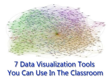
No matter what happens, there will always be a demand for data visualization tools. Data on its own can be pretty boring and brightening it up with images and other visual tools, it can make normally inaccessible information much easier to digest. (Editor’s Note: It’s also great for information reading literacy, and the new Common Core demand for multimedia “texts.”) There are a number of fantastic tools out there that will present your data in an accessible manner. All of the tools listed below are free and chances are you’ve used one or two of the tools mentioned before. Via Lauren Moss
The human brain processes visual information much faster and digests this type of content concurrently, whereas it takes more time to break text down. So, for many, it makes more than just sense to have your complex information delivered to your target audience in the most legible format... Infographics make good use of brain’s ability to assimilate knowledge and information through the visual medium, making tough-to-crack-data appealing. Simply put, an infographic is a carefully composed collage of images, content, charts, stats, diagrams, animations & video to graphically represent information. Infographics are used by various quarters such as educational institutions, acadamecians, businesses, newspapers, and just anybody who are serious about putting across their point in the most simplest manner. Infographics take different forms- venn diagrams, charts, timelines, maps and more. They are not merely a design or an image or random data; their purpose should be seen from every angle. Visit the link to learn more about the process of creating infographics, how to implement online tools and resources, and best practices... Via Lauren Moss
Want to create an attractive infographic but don’t have the budget to hire a professional designer? Then you should try using an infographic-creation tool. If your small business is looking for an eye-catching and easy to comprehend way to teach, inform, and inspire others about its products and services, infographics might be a good solution. Infographics can be more effective and memorable than other ways to present data, making them particularly effective for online audiences. To create an infographic, you should make a list of possible ideas that you want to get across, create the initial draft or skeleton, color scheme it, and research your content from authoritative sites. Then it’s time to select your design platform. Read about three online tools that can help you create stunning infographics... Via Lauren Moss

“Open data” — the philosophy and practice of making the data collected by government agencies freely available to the public — is critical to increasing citizens’ engagement with their governments. Since 2010, hundreds of nations, regions, and cities across the world have launched their own open data initiatives. For example, datacatalogs.org maintains centralized lists of local, regional, and national data catalogs. Europe is heavily represented: nearly every country publishes open data, geospatial files and maps and statistics. Within each nation, local councils, regional governments, and autonomous regions are publishing their own locally-relevant open data. Spain, Italy, and France each boast over a dozen internal data catalogs created by local agencies... Whether or not open data portals eventually lead to open, transparent, and accountable democratic governments is still up for debate, but they remain indispensable to the citizens, researchers, and journalists using data from these sites. Read the complete post for a better understanding of open data in a concise, yet informative article with numerous links and specific initiatives referenced for further research... Via Lauren Moss

Johnson Watts's comment,
October 2, 2012 1:35 PM
It's not the size of government that counts. It's the transparency, agility, and democracy of goverment that matters.
Beth Kanter Another way to articulate the importance of sense-making. Think about it this way: Tools are not always actual objects designed to help us with physical activities. A notebook, whether it is a Moleskine or an Evernote digital document, is a tool that expands our memory. A digital calculator, whether it is an inexpensive machine bought in the nearest Dollar Tree or an app downloaded to your iPhone, frees you from the burden of having to retain and execute many complex mathematical algorithms. Non-physical tools (or sets of tools and practices), such as statistics and the scientific method, evolved to let us gaze beyond what we would normally see, and to overcome our deepest biases and lazy habits of mind. The same is true for great visual displays of information... Via Lauren Moss

Beth Kanter In this 2-part series, I'm going to focus on the rapidly changing world of interactive tools for data visualization, or dataviz. These tools are especially useful for nonprofits and financial organizations whose brands rely on sharing metrics to deliver impact and value. Recently, many exciting HTML/CSS/Javascript-based data visualization tools have emerged. Some focus their attention on traditional charting and graphing, but others delve into the world of geocharting, heatmaps, timelines, and more.

Curated by Beth Kanter Mind maps, visual organizers, are terrific for organizing wild brainstorms for writing reports, preparing presentations, or as a prelude to your editorial calendar. This article written for an audience of content marketers provides some examples of using mindmaps to brainstorm ideas for blog posts. I like mindmaps for data visualization too because it help you get to the higher level synthesis. It also mentions two mind map apps: Do you use mindmaps? How?

These tools will help make some necessary adjustments to your photos before you start adding effects to enhance them. Via Khaled El Ahmad
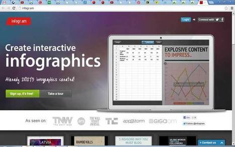
Maybe you want create your own infographic, here 10 tools to support you to do it. [note mg]
Information graphics, visual representations of data known as infographics, keep the web going these days. Web users, with their diminishing attention spans, are inexorably drawn to these shiny, brightly coloured messages with small, relevant, clearly-displayed nuggets of information. They’re straight to the point, usually factually interesting and often give you a wake-up call as to what those statistics really mean.
Who can resist a colourful, thoughtful venn diagram anyway? In terms of blogging success, infographics are far more likely to be shared than your average blog post. This means more eyeballs on your important information, more people rallying for your cause, more backlinks and more visits to your blog. In short, a quality infographic done well could be what your blog needs right now.
Read more: http://bit.ly/K0s4LL Via Martin Gysler, Khaled El Ahmad
|
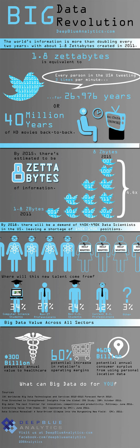
Is Big Data still a big mystery to you? Via Lauren Moss

At the Visualized conference on November 9th, Neil Halloran posed an interesting question: Can DataViz lead to a data savvy society in the same way that the printing press lead to a literate one? One that is prepared to make tough decisions on complex issues? Neil Halloran thinks so. That’s why he created VisualBudget.org to cut through hyperbole surrounding the what may be the most frequently misunderstood and pressing issue facing Americans today, our massive $16 trillion dollar deficit. But how is a modern citizen supposed to make an informed decision on issues of tremendous scope and complexity, such as the fiscal cliff or the growing budget deficit without falling back on sound bites and punditry? Neil Halloran’s solution is to tell a story. Rather than simply presenting a static infographic or a set of tabular data on federal receipts and expenditures, VisualBudget.org takes you on a interactive tour... Via Lauren Moss

A free resource from Tripwire Magazine: a useful portfolio infographics design kit you can use for your personal or business portfolio or CV. For those looking for a simple and easy to tweak portfolio, take a look at this Infographics design kit- a tool for anyone updating a portfolio or CV to make it stand out. The elements come in PDS and Ai files... Via Lauren Moss

Generally, people don’t have the time or energy to sit and plow through pages or screens of text; they want to be able to ingest information as quickly and easily as possible. With the recent rise of infographics (information graphics), what used to require an avalanche of stats or analyses to dissect, can now be interpreted and relayed into an easy-to-read, fun, and visually appealing schematic – and an excellent content marketing concept. Infographics, when designed well, can be applied to different online sites and social networks. Summarized at the article are 5 free tools (with links) that allow you to start creating simple infographics or explore the potential of data visualization... Via Lauren Moss

Cb Bowman's curator insight,
September 10, 2013 12:33 PM
The Tools Needed To Get You Started in Using Infographics
From simple charts to complex maps and infographics, Brian Suda's round-up of the best – and mostly free – tools has everything you need to bring your data to life... A common question is how to get started with data visualisations. Beyond following blogs, you need to practice – and to practice, you need to understand the tools available. In this article, get introduced to 20 different tools for creating visualisations: from simple charts to complex graphs, maps and infographics. Almost everything here is available for free, and \you may have installed already... Via Lauren Moss

Randy Rebman's curator insight,
January 28, 2013 12:33 PM
This looks like it might be a good source for integrating infographics into the classroom.

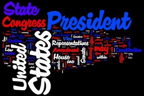
Infographics (or Information Graphics) are graphic visual representations of data or information, presented in a way to make it easier to consume information. Infographics gained popularity ...
Curated by Beth Kanter Want to create your own infographics? Here's 20 tools that help you. But tools alone won't do it -you need a credible data source, visualization and sense making skills, and some graphic design skills. Don't that scare you off .. but be ready to invest some thought before you dive into playing with the tools. Via Ritu Sharma
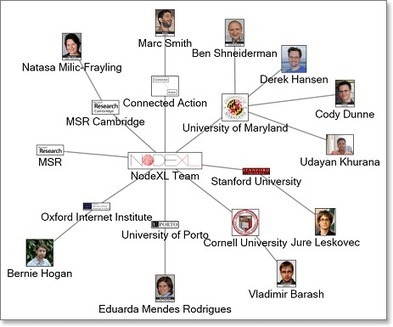
Visualizing your network. This tool helps. NodeXL is an Excel 2007/2010 template for viewing network graphs, along with a set of .NET Framework 3.5 class libraries that can be used to add network graphs to custom applications. My write up the workshop that I took back in 2009

FatFonts [fatfonts.org] is a novel numeric typeface for data visualization purposes. The design of FatFonts is based on Arabic numerals, but the amount of ink (i.e. dark pixels) used for each digit is proportional to its quantitative value. This font enables the reading of numerical data while still preserving an overall visual context.
|


So many cool free tools to help with images!