Visualization Techniques and Practice
16.3K views | +0 today
Follow
Visualization Techniques and Practice
How to use visualization techniques for nonprofits in areas like data analysis, learning, facilitation, and innovation
Curated by Beth Kanter
Your new post is loading...
Rescooped by Beth Kanter from visual data
Scoop.it!

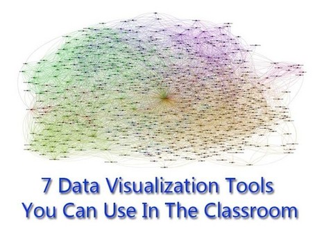
7 Data Visualization Tools You Can Use In The Classroom

7 Data Visualization Tools You Can Use In The Classroom | Visualization Techniques and Practice | Scoop.it

No matter what happens, there will always be a demand for data visualization tools. Data on its own can be pretty boring and brightening it up with images and other visual tools, it can make normally inaccessible information much easier to digest. (Editor’s Note: It’s also great for information reading literacy, and the new Common Core demand for multimedia “texts.”)


There are a number of fantastic tools out there that will present your data in an accessible manner. All of the tools listed below are free and chances are you’ve used one or two of the tools mentioned before.


Via Lauren Moss
bancoideas's curator insight, January 17, 2013 8:34 AM

Muy interesante!

Rescooped by Beth Kanter from visual data
Scoop.it!

How to Make an Infographic Worth a Thousand Words

How to Make an Infographic Worth a Thousand Words | Visualization Techniques and Practice | Scoop.it

As the old saying goes about pictures being "worth a thousand words," so goes the story about infographics.


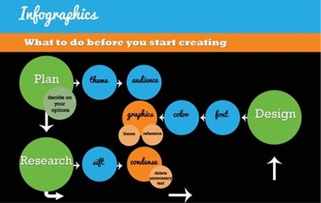
Infographics are a compelling way to represent complex information quickly and clearly. In an infographic, visual symbols and numbers are used with colors, fonts, and labels to make the data more useful. With the flood of information and exponential data points, it is imperative to focus people's attention on not just the valuable data, but the implications as well.

Storytelling is using a linear narrative to guide people- as the creative and performance marketing communities work together to make sense of data, we must not squander the opportunity that this format provides. We need to create meaningful infographics that minimize information anxiety by conveying the perspective in the most effective manner. Agencies are tasked with providing creative expressions that connect target audiences with meaningful content -- and infographics are by no means any different.

Visit the complete article to learn more about the fundamental factors that contribute to successful infographics:..


Via Lauren Moss
No comment yet.
Rescooped by Beth Kanter from visual data
Scoop.it!

All You Need to Know About Infographics: Tips, Tutorials, Guides

All You Need to Know About Infographics: Tips, Tutorials, Guides | Visualization Techniques and Practice | Scoop.it

Let’s be honest, we don’t like to read big pieces of text. Text-heavy graphs are rather difficult for understanding, especially when dealing with numbers and statistics. That is why illustrations and flowcharts are often used for such kind of information.

An infographic, or a visual representation of study or data, like anything else, can be done right or wrong. How to create a successful infographic? A good idea and a good design.


Stop by the link for more on what defines an infographic, what contributes to its popularity, as well as the various types of infographics and references for tutorials and best practices.


Additional topics covered include:

  • The major parts of an infographic
  • How to create an infographic
  • Developing ideas & organizing data
  • Research & sources
  • Typography, graphics & color
  • Facts & conclusions
  • Designing & Editing

Via Lauren Moss
HCL's curator insight, April 30, 2014 9:26 PM

Some good tips here...

Rescooped by Beth Kanter from visual data
Scoop.it!

The 16 Most Compelling Infographics Of 2012

The 16 Most Compelling Infographics Of 2012 | Visualization Techniques and Practice | Scoop.it

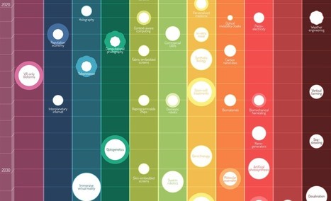
2012 might be the year which we reached 'peak infographic'.

You can’t have an issue or a piece of data without putting it into a picture so it’s easier for people to understand. While this has mostly resulted in a glut of ugly graphics that don’t actually do anything with data (and you’ll see some of these below), it’s still an incredibly simple way to get information to you fast. And this year, some of our most compelling content has appeared in the format.

These are some of our favorites.


Via Lauren Moss
Lauren Moss's curator insight, December 21, 2012 5:40 PM

A curated infographic gallery from FastCompany...

Jean-Michel Bayle's curator insight, December 29, 2012 11:49 AM

A voir ... rapidement 

Rescooped by Beth Kanter from visual data
Scoop.it!

A Living, Breathing Infographic: A Look at the Web's First Socially Generative Visualization

A Living, Breathing Infographic: A Look at the Web's First Socially Generative Visualization | Visualization Techniques and Practice | Scoop.it

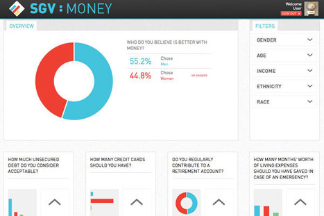
The idea of a Socially Generative Visualization originated out of a section of the design handbook INFOGRAPHICS.
An SGV, as described by the authors, is a new direction for data visualization– one which marketers and content consumers alike should take note of– especially as content distribution continues to be affected by socially relevant data.

What’s the next step when you’re looking to give your viewers a deeper interaction with your content? Apparently, we should be looking at “socially generative visualizations,” a novel approach that combines the best aspects of traditional static Infographics and classic interactive interfaces with a new purpose: “to allow the viewer to interact with the content in a more meaningful way by contributing to and actually being a part of the measured data that is displayed.”


Via Lauren Moss
No comment yet.
Rescooped by Beth Kanter from visual data
Scoop.it!

Why Infographics Are Visual Thinking

Why Infographics Are Visual Thinking | Visualization Techniques and Practice | Scoop.it

Beth Kanter

http://www.bethkanter.org


Another way to articulate the importance of sense-making.


Think about it this way: Tools are not always actual objects designed to help us with physical activities. A notebook, whether it is a Moleskine or an Evernote digital document, is a tool that expands our memory. A digital calculator, whether it is an inexpensive machine bought in the nearest Dollar Tree or an app downloaded to your iPhone, frees you from the burden of having to retain and execute many complex mathematical algorithms. Non-physical tools (or sets of tools and practices), such as statistics and the scientific method, evolved to let us gaze beyond what we would normally see, and to overcome our deepest biases and lazy habits of mind. The same is true for great visual displays of information...


Via Lauren Moss
No comment yet.