

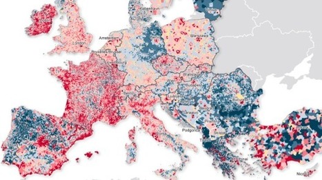

The map provides a level of detail previously unavailable. It is the first ever to collect data published by all of Europe’s municipalities.
Get Started for FREE
Sign up with Facebook Sign up with X
I don't have a Facebook or a X account


 Your new post is loading...
 Your new post is loading...
Your new post is loading...
The map provides a level of detail previously unavailable. It is the first ever to collect data published by all of Europe’s municipalities. 

Olivia Campanella's curator insight,
October 1, 2018 4:35 PM
Europe has been undergoing intense demographic change and this map is the first ever collect data published by Europe. How this map works:
The Dark Blue color shows average annual population fall of 2% or more The Medium Blue shows the average annual population fall of between 1 and 2% and Light Blue shows a fall of 1%. The areas in tan experienced no change at all. Areas in Deep Red show a rise of 2% or more in population, while in areas of Medium Red (1-2%) and Pale Pink (1%). 
K Rome's curator insight,
October 6, 2018 7:31 PM
Europe has been undergoing intense demographic change and this map is the first ever collect data published by Europe. How this map works:
The Dark Blue color shows average annual population fall of 2% or more The Medium Blue shows the average annual population fall of between 1 and 2% and Light Blue shows a fall of 1%. The areas in tan experienced no change at all. Areas in Deep Red show a rise of 2% or more in population, while in areas of Medium Red (1-2%) and Pale Pink (1%). 
othni lindor's curator insight,
October 20, 2018 2:45 AM
This article shows the population patterns of Europe between 2001 and 2011. Many cities have had a high rise in average annual population of 2 percent or more. This map also shows that there has been more migration in northwest Europe. Citizens have left certain cities in search of better job opportunities. The population in Germany is sparse except in Berlin. Spain has had a big drop in population overall. Many people living in more rural regions have moved to cities and many others are moving to coasts for retiring or downsizing.
Sign up to comment

Browse population growth and decline, changes in racial and ethnic concentrations and patterns of housing development. Via Andy Dorn
It took 200,000 years for our human population to reach 1 billion—and only 200 years to reach 7 billion. But growth has begun slowing, as women have fewer babies on average. When will our global population peak? And how can we minimize our impact on Earth’s resources, even as we approach 11 billion?

Jordyn Reeves's curator insight,
January 11, 2017 3:44 PM
This relates to our topic by showing that our population is growing rapidly. By the time 2025 there will be more than 11 billion people on the Earth. But we have enough resources to last us.
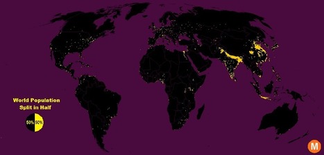
"Data viz extraordinaire Max Galka created this map using NASA’s gridded population data, which counts the global population within each nine-square-mile patch of Earth, instead of within each each district, state, or country border. Out of the 28 million total cells, the ones with a population over 8,000 are colored in yellow."
Tags: population, density, mapping, visualization. Via Brian Weekley

Brian Weekley's curator insight,
July 27, 2016 10:47 AM
Great simple map of world population. Scroll down and look at the U.S. It reflects the global trend. This also has political implications, as evidenced by voting patterns in the 2012 presidential election. Elections are dependent upon votes, which come from people, which are primarily clustered in cities. Election campaigns would use this data to plan their schedules as to where to focus their campaigning efforts. For the folks in Wyoming, they rarely see candidates other than during the primaries. And these world populationclusters have been relatively consistent historically, particularly in south and east Asia. Northern India has serious carrying capacity challenges. Notice the clusters along the Nile- evidence of arable land.
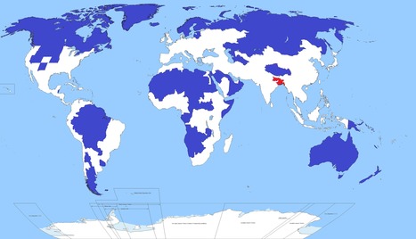
Well, this is kind of crazy. Only 5 per cent of the world's population lives in the regions of this map shaded blue. Another 5 per cent lives in the area shaded red. Yoinks.
Tags: population, density, South Asia.

Carlos Fosca's curator insight,
January 6, 2016 6:34 AM
Parece realmente una broma, pero la zona coloreada de rojo alberga a 350 millones de personas sobre una superficie que arroja una densidad poblacional de 1,062 habitantes por Km2. Si esto se compara con el país más densamente poblado de Europa, que es Holanda, con una densidad de 409 habitantes/Km2 o incluso con el departamento de Lima (269.1 habitantes /Km2) vemos que hay una gran diferencia. Pero el Perú también tiene propio su punto rojo en términos de densidad poblacional (no en términos de población absoluta). ¿Saben que lugar es este? Pues la provincia Constitucional del Callao que tiene una densidad poblacional de 7,159.83 habitantes/Km2 (2015). 
Richard Aitchison's curator insight,
March 19, 2018 11:52 AM
This map shows how much population is in one certain area. It is amazing to see all the land in the blue area which roughly adds up to 5% of the population, while that small area in red is also 5% of the worlds population. One can see just from the map some of the difficulties this might cause. The area in red has a major overpopulation problem and has a major need for resources for all of the people that live there. It also causes major divisions in socioeconomic and we tend to see many slum cities develop which on most likely built in poor geographical area. This can cause many issues in this area and we also see at the end of the article that with sea changes this could cause major problems in the near future in this area. If we were to see population move out of this area where would they go? We have major issues currently with a moving population in Europe, however it will be interesting to see where this population would move and how that would effect possible political policies of other South Asian countries.

Katie Kershaw's curator insight,
April 5, 2018 2:19 PM
If someone looked at this map and didn't have background knowledge on the population distribution on earth, they would probably think this map is fake. It's pretty unbelievable that one tiny spot of land has the same amount of people living on it than pretty much the rest of the entire world. The biggest thing that this map indicates is that earth's population is not evenly distributed even a little bit. This is partially because there are parts of the world that are uninhabitable, but that doesn't fully explain why so many people live in that tiny area. The red spot also tells me that people living in that area are going to have a very different experience than most other humans. Their resources are going to have to be divided thoroughly and they probably aren't going to get away with spending a lot of time without being in contact with other people. The end of this article pointed out another big problem with this dense area of settlement- if something were to happen to this area which either wiped out resources or killed people, the earth's population would drop significantly in a really short period of time. After looking at this, I regret how angry I used to be about sharing a room with my sister. Now that I have my own bedroom I can see that I was actually pretty lucky, because at least I didn't have 5% of the world's population within a few hundred miles of me.
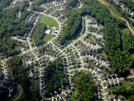
"Although we seldom think about them this way, most American communities as they exist today were built for the spry and mobile. We've constructed millions of multi-story, single-family homes where the master bedroom is on the second floor, where the lawn outside requires weekly upkeep, where the mailbox is a stroll away. We've designed neighborhoods where everyday errands require a driver's license. We've planned whole cities where, if you don't have a car, it's not particularly easy to walk anywhere — especially not if you move gingerly. This reality has been a fine one for a younger country. Those multi-story, single-family homes with broad lawns were great for Baby Boomers when they had young families. And car-dependent suburbs have been fine for residents with the means and mobility to drive everywhere. But as the Baby Boomers whose preferences drove a lot of these trends continue to age, it's becoming increasingly clear that the housing and communities we've built won't work very well for the old."

Alexandra Piggott's curator insight,
October 18, 2014 6:48 PM
This is also an issue in Australia where the overwhelming majority of people live in single story dwellings and are very car reliant. 
Joshua Mason's curator insight,
January 28, 2015 8:59 PM
I can definitely see this as a real problem. Both my Uncle and my Great Uncle moved their condos from ones that had numerous steps to climb to the second floor to more elder-friendly options. My Great Uncle even went a step further to move him and his wife to a senior living community, where there food, entertainment, etc. is all provided within an enclosed neighbourhood with other people of their age group. More of these communities that act like oversized retirement homes could be the answer. They give the illusion of suburban living, something the baby boomers liked, while providing the accessibility they need.

"There are 1.2 billion people between the ages of 15 and 24 in the world today — and that means that many countries have populations younger than ever before. Some believe that this 'youth bulge' helps fuel social unrest — particularly when combined with high levels of youth unemployment. Youth unemployment is a 'global time bomb,' as long as today’s millennials remain 'hampered by weak economies, discrimination, and inequality of opportunity.' The world’s 15 youngest countries are all in Africa. Of the continent’s 200 million young people, about 75 million are unemployed. On the flip side, an aging population presents a different set of problems: Japan and Germany are tied for the world’s oldest countries, with median ages of 46.1. Germany’s declining birth rate might mean that its population will decrease by 19 percent, shrinking to 66 million by 2060. An aging population has a huge economic impact: in Germany, it has meant a labor shortage, leaving jobs unfilled." Via Jim Lerman

Brian Wilk's curator insight,
March 23, 2015 7:08 PM
Demographics seemingly started with age as a metric many years ago and have evolved into marketing tools, political footballs, and ways to combat everything from obesity to social security. Africa is clearly the youngest and probably for a very morbid reason; AIDS and Ebola among other diseases have taken their toll on the sexually active and thus have reduced the average age of their population. Germany seems to be the place to go for a job as the labor shortage will mean higher wages for the folks who are left. Japan has another issue; a healthy aging population that will strain the government's ability to financially take care of them. I wonder if the unevenness of Europe is an indication of the two World wars that were fought mostly on the turf. Did some countries lose more than others? If more soldiers, presumably of baby making age, perished did this affect the countries ability to keep pace with the Germany's and Spain's of Europe? Diet seems to play a large part as well as the Mediterranean is well represented in terms of age. Does their healthy diet of fish, nuts, legumes and olive oil make a difference? I could spend all day postulating, but I'll leave some of the findings for you to discover... 
Deanna Metz's curator insight,
March 1, 2016 8:05 PM
The median age of a population call be a quite telling statistic--almost a surrogate for a population pyramid. I post this with a special attention to Sub-Saharan Africa; the youngest 15 countries in the world are all in Africa, one of the major demographic realities confronting African economies and politics. Here is a map with the median age of U.S. counties. Tag: population, demographic transition model, population pyramids.
Olivia Campanella's curator insight,
October 31, 2018 11:55 AM
In the article there are 1.2 billion people between the ages of 15 and 24 in the world today. Meaning that, countries around the world have populations younger than ever! 15 of the youngest countries are in Africa. And of the 200 million young people of Africa, about 75 million are unemployed. The worlds youngest country is Niger with a population and median age of 15.1 and coming in a close second is Uganda with 15.5, but Japan and Germany are some of the Worlds oldest countries ranging in a median age of 46.1!
|
In which John Green teaches you about population. So, how many people can reasonably live on the Earth? Thomas Malthus got it totally wrong in the 19th century, but for some reason, he keeps coming up when we talk about population. In 1800, the human population of the Earth passed 1 billion, and Thomas Malthus posited that growth had hit its ceiling, and the population would level off and stop growing. He was totally right. Just kidding, he was totally wrong! There are like 7 billion people on the planet now! John will teach a little about how Malthus made his calculations, and explain how Malthus came up with the wrong answer. As is often the case, it has to do with making projections based on faulty assumptions. Man, people do that a lot.
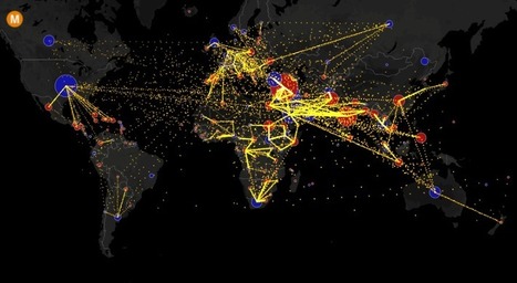
Visualizing the flow of the world's migrants from country to country.
Based on data from the U.N. Population Division, this map shows the estimated net migration (inflows minus outflows) by origin and destination country between 2010 and 2015. Blue circles = positive net migration (more inflows). Red circles = negative net migration (more outflows). Each yellow dot represents 1,000 people. Hover over a circle to see that country’s total net migration between 2010 and 2015. Click a circle to view only the migration flows in and out of that country. For more info about this map, read the article, All the World’s Immigration Visualized in 1 Map.
Tags: migration, USA, mapping, population, unit 2 population.

GTANSW & ACT's curator insight,
December 17, 2016 11:46 PM
Migration at a global scale changes places
Syllabus Students investigate reasons for and effects of internal migration in Australia and another country, for example:
Students investigate the reasons for and effects of international migration to Australia, for example:
Geoworld 9 NSW 8.1 Migration: people own the move 8.2 Australia: destination nation 8.3 Where do immigrants settle 8.4 Culturally diverse australia: trends in migration
8.8 Australians are mobile people 8.9 Mobile indigenous populations 8.19 Lifestyle migration 8.11 The power of resources: the Pilbara 8.12 Migration changes the USA Geothink
"What has lead to this marriage squeeze? First, millions women have gone 'missing'. A generation ago, a preference for sons and the greater availability of prenatal screening meant first Chinese couples, then Indian ones, started aborting female fetuses and only giving birth to boys. At its extreme, in parts of Asia, more than 120 boys were being born for every 100 girls. Now, the generation with distorted sex ratios at birth is reaching marriageable age. The result is that single men far outnumber women."
Tags: gender, China, India, culture, population.

Taylor Doonan's curator insight,
May 3, 2018 11:58 AM
This video talks about the marriage crisis India and China will be facing over the next few decades. The one child rule that was enforced in the region caused many couples to selectively abort their daughters so they could have sons instead, doing this caused a major population gap between men and women. Now as this group of the population where men so drastically outnumber women come of age the countries face a marriage crisis. With men so drastically outnumbering women and marriage being such an important part of the culture in India and China the countries could undergo severe cultural changes.
Every 10 years, the Census Bureau calculates the exact center of the US population. Here's what that statistic shows about our history.
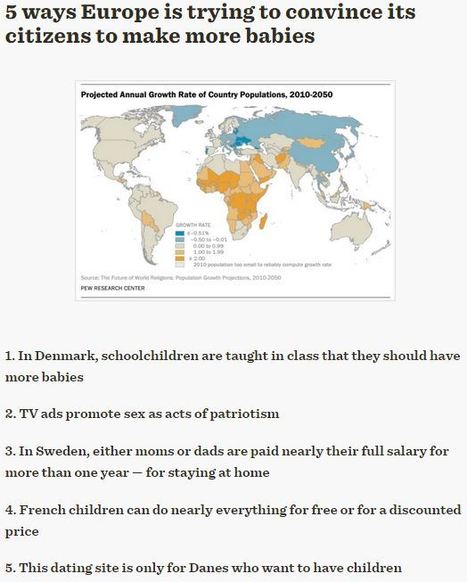
"All over the continent, potential parents have shown reluctance to have more babies. Hence, governments and advocacy groups are becoming increasingly creative about getting their citizens to make babies."
Tag: Europe, declining populations, population, demographic transition model.

Adam Deneault's curator insight,
December 7, 2015 4:32 PM
After reading such an article, I could not understand why someone would not want to have children, especially with the incentives offered by the governments. Clearly it seems as if Denmark is the most concerned because they take up three out of five of the slots for how Europe is trying to convince its citizens to make more babies. In general, the incentives seem to be very good, good enough for someone to want to have children. In Sweden you get 480 days out of work plus 80% of your previous salary, Denmark says if Danes were successful in conceiving a child while being on a vacation organized by the company, they were eligible to win three years of free diapers and a trip abroad and France pays families monthly allowances to their children who are younger than 20, plus discounts. 
Benjamin Jackson's curator insight,
December 13, 2015 3:01 PM
the fact that these campaigns are necessary in this age where migrants are flooding Europe and the birth rate is declining. its amazing that this is necessary, but with the birthrate declining the only other home to insure their economic system continues to function is to get the migrants working. 
Zavier Lineberger's curator insight,
March 13, 2018 11:53 PM
(Europe) Europe, especially in the middle and eastern regions, faces a challenge: population decay. Europeans are having less children so the population rate is decreasing, unlike many parts of the world. In Denmark, instead of focusing only on preventing pregnancy and using contraceptives, educators mention the advantages to having children. Denmark also launched advertisements linking sex to patriotism, gives benefits to couples conceiving during vacations, and created a dating site for citizens who intend to start a family. Nearby Sweden passed a law allowing either the mother or father to be entitled to 80% of their pay for 480 days after their child's birth, eliminating some financial concerns for inability to work during childcare. In France, families with children/young adults under 20 get a monthly federal stipend and heavy discounts.
However, according the accompanying map, the projected annual growth rate of the three countries mentioned are all positive (0.00 to 0.99% growth). This may be because of the mentioned campaigns, but the article does not mention the efforts to remedy this social problem in countries marked in blue. These areas face great population problems in the next decades, and it would be interesting to understand more of their problems.
"Although we seldom think about them this way, most American communities as they exist today were built for the spry and mobile. We've constructed millions of multi-story, single-family homes where the master bedroom is on the second floor, where the lawn outside requires weekly upkeep, where the mailbox is a stroll away. We've designed neighborhoods where everyday errands require a driver's license. We've planned whole cities where, if you don't have a car, it's not particularly easy to walk anywhere — especially not if you move gingerly. This reality has been a fine one for a younger country. Those multi-story, single-family homes with broad lawns were great for Baby Boomers when they had young families. And car-dependent suburbs have been fine for residents with the means and mobility to drive everywhere. But as the Baby Boomers whose preferences drove a lot of these trends continue to age, it's becoming increasingly clear that the housing and communities we've built won't work very well for the old."
Alexandra Piggott's curator insight,
October 18, 2014 6:48 PM
This is also an issue in Australia where the overwhelming majority of people live in single story dwellings and are very car reliant.
Joshua Mason's curator insight,
January 28, 2015 8:59 PM
I can definitely see this as a real problem. Both my Uncle and my Great Uncle moved their condos from ones that had numerous steps to climb to the second floor to more elder-friendly options. My Great Uncle even went a step further to move him and his wife to a senior living community, where there food, entertainment, etc. is all provided within an enclosed neighbourhood with other people of their age group. More of these communities that act like oversized retirement homes could be the answer. They give the illusion of suburban living, something the baby boomers liked, while providing the accessibility they need. |


