Education in a Multicultural Society
1.1K views | +0 today
Follow
Your new post is loading...
Rescooped by Dennis Swender from :: The 4th Era ::
Scoop.it!

Human Development Index (HDI)

Human Development Index (HDI) | Education in a Multicultural Society | Scoop.it

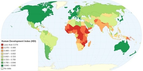
"This map shows Human Development Index (HDI) for 169 countries in the World. The HDI is a comparative measure of life expectancy, literacy, education, and standard of living for countries worldwide. The HDI sets a minimum and a maximum for each dimension, called goalposts, and then shows where each country stands in relation to these goalposts, expressed as a value between 0 and 1, where greater is better. The Human Development Index (HDI) measures the average achievements in a country in three basic dimensions of human development: health, knowledge and standard of living."


Tags: development, statistics, worldwide.


Via Jim Lerman
Caroline Ivy's curator insight, May 18, 2015 10:41 AM

This article discusses the Human Development Index (HDI), what it is, and how it is calculated. 


This chart displays that the top three spots on the HDI are occupied by Norway, Australia, and the Netherlands respectively, with the USA coming in fourth. As HDI is calculated by comparing aspects like literacy, standard of living, education, and life expectancy, why are two European countries and Australia in the top 3? Something to be looked at is the in-migration of each country. Immigrants arrival in large numbers in some countries can lower HDI if they are refugees or come from a country with a lower HDI, for they may be illiterate, have a low education, and therefore a low life expectancy. With in migration to the US tightly controlled but in constant motion, their HDI could be pulled down to 4th. As Norway and Australia and the Netherlands are not the main destination for refugees, their HDI could be higher.   

Cody Price's curator insight, May 27, 2015 12:49 AM

The HDI is the human development index which ranks countries in many different aspects. The higher the country the more developed and modern it is. The least amount of death and the longest lives are here. It is more stable the higher the country.


This relates to the topic in unit 6 of HDI. this map shows the basic HDIS of the world and the patterns formed by the HDI layout of the world. 

Anna Sasaki's curator insight, May 27, 2015 2:04 AM

This map shows the Human Development Index around the world. The HDI depends on a set list of variables, ranking them from 1st to last. Nations considered to be "Western" are more developed than nations in regions such as Africa and Asia, although all nations are slowly but steadily developing, improving their Human Development Index ranking.

The HDI shows development in nations, although leaving out Inequality factors. This map also allows us to see spatially what regions tend to be more developed as well as developing.

Scooped by Dennis Swender
Scoop.it!

Worldwide Country Comparison

Worldwide Country Comparison | Education in a Multicultural Society | Scoop.it

"MyLifeElsewhere allows you to compare your home country with different countries around the world. Ever wonder what your life would be like if you were born somewhere else?"

HG Académie de Rennes's curator insight, January 31, 2015 1:56 AM

Un site d'une grande simplicité d'utilisation bien qu'en anglais. Le principe est de choisir deux pays dans un menu déroulant pour en comparer les principaux indicateurs de développement sous la forme de petites infographies très pédagogiques.
La comparaison est évidemment un processus de raisonnement à mettre en place pour situer et caractériser en géographie. On songera ainsi à l'utilisation d'un tel outil dans le cadre de l'étude des inégalités de développement en classe de 5e et de Seconde, mais aussi pour une mise en perspective sur les Territoires dans la mondialisation en classe de 4e afin de caractériser un PMA, un pays émergent, un pays développé (cf. exemple réalisé pour l'illustration).

Dernière information sur ce site, les statistiques utilisées proviennent des bases de données open source de la CIA américaine.

Brian Wilk's curator insight, February 7, 2015 7:51 PM

After studying this comparison tool and using it to find the best of the best and worst of the worst, I picked out some highlights I'd like to share. Monaco is clearly the place to be born, earn, and live. When compared to the USA, the infant mortality rate is 71% less, the life expectancy is 10 years longer @ 84, and you'll earn 62% more money, no doubt because you have ten more years in which to do so. I believe the stats may be skewed a bit in this country comparison as the very rich live there and they have access to the best medical care, and probably don't have very many infants with them when they make the move from elsewhere, hence the low infant mortality rate. Austria is not a bad second choice as you are 33% less likely to be unemployed. On a sobering note, the life expectancy if you live in Namibia is only 52! Yikes, I'm already 53... It's far worse however in Swaziland. The life expectancy is sadly only 50.5 years and you are 44 times more likely to have AIDS than if you lived here. 26.5% of the population has AIDS! Be thankful for where you live and stop complaining, it's far worse on average in nearly all other countries.

Monika Fleischmann's curator insight, February 15, 2015 4:59 AM
Seth Dixon's insight:

Did you know that with 1/30th the territory of the United States, Norway still has over 25% more coastline?  I didn't either until I compared Norway to the United States using My Life Elsewhere.  This site is designed allow United States students to imagine how their lives might be different if they were born in a different part of the world.  Students would probably die 21 years earlier if they were born in Liberia and 11 times more likely to have died in infancy.   Students would be 43.8% less likely to grow up and be unemployed and have 36.3% less babies if they were born in Taiwan.  This side-by-side format is a great way to help students help make these statistics real and meaningful.  One major drawback: this site only allows users to compare a country to the United States.  If you prefer to have students compare, say Cuba to the United Arab Emirates, I would recommend that you try If It Where My Home.