
Curated by Beth Kanter
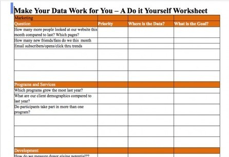
How to think about data in your organization, including an inventory worksheet.
Get Started for FREE
Sign up with Facebook Sign up with X
I don't have a Facebook or a X account


 Your new post is loading...
 Your new post is loading...
Your new post is loading...
Curated by Beth Kanter How to think about data in your organization, including an inventory worksheet. 
No comment yet.
Sign up to comment
7th Annual Media Maven Luncheon hosted by CCTV & Common Good Vermont Burlington, Vermont 21 September 2012...
Sponsors | Social Media Samples | Logos & Buttons | Press Release | Contacts ...

We’ve barely started to use the term “data scientist” and the demise of this new profession is already predicted? Well, it’s not one more “rise of the machines” prophecy but instead the provocative title of a proposed panel for the upcoming SXSW.
Can data science tools replace data scientists before this field has even taken flight? Many startups and established companies are building tools that enable users to enact data science by interacting with data at a high level. We will debate the proposition, "In the future, data scientists will be replaced by data science tools." The goal will be to explore the definitions and assumptions data scientists and people who develop tools about the line between best practices and human expertise. Ultimately, the panel will explore what unique attributes data scientists and tools bring to the field of data science. Questions Answered What tools do data scientists need? More specifically, what tools improve productivity and can tools keep data scientists from making mistakes?
How can this scale without a large pool of data scientists? DataKind (formerly known as Data Without Borders) brings together leading data scientists with high impact social organizations through a comprehensive, collaborative approach that leads to shared insights, greater understanding, and positive action through data in the service of humanity.

Curated by Beth Kanter This post offers some reasons why visual marketing is important but focuses on why blogs need to be more visual. Buzzword: The Trend Toward Visual Engagement...

Curated by Beth Kanter Do your employees have the skills to benefit from big data? As Tom Davenport and DJ Patil note in their October Harvard Business Review article on the rise of the data scientist, the advent of the big data era means that analyzing large, messy, unstructured data is going to increasingly form part of everyone's work. Managers and business analysts will often be called upon to conduct data-driven experiments, to interpret data, and to create innovative data-based products and services. To thrive in this world, many will require additional skills.
Tomorrow's leaders need to ensure that their people have these skills, along with the culture, support and accountability to go with it. In addition, they must be comfortable leading organizations in which many employees, not just a handful of IT professionals and PhDs in statistics, are up to their necks in the complexities of analyzing large, unstructured and messy data. It is about fostering a data-driven mindset and analytical culture as it is about adopting new technology.
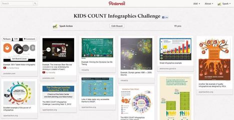
Curated by Beth Kanter The noun project is a growing collection of icons to use for graphic elements and symbols in DYI Infographics.
Thanks to my colleague - Conrad Taylor - for signposting this.
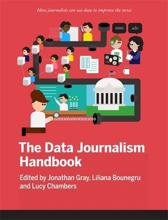
What is data journalism? To quote from the authors: "Perhaps it is the new possibilities that open up when you combine the traditional‘nose for news’ and ability to tell a compelling story, with the sheer scale and range of digital information now available."
But you don't need to be a professional journalist to be able to see the value in this handbook. There are tips and good practice here for anyone using the Interweb for research.
Whether you are an 'armchair auditor' checking on how government is spending your money, or a researcher looking for patterns of poor healthcare, or you're just interested in finding connections between hundreds of thousands of documents, as The Telegraph did in revealing the scandal of with MPs' expenses. You'll find some useful tips here, together with examples and case studies of stories (scandals even) that have surfaced as a result of knowing your rights to open data as a private citizen, where to find the data sources, and how to use and understand data.
The authors are also behind the website at: http://datadrivenjournalism.net/
Value: 9/10 Via Stephen Dale
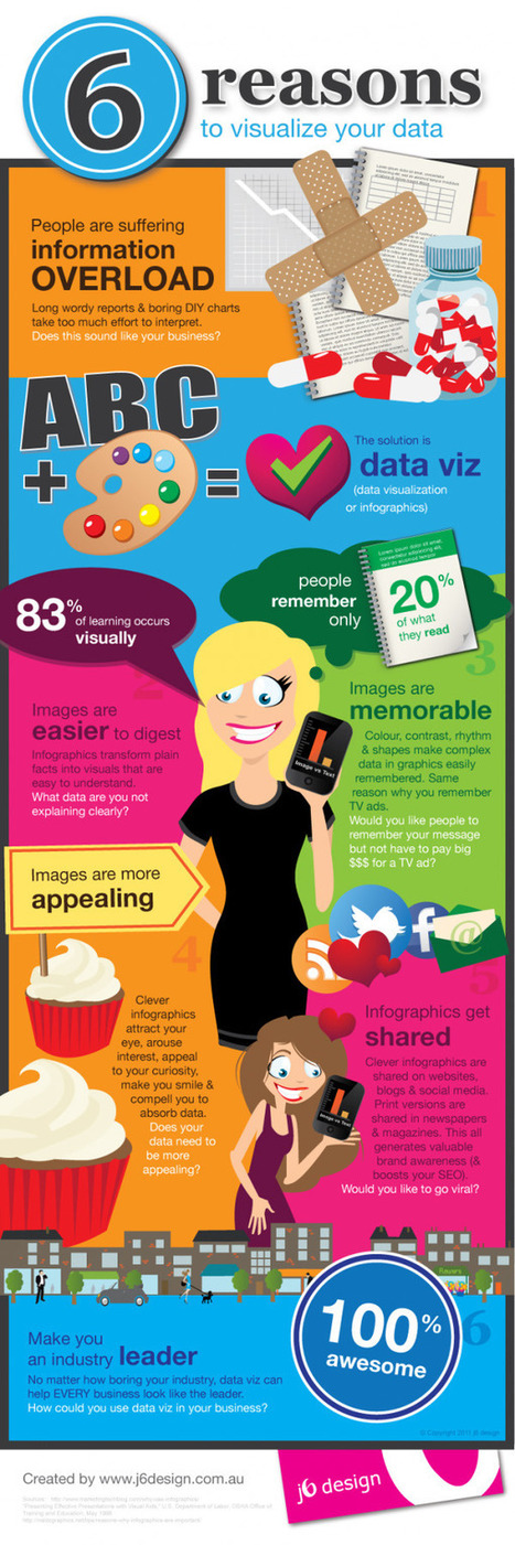
This piece was posted by Loren Sorenson for Hubspot, I selected it because as she says "If you aren’t prepared for the visual content revolution, you may be left in the dust. Not convinced? Let's take a look at exactly how visual contentis positively contributing to marketing strategies -- it may just give you the push you need "Learn why visual content is a critical part of your content creation strategy. Here are some highlights: **People remember only 20% of what they read **83% of learning is visual Condenses and Explains Large Amounts of Information **Today, there is too much information on the Internet you have about 3 seconds to catch someone’s eyes so they'll consume your information. Gives Your Brand an Identity **Visual content draws people in, letting viewers better understand your brand's identity Drives User Engagement **If you've ever read a book with a child, you probably know they find pictures more interesting than words; but are adults really that different? Selected by Jan Gordon covering "Content Curation, Social Business and Beyond" Read full article here: [http://bit.ly/Ifujbp] Via janlgordon

janlgordon's comment,
April 11, 2012 3:21 PM
Beth Kanter
Thank you for adding me to the wiki and for your kind words, it's greatly appreciated. Yes this is the conversation of the moment so to speak. I'm sure your presentation was amazing. Would love to hear it if you have a replay. 
Beth Kanter's comment,
April 11, 2012 10:08 PM
Jan: There's a link in the wiki to the live stream of the session - and a lot of notes and resources ... I love this topic! I'm holding myself back from created another scoop.it on it ...
janlgordon's comment,
April 13, 2012 10:05 PM
Beth Kanter
Thanks for looking forward to seeing this info. Knowing you, I can imagine that you want to start another scoopit on this topic but it's not necessary because you're already doing a wonderful job covering it now. |

Curated by Beth Kanter Good round up of articles on Big Data and how it applies to nonprofi sector.
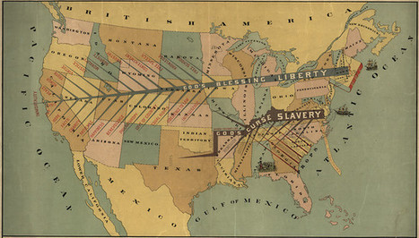
We live in a world steeped in graphic information. From Google Maps and GIS to the proliferation of infographics and animated maps, visual data surrounds us. While we may think of infographics as a relatively recent development to make sense of the immense amount of data available on the Web, they actually are rooted in the 19th century. Two major developments led to a breakthrough in infographics: advances in lithography and chromolithography, which made it possible to experiment with different types of visual representations, and the availability of vast amounts of data, including from the American Census as well as natural scientists, who faced heaps of information about the natural world, such as daily readings of wind, rainfall, and temperature spanning decades. But such data was really only useful to the extent that it could be rendered in visual form. And this is why innovation in cartography and graphic visualization mattered so greatly... Via Lauren Moss

Curated by Beth Kanter For the early adopters in data visualization, here's next generation tool that will analhyze in 3D Analysts now have the ability to explore and make sense of their data in 3D with the launch of Datascape – a 3D data visualisation application – by immersive environments specialists Daden Limited. Data visualisation is a powerful method for analysing and presenting large quantities of information, and with the continued explosion of “big data” tools to help make better sense of data are a necessity. Over the last year Daden have been looking at how immersive spaces can be used to provide an alternative to the 2D tools which are so common today. The result is the launch of Datascape. Using Daden’s immersive data visualisation application, Datascape, you can explore and make sense of your data in 3D. Datascape provides an easy to use, install and maintain immersive 3D environment in which users can visualise and interact with data from almost any source and from any domain including financial, political, technical, scientific, health and social media. Data can be imported from spreadsheets and databases or even taken from live feeds.

Gnip data scientist Scott Hendrickson looks at both arguments on whether data scientists can be replaced by data tools.
Tweets, pics, links, and more from 'Putting Your Data to Work' with Jake Porway.
Curated by Beth Kanter A collection of articles that address: Once you’ve got your data, what do you do with it? What should you look for? What tools should you use? This section opens with some ideas on improving your data literacy, tips for working with numbers and statistics, and things to bear in mind while working with messy, imperfect and often undocumented datasets. We go on to learn about how to get stories from data, data journalists' tools of choice, and how to use data visualization to giving you insights into the topic you’re looking at.
Visual artifacts from our one day graphic facilitation workshop at KM Singapore, September 2012. https://onlinefacilitation.wikispaces.com/Visual+Work+and+Thinking
Curated by Beth Kanter If you have to make a case for the usefulness or value of informations, here's some benefits.
Curated by Beth Kanter For my short list of free visualization tools for non-graphic designers
Curated by Beth Kanter Good tips here. Especially like the term "yak" shaving from Seth Godin (http://sethgodin.typepad.com/seths_blog/2005/03/dont_shave_that.html) A corollary and contradictory point to the last: Sometimes you need to indulge in yak shaving. “Yak shaving” is a term used particularly by geeks to describe the receding path of prerequisite steps you may find yourself on while completing what appeared to be a simple task. Yak shaving can distract you from your original goal, (“I just wanted to get the text out of this PDF, and suddenly I find myself researching Java memory resources”), and it often means you’re overlooking a more direct route to getting the job done (“So, have you tried copy and paste?” “Aaargh!”). But it can also lead you to learn things that otherwise would forever remain on the someday/maybe list. As long as a) it isn’t depleting all the time and energy you’ve reserved for the project and b) there is intrinsic interest and potential value for future projects, then I say “shave away.” Just try to follow Henry James’ advice to writers: “Try to be one of those on whom nothing is lost.”
|